The
Stanford Election Atlas shows election results by polling location. This reveals voting patterns that are not apparent when using the standard state or county maps. Unfortunately last week's election results are not currently mapped so we are looking at the 2008 presidential election.
The map still looks more red at a national scale than the vote actually went (due to the heavy clustering of urban polling locations) but it's not as unbalanced looking as the state and county maps. Two unfortunate aspects of this map are the Platte Carre projection (where Maine appears to be falling asleep from lack of interest) and the ESRI interface. I use ESRI interfaces enough at work to be frustrated with them. You can click on any point to get some detailed statistics and an ugly looking pie chart.
When you zoom in notable patterns emerge such as the cotton belt in the south that I've mentioned in a
previous post. Most cities have the standard blue core surrounded by a ring of red. Good examples include Minneapolis and Pittsburgh.

Note the lines of blue along rivers and railroads radiating out from Pittsburgh. This patterns shows up even more clearly along the east coast Metroliner corridor.

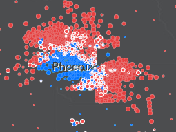
However, some cities have a more notable geographic split. Examples
of these are San Antonio and Phoenix. I don't know these cities very
well but there are almost certainly ethnic/racial divides that explain
these patterns.
A similar divide occurs on a broader scale in the Carolinas where the non-coastal east is strongly blue and the central and western regions are more strongly red.
There are other maps you can choose and specific maps for some of the swing states. Hopefully they plan on posting the 2012 results in the future and maybe they'll find a better map projection too. Also, maybe the next map will include Oregon, strangely omitted here. Must be that Stanford-Oregon football rivalry.


