Wednesday, January 28, 2015

100 Years of National Geographic Maps

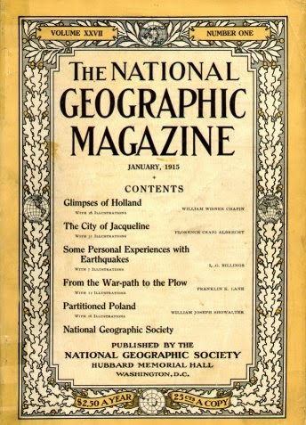
 In 1915 National Geographic created a new cartographic division, now known as National Geographic Maps.
http://en.wikipedia.org/wiki/National_Geographic_%28magazine%29#mediaviewer/File:1915NatGeog.jpg
A century's worth of highlights and challenges are detailed in Cathy Newman's article 100 Years of National Geographic Maps.  From Newman:
At this writing (the count is obsolete as soon as it is tallied), National Geographic cartographers have produced 438 supplement maps, ten world atlases, dozens of globes, about 3,000 maps for the magazine, and many maps in digital form.
Their first cartographer, Albert M. Bumstead invented a sun compass* and the Bumstead photocomposing machine that replaced hand lettering with photographic type. An example of some of their innovative approaches is this gorgeous map of the Himalayas, taken from a combination of high resolution photography from the Space Shuttle Columbia and aerial photography
http://news-beta.nationalgeographic.com/2015/01/150123-maps-mapping-cartography-history-national-geographic-centennial/
They were also the first to map both sides of the moon, including the side that is hidden from the earth.
http://news-beta.nationalgeographic.com/2015/01/150123-maps-mapping-cartography-history-national-geographic-centennial/
Here is a map showing many of Ukraine's place names that needed to be changed after the collapse of the Soviet Union in 1991.
http://news-beta.nationalgeographic.com/2015/01/150123-maps-mapping-cartography-history-national-geographic-centennial/

See the article for more maps and details about the past and future of National Geographic cartography.

* the sun compass was a type of watch with a pin that cast a shadow that when inclined at the correct angle would indicate which way was north based on the time and latitude. It was used by Admiral Byrd on his first flight over the South Pole in 1929.

Friday, January 23, 2015

New Jersey Sidewalk Crack

Yesterday I found a crack in the sidewalk shaped like New Jersey. I couldn't resist taking a photo and adding some annotations.
I posted it on Twitter where it was promptly ignored. Afterwards I had an even worse idea - see what it looks like as a New Jersey Transit map. Enjoy!

Wednesday, January 21, 2015

Spain vs. New Zealand Antipodes School Map

As young geo-nerds, my brother and I started digging a hole in our back yard in Pennsylvania. Eventually we hoped to reach China because that was the cliche of the time. This ignores the fact that you probably wouldn't dig precisely downwards without a level and if you did, you'd melt when you got to the earth's core. We also didn't realize that a straight dig downwards would have put us off the coast of western Australia. This is our antipode - the opposite side of the earth.

Most places don't have very interesting antipodes - North America is opposite the Indian Ocean and most of Europe and Africa is opposite the Pacific. Spain, however shares an antipode with New Zealand. The Antipodes Spain/New Zealand School Map is a tool teachers can use to teach geography and hopefully set up relationships between schools on opposite sides of the globe.
 Zoom in on a location and you can see the closest opposite school.
In a large city such as Madrid, the idea breaks down a bit as you have numerous schools competing to partner with New Zealand's Weber School, located in a low density area with few nearby schools.

The area around Wellington, New Zealand, being opposite the triangle between Madrid, Salamanca and Valladolid, has much better opportunities for anitpode sister schools though most of the city is paired with the Miguel De Cervantes School.  
- via Maps Mania

Wednesday, January 14, 2015

Big Ten Games of Thrones Map

Like many Americans, I spent way too much time Monday night watching the NCAA Championship football game. While not paying total attention, this commercial for the Big Ten Conference really jumped out at me. The commercial is called "Maps" and is based on the Game of Thrones intro (with the same music.)
It constructs a flyover of the US, starting at the Rose Bowl. As you pass by iconic buildings, stadiums and landmarks pop up from the landscape. Here is a tour using screen grabs from YouTube.

From the west coast you fly across the mountains to Nebraska, the current westernmost outpost of the conference.

Next comes Iowa, then Minnesota, then Wisconsin.
One of the most dramatic moments is watching the Chicago skyline pop up in front of the Northwestern logo. Note the theater references for Northwestern and Iowa. The mist coming off the Ohio River adds to the medieval theme.
The Michigan-Ohio State rivalry is about as big as it gets.
From there, it makes the jump to the east coast to cover the conference's recent acquisitions. Here are Penn State and Maryland with east coast icons such as the Capitol building, Washington Monument, LOVE statue and the Liberty Bell.
The flyover heads over the Atlantic and turns back to the west to include Rutgers the "birthplace of college football" (according to the ad) along with the NYC skyline and the ferris wheel at Seaside Heights, New Jersey. I like the reflections off the water.  
The full video is at the top - enjoy!

Wednesday, January 7, 2015

Toronto's Language Quilt

The Toronto Star published a set of maps in 2007 showing the second language (after English) for more than 1000 neighborhoods in the Greater Toronto Area. The map (based on 2006 Census data) is a nice, colorful illustration of where different immigrant groups chose to settle - although languages such as Spanish and Portuguese (and even Chinese to some extent) don't tell you much about where those settlers really came from. The original map is pretty large - here are some smaller images from Bricoleurbanism.
http://www.bricoleurbanism.org/wp-content/uploads/2007/12/gta-language-quilt_main-e.jpg

Particularly striking and unexpected (to me) is the number of Italians. Although many of the green neighborhoods are lower density suburbs creating a false illusion of dominance, Italian is still the largest
second language with almost three times as many speakers as French. The dull, generic gray color used for French (mostly in the far eastern part of the region) minimizes the visual importance of Canada's second language, whether intentionally or not.

Three neighborhoods where English is not the first language are highlighted with circles and expanded on.
http://www.bricoleurbanism.org/wp-content/uploads/2007/12/gta-language-quilt_eng-2nd-e.jpg
I made a screen shot of the main urban area to show some of the patterns of diversity that are less apparent from the large map. These patterns include Greek (black) in the east, Portuguese (light blue) in the west and various eastern Asian languages, mostly east and north of downtown. There are also numerous French speaking areas, if I'm interpreting the generic gray correctly.
The entire map can be downloaded from the Star here.