Wednesday, June 29, 2016

India Wants to Punish Cartographic Aggressors

This map via geocurrents shows India's disputed lands. 
A draft law in India aims to punish cartographers who do not include the claimed territories as part of the country. From the Washington Post:
Let's start with a basic fact: India claims much more land than it controls.

Thus, any map of India and its neighbors makes an inherently political statement based on how it depicts their borders. The issue is particularly thorny because the border disputes are with India's great rivals: Pakistan and China.
The law would punish offenders with up to seven years of jail time and fines running from $150,000 to $15 million. That's a high price to pay for trying to represent reality.

A few years ago Al Jazeera was banned for five days after showing a map that depicted Jammu and Kashmir as being divided between India, Pakistan and China. The media company was denounced for "cartographic aggression."

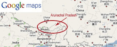
So how do the online map providers deal with these situations? A GIS Lounge article shows three different Google representations of the disputed state of Arunachal Pradesh, depending whether you are in India, China or the rest of the world (the last image.) While the rest of the world sees two parallel dashed lines, users in China and India see the border the way their governments want them to see it.


https://www.gislounge.com/wp-content/uploads/2010/07/World11.jpg
Apple maps (here in the United States) represents this border with two thin, unshaded lines. Note that there is another set of these along the Bhutan-China border. Last summer those two countries held their 23rd round of talks on this border.
Maps can be weapons.Be careful how you use them! I'll finish this with this nicely done map of Chinese "Intrusions" into India. I'm sure China has a different word for this. Click here for source.
https://blogger.googleusercontent.com/img/b/R29vZ2xl/AVvXsEhi7UdoqNdJAmXY3nvfxExgcoGUw-9L3csudKpNFMvZsugrLmgSxd1UpNxCRFTFpEP6G6MhtCfjzbxjKMGDhvbScXBEgppt8onbjnSDcLlbKQppbnbvHkTkorjQXW_l-7trnSaZssf1xSth/s1600/Neighbours-large_918.jpg


Monday, June 27, 2016

Wednesday, June 22, 2016

Linguistic Landscapes of Beirut

David Joseph Wrisley, an English professor at American University of Beirut has compiled a set of maps in an attempt to document the language diversity of Beirut. Arabic is the official language of Lebanon but a law determines "cases in which the French language may be used.” These maps show signs and are color coded by the language of each sign.
Unfortunately the color scheme does not lend itself well to seeing geographic patterns, if there are any. The French color is much too similar to some of the English colors. A trivariate color scheme like the map below might work better, though for dots I would go with stronger colors. Choose a primary color for each language and let them blend together where they mix.
http://i.stack.imgur.com/HmE2P.gif
If the point is that there is no pattern then his color scheme is as good as any. Here is an embedded version of the map. You can pan, zoom and click each point to see a picture of the sign. One final recommendation would be to allow the full screen option. The small map windows are tough to navigate.
Numerals used in signs, with only two choices, shows more of a pattern. Western Arabic numerals are in blue (0 1 2 3...) while Eastern Arabic or Arabic-Indic numerals are in orange (٠ ١ ٢ ٣ ٤ ٥ ٦ ٧ ٨ ٩)
Another interesting map is the vernacular map, showing the locations data collectors named when taking the pictures. This was done in response to some articles discussing Beirut's lack of addressing and how people navigate by informal landmarks, many of which no longer exist.
http://llb.djwrisley.com/?page_id=52

You can read more about the project and see more maps on Wrisley's project page.

Wednesday, June 15, 2016

Whistler's Map

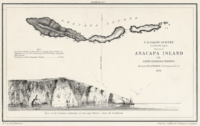
James Abbott McNeill Whistler was one of the most influential artists of the 19th Century. His best known work is his portrait of his Mother. Lesser known is his map of Anacapa Island in southern California.
http://www.archives.gov/exhibits/featured_documents/whistler_etching/images/anacapa_island_etching.jpg
Whistler was briefly employed in the cartographic section of the US Coast Survey where he learned to etch. He thought the Anacapa map looked dull so he added two flocks of gulls flying over the rocky cliffs.
His unconventional works habits led to his dismissal only three months into the job. These unapproved artistic flourishes may have contributed to the early demise of his cartographic career.

The National Archives holds three prints of his maps. More info about the Anacapa Island map can be found on their website.

Wednesday, June 8, 2016

Imperial Russian Trading Cards

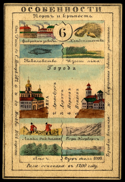
The Mid-19th Century Russian Empire was so large that it covered over 15% of the world's land area. It included a huge mix of ethnic, linguistic and religious groups. One way to show their imperial pride was to create sets of cards representing their many provinces. Here is Lifland Province (Latvia)
These cards listed principal cities, agricultural and industrial products. They also show coats of arms and local clothing styles. On the back side was usually a map.
The cards are from the National Library of Russia and The World Digital Library has put images of them online. They can be browsed from an interactive map that also has an overlay of a map of the Empire from 1827-the approximate time period of the cards. Click on the numbers to see the cards.
For example, Kamchatka
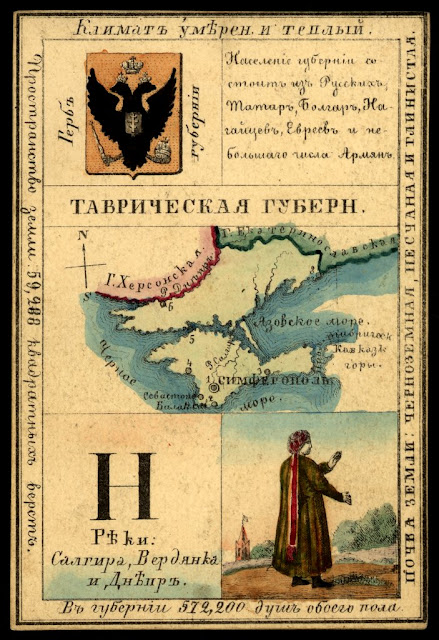
Here is Tavrich (Taurida) Province, including Crimea claimed then as it is again now by the Russians.
https://www.wdl.org/en/item/746/view/1/1/

https://www.wdl.org/en/item/746/view/1/1/
To browse the map. for more cards click here.

Wednesday, June 1, 2016

Moving Pictures

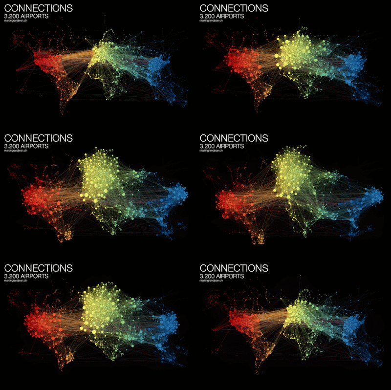
Martin Grandjean shows the network of air traffic patterns with an animation that loops between a purely geographic view and a force directed layout. This network view expands the busy areas such as Europe so you can see individual airports where they are tightly clustered.
http://www.martingrandjean.ch/connected-world-air-traffic-network/
Colors are arranged by longitude to help untangle the network - and also make it pretty. The network view is also arranged to visualize clusters where travel connections are more frequent. His observations about these clusters are interesting:
"India is more connected to the Middle East than to South and East Asia. The Russian cluster is very visible, connecting airports in Russia but also in many former Soviet republics. Latin america is clearly divided between a South cluster and a Central American cluster very connected with the U.S."
More information about this visualization and larger versions of the maps can be found here.

Mark Evans created visualizations of commutes to every county in the United States from ACS (US Census) data.
Non-blue dots represent the most common four counties that commuters come from, while the blue dots are other common locations. ACS data is aggregated by census tracts or block groups so the to and from locations are generalized. His blog post explains.

I find it interesting to compare the density of jobs among cities. This comparison of Houston and San Francisco gives a good idea of the differing transportation needs in those cities.
Here are screen shots of the final work destinations. You can explore your own favorite places here.