Wednesday, March 29, 2017

Pratts High Test Maps

I stumbled upon this pictorial map and was intrigued to learn more
https://s-media-cache-ak0.pinimg.com/736x/15/61/94/156194475f7a9deff80caf8bebca7787.jpg
What is a "High Test" map? It turns out that high test does not refer to the map at all but to a brand of fuel sold by the Pratts petroleum company. Alfred E. Taylor designed many of these pictorial maps for Pratts in the early 1930's and later for Esso (now Exxon) after they took over the Pratts company.

This linear road map hearkens back to the Peutinger Map and medieval itinerary strip maps such as this one.
Source-cartographic images
The Pratts maps have some wonderful details when you zoom in such as this compass rose,
"East West Pratts Best"
and some great ad copy for the quality of British roads.
"The main roads of England are incomparable for excellence, of a beautiful smoothness, very ingeniously laid down, and so well kept that in most weathers you could take your dinner off any part of them without distaste..."
Here is a detail from his map of the West Country including bathing recommendations and a poetic warning to seafarers. The full map can be seen on the David Rumsey Map Collection.
Quotes from Hamlet and Henry IV appear in this detail from his map of Wales.
https://www.oldimprints.com/pictures/38835_2.jpg?v=1390438949

I have found few details online about Taylor or these maps but many of them are available at antique map sellers such as Old Imprints and Jonathan Potter, Ltd.


Wednesday, March 22, 2017

Swiss Peaks

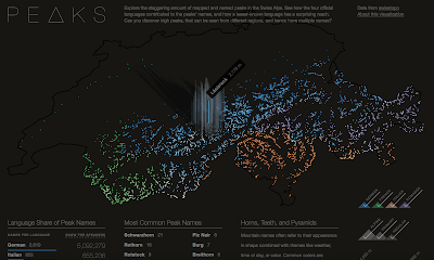
Peaks is a visualization of Swiss mountain peaks by Raphael Schaad, a designer at the MIT Media Lab.
https://raphaelschaad.github.io/peaks/
He uses four colors to distinguish the language (there are four official languages in Switzerland) of each name. In addition to color (hue) he also uses lightness (value) to represent height. The highest peaks are almost white making the language more difficult to determine. As you hover over a peak, you get the name and height of each one.
There is an About this Visualization link you can click to get some insight into Raphael's design process. Here is a quote about the stories he looks to tell.
The first narrative explores the impact language has on naming (e.g. Romansh’ names have much wider reach than the region this language is spoken in), the second story shows common names (similar to almost every U.S. state having a Springfield), and the third one highlights three colors as common origins for names. Each of these narratives is also interactive and tied to the central map.
 I like way he presents the legends,
and the supplemental language details.


Wednesday, March 15, 2017

The Ghost Cities of China

China has built dozens of "Ghost Cities" - not necessarily entire cities but new housing areas that far exceed demand and are therefore mostly empty. The poorly regulated climate of the country has contributed to fast growth in construction projects and made it difficult to get a good accounting of where all of these projects are located. Baidu, China's most popular search engine, used an algorithm to locate these places by comparing location data from mobile devices to housing units. Places with a high density of housing, but low mobile use are assumed to be areas of vacant housing. The map below shows 20 of the top 50 cities for vacancy rates. They do not show all cities or rank them for fear of having a negative impact on real estate sales.
https://arxiv.org/ftp/arxiv/papers/1510/1510.08505.pdf
The Baidu study used Baidu Maps, their mapping platform to determine density by using points of interest. The study is imperfect for many reasons, for example mobile use as a proxy for activity excludes people that do not use these devices. The study also factors in tourist areas as places that are empty during certain times of the year.

The study found that most of these "ghost" cities are "second or third tier" cities-tiers are determined by income, education, technology and other factors. They are also mostly clustered in the east and especially the northeast. Inner Mongolia is also well represented. These findings agree with a map compiled the South China Morning Post.
http://multimedia.scmp.com/china-ghost-towns/
This map shows a "demolition index" based on future supply versus future demand for housing. The redder end of the spectrum are cities that are most likely to become ghost cities.  The results can be viewed interactively here. From the article:
"From the map, the 'ghost towns' are clustered in northeast China, where local economies rely heavily on natural resources, heavy industries and farming, and are not diversified enough to offer a variety of jobs."
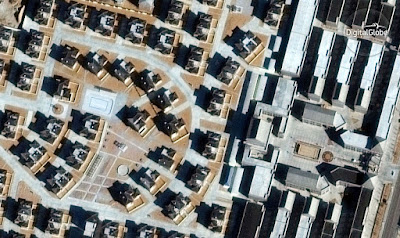
Though some of these places and beginning to get inhabited, Business Insider recently used Digital Globe to showcase how empty many of these places still are. Here are a couple of examples.

http://www.businessinsider.com/china-ghost-cities-satellite-images-2017-3/#chenggong-has-several-big-new-university-campuses-this-has-sat-mostly-empty-and-unfinished-for-a-while-according-to-digitalglobe-5
Erenhot, Inner Mongolia - Large mansions along empty, sand blown streets.
http://static5.businessinsider.com/image/58b986c1be967321028b4846-1200/dongsheng-named-by-baidu-as-a-partial-ghost-city-has-large-developments-like-this-one-sitting-dormant-the-skyscrapers-are-apparently-finished-but-the-construction-equipment-is-gone-so-it-appears-that-work-has-stopped-on-the-site-digitalglobe-says.jpg
Dongsheng, also in Inner Mongolia

More voyeuristic pictures can be seen at Business Insider

Thursday, March 9, 2017

One City Marathon

The third annual One City Marathon in Newport News, Virginia will take place this weekend. Jonah Adkins, the city's most famous cartographer designed a very nice map of the route.
http://jonahadkins.com/img/posts/onecity_sm.jpg
After numerous tries, he settled on this simple two color scheme. These are two colors I would never choose to mix (the Never Mind the Bollocks Here's the Sex Pistols color scheme) but it actually looks great. The map also has way more detail than is necessary (every building!) but these details are faded out enough to not distract from the focus on the map while also adding some lovely texture and character. Edward Tufte, with his focus on using as little ink as possible would not approve but I do.

Other nice features include clear mile markers, subtle text masking and a nice gentle mask along the coastal features. Also there is an elevation profile at the bottom.
Here is the whole map.
http://jonahadkins.com/2017/02/22/onecity.html
Jonah also created this animation showing the different designs he considered. I think the final version is by far the best and I like that north is up, as opposed to some of the rotated orientations.
 Unfortunately the marathon organizers are not using this map, instead going for a lame Google Map with line on it-and no further detail.


Wednesday, March 8, 2017

Cartographic Gems from Women

I was a little hesitant to have a post on women cartographers. On one hand today is International Women's Day. On the other hand, with so many more women in cartography these days it seems kind of unfair to lump them all together as if they all think (and map) the same. On the other, other hand (3 hands?) I do not feature works by women here as often as I should.

In a previous post, I featured the Women in Cartography exhibit at the Norman Leventhal Map Center.  That post covered some major contributors to the field such as Marie Tharp as well as the history of somewhat anonymous women producing maps. For today I want to enjoy posting a few more recent maps.

Paranormal Madison by Chelsea Nestel
http://nestelmaps.azurewebsites.net/Content/images/C_Nestel_Haunted_I.jpg

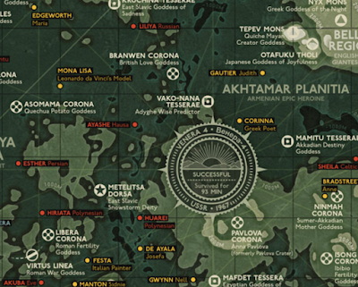
Goddesses of Venus by Eleanor Lutz - see my previous post for her Mars map.
http://tabletopwhale.com/2017/03/06/goddesses-of-venus.html
Shinjuku West by Geraldine Sarmiento
https://tangrams.github.io/tangram-frame/?url=https://raw.githubusercontent.com/tangrams/multiverse/gh-pages/styles/building-grid.yaml#16/35.6900/139.6920
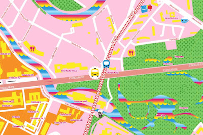
I also like her Candy Map style. Here is Candy Berlin.
http://geraldinesarmiento.com/candy-map/


Wednesday, March 1, 2017

Horses and Cows of France

I found this map online showing the large breeds (mostly horse and cows but also donkeys and mules) of France.
It appears to be a classroom map from 1960 from what I can tell with my bad French translation skills. There are a couple of zoomed in looks on this page.
The top corner compares horses around the world by average(?) size while the bottom right corner does the same for cows.

For 52 euros you can buy a copy here.