Thursday, July 26, 2018

Comparative Mountains and Rivers

Continuing last week's theme of comparative maps, here are a few examples of a genre of map that compares mountain heights and river lengths.
https://www.davidrumsey.com/luna/servlet/s/0ixpy8
This map was originally published by Henry Tanner (1836) and modified by S, Augustus Mitchell (1846), both of Philadelphia.  Like last week's map, the geography is arranged to fit the space with the shortest rivers cleverly positioned atop the tallest mountains.

The peaks are numbered. On this and the other maps from this period the highest known peak was Dhaulagiri in the Himalayas, now the seventh highest. In addition to mountains, the heights of cities and lakes are shown. Below Quito, Ecuador is shown beneath Pambamarca.

Down at the bottom are some of the Pyramids of Egypt, the "Falls of Niagara" and lakes such as Ontario (42), Erie (36) and Superioir (32). Above that is Caracas and the limit (this is a guess) of where bananas grow. Also along the bottom are various cities and landmakes such as the mines of Huancavilica and the Philadelphia Shot Tower. More of this map can be seen on the David Rumsey Map Collection page here.

Here are a couple more variations on this theme You can click them to see enlarged views from the Rumsey collection. This one published in London by William Darton in 1823 has everything arranged on one side.
https://www.davidrumsey.com/luna/servlet/s/0c039n
I like the treatment of the rivers here.
This one (Joseph Thomas, London, 1835) has the rivers at the bottom and the mountains in several rows.
https://www.davidrumsey.com/luna/servlet/s/9s1h69
Finally, for a local view, here are the rivers of Scotland.
https://www.davidrumsey.com/luna/servlet/s/9w9pif

Many more examples of this theme can be seen on this excellent blog post from the Rumsey collection.

Wednesday, July 18, 2018

Comparative Lakes and Seas

Here's a beauty from the David Rumsey Map Collection. Comparing lakes and seas all at a uniform scale.
https://purl.stanford.edu/fh689md1694
The full title of this map is "Comparative Form and Extent of the Inland Seas and Lakes of the Globe" followed by the text "Drawn to uniform scale with indications of the nature and country in which they are situated." There are four panels, one for each continent (Australia was not included).
Lakes are placed where they fit on the page and are only arranged geographically if they are connected or otherwise grouped such as the Great Lakes or the lakes of central Manitoba-which are clearly not south of Chicago.
Here is part of Asia - the major seas are arranged geographically while the rest of the lakes are fitted in where space (land) allows.
 Published in 1852 by William Blackwood & Sons of Edinburgh and London, it is Plate 3 from the Atlas of Physical Geography, Illustrating, In a Series of Original Designs, The Elementary Facts of Geology, Hydrology, Meteorology and Natural History.  This atlas has some other gorgeous details such as this "chartography" from the frontispiece.


Wednesday, July 11, 2018

Mapping the A:shiwi Perspective

The A:shiwi Map Art Initiative is an indigenous mapping project sponsored by the A;shiwi A:wan Museum and Heritage Center on the Zuni Reservation in New Mexico. The project seeks to challenge ideas of what maps are. To the Zuni, or A:shiwi people they are more about telling stories than about scale and direction.
https://emergencemagazine.org/app/uploads/2018/02/Little-Colorado-River.jpg
Little Colorado River - Larson Gasper, 2009 via Emergence Magazine
There is an excellent article on this project with videos and maps in Emergence Magazine. According to Jim Enote, the museum's director more native lands have been lost through mapping than through physical contact. These maps seek to reclaim their land, names (including their own people's name) and memories.
https://emergencemagazine.org/app/uploads/2018/02/Our-land-1280x953.jpg
Ho'n A:wan Dehwa:we (Our Land) - Ronnie Cachini, 2006 via Emergence Magazine
In the map above the modern road network intersects an otherwise dream-like landscape.
https://emergencemagazine.org/app/uploads/2018/02/Salt-Mother-big.jpg
Migration of Salt Mother - Larson Gasper, 2009 via Emergence Magazine
http://ashiwi-museum.org/wp-content/uploads/2014/12/shibabulima.jpg
Shiba:bulima - Levon Loncassion
These maps are in a traveling exhibition that has appeared in New York, Los Angeles, Albuquerque and Flagstaff.
http://ashiwi-museum.org/wp-content/uploads/2014/12/zuniworld-ipcc.jpg
Most of these are in the form of traditional paintings but there are also a couple of digital paintings.
"The maps represent landscapes but also historical events, such as Zuni migrations and Zuni relationships to places throughout the Colorado Plateau. The maps also guide viewers through Zuni cosmological processes where water, plants, animals, and even the sky make up the unique Zuni world. The exhibition shows how Zuni see their own history, their ancestral migrations, their ancient homes, and the parts of nature that sustains them."

Wednesday, July 4, 2018

Major Native American Map Found

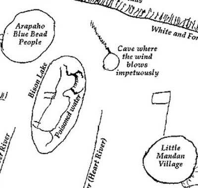
A map drawn by Arikara tribal leader, Too Né for Lewis and Clark was recently discovered in the Bibliotheque National de France. Here is a sample.
https://elledawilson.wixsite.com/ears/lcmap

Too Né drew this map in 1805 or 1806 and it shows how much the American explorers depended on the knowledge of Native Americans.

The map is from the May 2018 issue of  We Proceeded On, journal of the Lewis and Clark Trail Heritage Foundation. It is available as a print copy only but the version above was put online by the Daily Astorian. Here is a quote from the Daily Astorian article:

“Monumental doesn’t fully cover the importance of this discovery,” historian Clay Jenkinson declared, noting that “individuals like Too Né were as important to the success of the expedition as, say, Sacagawea.”
here are a couple more map samples - the entire map can be seen here.