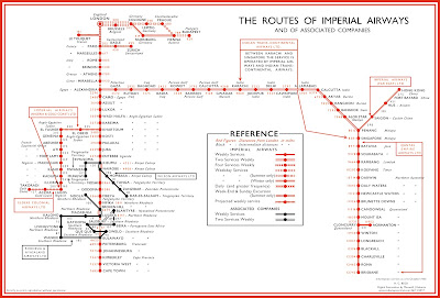
This map was published a month ago in the Londonist. Just about every other map blog has already picked up on it and I am late to the game. However, I've spent so much time looking at it that I think it's worth a visit even if you've already seen it. It was drawn by Harry Beck, author of the iconic London tube map that discarded geography for straight lines. Here he applied it to airline travel.
 |
| via Londonist |
Specifically it shows all the routes of Imperial Airways and it's subsidiaries. The map was discovered at the Croydon Airport in England and dates from a few years after his subway map was produced. The legend takes a little work to understand. Generally the busier lines have more service but there are various complications within that scheme.
Here is a close up from Europe where things are busiest to illustrate the differing line weights. Interesting how the routes through Germany differ in winter and summer.
I spent a lot of time looking at Africa, trying to translate the colonial country and city names to their current ones.
You too can spend way too much time exploring the eastern hemisphere's 1930's airports here.


