
Many people are putting together their best of lists for 2025. I don’t have time to stay on top of all map content so rather than a best of, here is a list of inetersting map-related posts I’ve missed this year. Due to content length restrictions, I will break this into two separate posts so here is Part 1.
Overthinking about vertical writing of Hangul labels on maps - Here is a wonky problem I have never considered in my cartographic career. Hangul is the Korean alphabet. In a system that can be written vertically or horizontally, how do you orient your text on the vertical (north-south) roads? Author Hanbyul Jo surveyed her Korean friends for a preference. When no clear preference emerged, she turned to Korea’s main map services, who approach the problem differently.

I reformatted the maps above from the original post for ease of comparison. It may be a little difficult for westerners to interpret but you can clearly see how the number 12 is written differently. Next, she turned to paper maps with the conclusion that maps that mixed Hangul with Chinese characters tended to label these road vertically, while maps in pure Hangul went horizontal.


The map above (Seoul City Map -Seongji Publishing, 2024) appears to be in the latter category. Mainly I’m showing it because it’s a nice looking map. While the author remained on the fence she considers maps with the vertical text “a precious example of two writing styles naturally mixed together”.
While on the subject of Korea, Miguel from A Cartographer’s Tale acquired an electronic copy of a North Korean atlas from the early 2000’s. It is fascinating. The narrative is that the Communists won the Korean War and the country is united, as in this physical map of Korea.

Maps of other countries are shown in various colors but they chose gray for “enemy” countries such as the United States and Japan. Here is the United States, because it’s the country I know best. What are the red lines? Roads, railroads or just random lines connecting cities? They appear to loosely follow rail lines. Also, the city locations are odd. Note the major city in central Oregon, Perhaps that’s Portland but if so the location is way off. Is the furthest Northeast dot also Portland? The text is different.


You can see many more of these maps at A Cartographers’s Tale.
Daniel Huffman, who has always been generous about sharing his mapmaking techniques, made his first National Park map. It is a beautiful sketch of Isle Royale in Lake Superior.
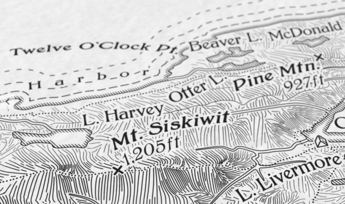
The map uses a plan-oblique view, a hybrid between a bird’s-eye style view and an overhead (typical of most maps) view. If you’re interested in technique or want to buy a copy you can do so here.
From that well known map site, Instagram comes this map showing northern Africa when it was a much more humid place, full of rivers and lakes. Aside from a few oasis towns, Lake Chad is about the only surviving water body and it is drying up.
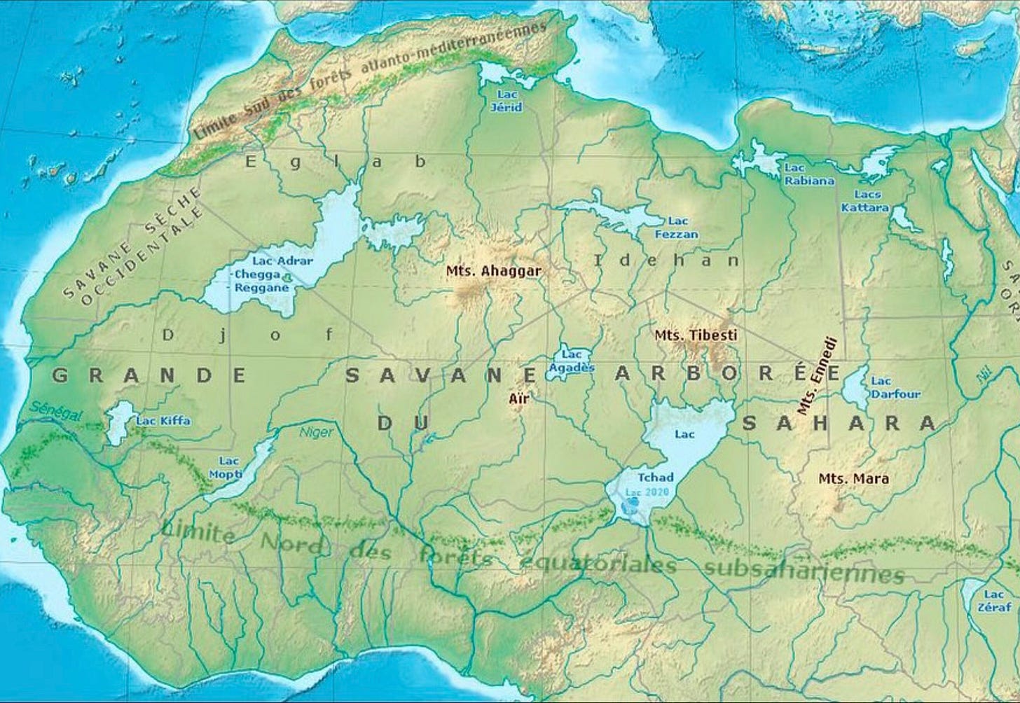
This map came from Alex Vicente Conde who posts “bizarre maps” under @egm_bizarros. Translated into English from the author’s text: “This is what North Africa and the Sahara looked like 8,000 years ago at the height of the African Humid Period. 🙂 Subfossils of fish and other creatures that inhabited these lakes can still be found there today.”
More highlights to come, probably next week.
.jpg)


