Wednesday, October 22, 2025

Remrkable River "Map"

This “map” should absolutely not be used for navigation. More of an illustrative graphic than a true map, it is geographically accurate in many ways while placing rivers that are continents away as neighbors.

-via David Rumsey Map Collection

Titled “A Map of the Principal Rivers Shewing Their Courses, Countries, and Comparative Lengths“, it was created in 1834 in England by the Society for the Diffusion of Useful Knowledge. Rivers radiate around a circle based on their orientation of flow. That is how you get Italy’s Po River situated between China’s Yangtze and the Amazon in South America - all east-flowing rivers.


The amazing trick of this map is how the authors were able to fit river courses into each other with minimal distortion of directions or lengths. Here you can see how the Amur River flows over the top of the Great Lakes with the entire area nestled into the Amazon’s curving headwater tributaries.


Some sacrifices had to be made here such as cutting off the major south flowing tributaries of the Amazon but I love the way they folded Brazil and Peru around Mongolia.

There is a cliche (at least here in North America) that few rivers flow northwards. This map shows that many of the world’s longest rivers including the Nile, Lena and Yenisei (Ienisei on here) flow north.


At the top of the map is a legend. The word “character” is confusing here but I think it just refers to the different line symbols (dots, dashes, etc) used to distinguish the river by their continents.


At the bottom is a chart “shewing” the length of each river and some text stating that the concentric circles at 200 mile increments are to give a general idea of the distance to the sea.

Not just impressive in its scope, the map also highlights some beautiful details with hatch lines for topography, parallel lines implying water depth, shading and a very restrained bit of blue shading for water bodies.


Browse this map here.

Wednesday, October 15, 2025

Sketchy Boats

Sketchy Boats is a site created by maritime researcher Christian Panton. It tracks ships with “murky paperwork, shady ownership, strange port calls, and a suspicious tendency to vanish from tracking systems”. Sketchiness scores are calculated by a number of red flags including switching flags or names, questionable insurance documents, spending time off the coasts of sanctioned countries and going dark from tracking systems. There is a globe you can spin to see a heat map of these ships. 


You can also bring up the list of ships and click for more information.


Here is a detail of the Ocean Embrace, one of the ships with a top sketchiness score, currently sailing under the flag of Sierra Leone.


There are also links below to other tracking sites such as VesselFinder and Global Fishing Watch, which has its own ship tracking visualizations.


More on this project from Christian Panton's web site


Wednesday, October 8, 2025

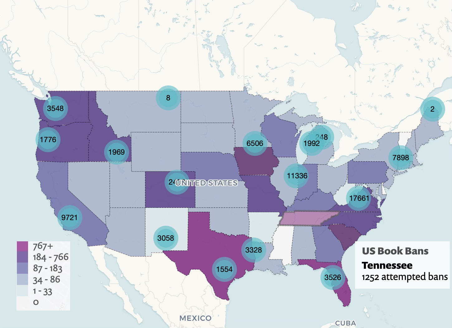
Banned Books Map

Happy Banned Books Week. As book burning fever persists across the land the Little Free Library organization is fighting back with a map showing book bans across the USA.

The map is a bit confusing in that the numbers are libraries, not book bans. Bans are colored by state, but not shown more locally than that.


You can find your area, get info on specific libraries and 


use their mobile app to find Little Free Libraries to deliver books to.

More on Little Free Library’s fight against censorship here.


Wednesday, October 1, 2025

African Migration Myths and Reality

I saw this very interesting map on Global Threads, a blog from Oxford Professor of Global History Peter Frankopan. 


It shows migration within Africa. Despite headlines and pictures of dangerous boat crossings, the vast majority of these migrations take place within Africa. Less than 1% of Sub-Saharan Africans migrate outside the continent. “In some cases, routes within Africa are more lethal than the highly publicised ones across Mediterranean itself.” These facts are obscured by the focus on European immigration.

The countries receiving the most migrants are Côte d’Ivoire, Kenya, and South Africa. Almost 10 percent of Egypt’s population are migrants though oddly there are no arrows there on this map. Ethiopia, Sudan and Uganda are major host countries for refugees despite their own internal problems. The other takeaway is that most of this migration takes place within the major regional economic communities-the colored areas.

To not simply repeat Frankopan’s blog post (though it is well worth reading), I did some research and came across the International Organization for Migration’s annual World Migration Report. It is full of interesting graphics and as you scroll down there are flow arrows connecting the countries or origin (on the left) and destination (right) of migrants. The arrows are sized by numbers with the top five destinations (or origins) listed. Here is an example from Mali showing only one European country at the bottom of its top five destinations.


Looking at a European country’s (Italy) top sources of migrants, only one of these countries is in Africa. France has three (former French colonies) while Germany and Britain have no African countries in their top five.


This south to south, rather than south to north migration is in Frankopan’s words, “binding African economies and societies together in ways that are under-recognised in global debates.”