Tuesday, June 13, 2017

The Evolution of Ordnance Survey Mapping

Britain's Ordnance Survey has consistently produced some of the world's finest and most detailed maps. Here is a display showing the evolution of their mapping styles, blended together with Photoshop.
https://www.ordnancesurvey.co.uk/blog/2012/11/the-evolution-of-ordnance-survey-mapping/
I like the subtle stylings of 1895. You're welcome to disagree. I also really like how the legend is made from a theoretical landscape.

Wednesday, June 7, 2017

Beyond the Sea

Our local Bostonographer and Maptime Boston co-host Andy Woodruff has been working for a while on mapping what is across the ocean from where you stand. His latest "flowing and exploding" version is quite fun to watch,
or interact with by pointing your mouse and seeing where it goes-here.
If the results are unexpected it is because the lines go perpendicular to the coastline, rather than following a specific latitude. We are conditioned to think that "across" means the same latitude on the other side. As children going to the Jersey shore we imagined that we were looking at Portugal on the horizon-because we were geography nerds. However the shore is angled in a northeasterly direction so you are actually looking southeast, towards either South Africa or in some areas missing that continent entirely and rounding the Cape of Good Hope, reaching all the way to the west coast of Australia. That would be the case for most of the shoreline, but any bay or other odd turn in the coast and you may be looking at Norway, Nova Scotia, Morocco or Brazil.

If you are more interested in latitude, there is a nice map series from the Washington Post, showing the continents color coded by what's across the way. Here is Africa, for example.
https://www.washingtonpost.com/news/wonk/wp/2015/08/03/whats-across-the-ocean-from-you-when-youre-at-the-beach-in-7-fascinating-maps/?utm_term=.57978062dd22
 This one shows that Portugal is across from the Jersey shore but to see it you need to look at an angle.

Thursday, June 1, 2017

Maps of the Flat Earth Society

In a world of alternate facts and ridiculous theories, the flat earth alternate fact has stood the test of time despite obvious evidence to the contrary. All NBA star and flat-earther Kyrie Irving needs to do is look out the plane window on his next flight to see the curvature of the earth. He doesn't even need to pay attention to the northward tilt of the flight path.

The Flat Earth Society has various examples of flat-earth maps such as this one by Samuel Rowbotham.
It has a nice letter coding system to help the average flat earther figure out the difference between Land (L) and Water (W). N is the north pole (more on that below) and D is...darkness?

One of the most common maps used by flat earthers is from Wilbur Glenn Voliva, an evangelist who offered a $5,000 prize for anyone who could disprove the earth is flat. By choosing to disbelieve any takers, he never had to pay the money.
What these maps have in common is that they all see the world as round-circular or elliptical. The Sun (as shown above) rotates around the equator, explaining the differences in climate. They believe in the North Pole, but not in the South Pole. The southern edges of the world are conveniently edged by a wall of ice to keep mariners from falling off. Some believe in a dome shaped sky with stars hanging down.

The belief that the South Pole cannot exist, gives rise to many conspiracy theories about why airline flight routes go the way they do. These theories are easily debunked by anyone who has flown between cities in the southern hemisphere.

Yes they don't fly over the South pole because the great circle routes are much further north.

Here is a flat earth globe

For more see the Flat Earth Society's maps page.
 

Tuesday, May 23, 2017

The Rapid Growth of Chinese Metro Systems

This remarkable animation from Peter Dovak (website no longer available) shows the rapidly accelerating growth of metro systems in China, including Taiwan.
http://pdovak.com/projects/#/chinese-metro-evolution/
China's first metro opened in Beijing in 1969. Growth of the systems was modest up to 1990. From then until (proposed) 2020 you can see how quickly things changed. The animation is an adaptation from his wonderful mini metros project where he designed a bunch of icons for wordlwide metro systems, many of them instantly recognizable, such as Washington DC (bottom) - Beijing is the one below.


Wednesday, May 17, 2017

English Settlement

 The English Landscape and Identities Project has some tri-variate maps of England showing eras of archaeological sites. The author, Chris Green, begins with an apology to those with color deficiencies. Because three color channels are needed, it would be hard to make this more legible to color blind readers*. The legend is shown first to see what you are looking at.
Darker areas are more "complex" - meaning there are sites from more time periods. The primary colors show more specific time periods as seen above. Magenta is Roman in case the image is hard to read.
https://englaid.com/2017/05/12/regionality-complexity/
There is a second map based on more local variation on the blog post, but I find this one easier to interpret. Some of the patterns that show up are settlement along Roman roads (magenta lines), some clusters of prehistoric sites in the southwest and northeast and a much lower level of intensity in the west (fewer archaeological sites here?) Some of the darkest, most intense areas are along major river valleys where quarrying activities have possibly uncovered more sites than average.

This map is based on available data and may not tell the full story but it does give an idea of the variation and complexity of archaeological records.

* This color scheme (via StackExchange) would have worked for color deficiencies.


Wednesday, May 10, 2017

Seattle Awareness Map

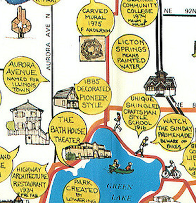
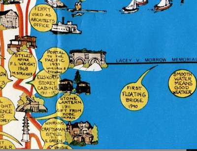
In 1978 the Seattle Department of Community Development published this map to raise awareness of the city's cultural landmarks.
https://www.flickr.com/photos/seattlemunicipalarchives/2572719557/in/photostream/
Seattle Municipal Archives posted a scanned copy on their Flickr site. The cover is a nice grouping of buildings, statues and ferries.
https://www.flickr.com/photos/seattlemunicipalarchives/2572719557/in/photostream/
Inside the map is densely populated with landmarks and yellow descriptive text bubbles,
https://www.flickr.com/photos/seattlemunicipalarchives/2572719673/in/photostream/
sometimes with additional info or commentary added.
 Some more detailed scans can be found on Rob Ketcherside's Flickr pages.
https://www.flickr.com/photos/tigerzombie/5076442361/
One final view-because I briefly lived near the Arboretum Gate House

Wednesday, May 3, 2017

LEGO Poland

Last year, the first LEGO store in Poland opened, in a Warsaw shopping mall. The event was celebrated with a huge 3D model of the country built by kids and adults.
https://www.flickr.com/photos/biplex/28509278013/in/album-72157671813609731/
Here are some photos from various stages of completion via this Flickr gallery.
https://www.flickr.com/photos/biplex/29128034255/in/album-72157671813609731/


https://www.flickr.com/photos/biplex/29022656902/in/album-72157671813609731/

https://www.flickr.com/photos/biplex/29095453436/in/album-72157671813609731/
A couple more from the Hive Miner page
https://farm9.static.flickr.com/8334/29570331026_148842ac8c_b.jpg

https://farm9.static.flickr.com/8086/29314178810_e7cc164e1f_b.jpg