Wednesday, July 26, 2023

Water Taxis of Paris

Here is a nice map of the water taxi system in Paris, circa 1900.

Boats pulled by horses or with oars or sails were eventually replaced by steam powered boats in the 1800's. They were a large part of the Paris transportation network before the railroads took over in the early 1900's. 

Recently a new commuter boat service the Voguéo was started to serve part of the area. The maps are not nearly as attractive.


Wednesday, July 19, 2023

Summer of Extremes

It's been a summer of extremes around the world. Here is the United States we have dangerous heat,

via Washington Post

 droughts and floods, existing in close proximity in places,

US Drought Monitor
and wildfire smoke covering much of the country.
via Newsweek

Around the world there are floods in Pakistan and Japan, huge wildfires in Canada, droughts in South America and probably many more situations that I have not been following. For those still in denial about global warming, here's a picture of just a normal summer day in Phoenix.

via YouTube


Wednesday, July 12, 2023

Pictorial Bird's Eye Map of Banff

Here is a really nice pictorial map of Banff, showing the mountains, rivers, railroads and hotels. 


 Mountains are listed with their elevations.

A quiet corner at the end of Lake Minnewanka,

and some sky above the ice field.

Browse the whole map here.


Wednesday, July 5, 2023

Protein Survey Map

While looking for unrelated items I came across this 1920's Protein Survey Map of Western Canada.

Wondering what any of this means, I did some research and discovered that protein refers to the gluten content of wheat. In the early 1900's flour mills began classifying their wheat based on protein content with premiums offered for the highest protein flour.

The map follows along the railroad lines because rail cars were tested for gluten content. The color scheme of this map is hard to follow but red is the highest protein content followed by blue. 

The map credits the chemists in addition to the Trade and Commerce Department minsters. I lost the original source of the above map but found this map from a few years later

with an even more detailed and confusing color scheme.

Here is the title block.
 

In a previous post I highlighted the Alphabet Railway. Here is a piece of that, with a few interruptions for pre-existing towns.

See the whole map here.

Wednesday, June 28, 2023

Maps of Julian Hoffman Anton

I'm always excited to find new cartographic artists. Here are some maps from Julian Hoffman Anton. The first one is his Tokyo Eat Map. I've cropped the map a bit to fit the format of this page. To see it all click here.

This is really a heat map showing restaurant density. Egg yolks represent the highest concentrations. Outside of the dense egg area individual restaurants are indicted by green pegs. In place of a legend there words around the top of the bowl pointing to neighborhoods and examples. This is one of the most clever maps I've seen in a long time.

He has also represented transit networks of Tokyo and London in neon,

wine regions of France as spills of wine over a hunk of cheese,

and the Great Fire of London as fire.

There's plenty more map goodness to discover here, as well as other visualizations, digital art and photography on his main page.


Wednesday, June 21, 2023

The Southern Underground Railroad

This map, via Smithsonian, shows the main passageways that the enslaved took southwards to freedom.

The southern Underground Railroad was less traveled and much less well documented, but Mexico after gaining independence passed strong anti-slavery laws. Even before that the Spanish government granted freedom to many who escaped to the south. When the United States passed the Fugitive Slave Act in 1850, Mexico refused to comply despite pressure from US diplomats. When Mexico lost Texas and large portions of other states to the United States as a result of the Mexican-American War, slavery was re-established in Texas and the Rio Grande became the crossing to freedom. - via Smithsonian


Wednesday, June 14, 2023

Forest Fires All Over North America

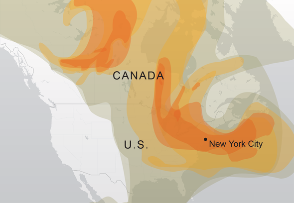
This has been a remarkably heavy year for forest fires and it's still very early in the season. The last few summers the West Coast has experienced many days of terrible air quality. This year the East Coast is experiencing it. Last week cities like New York, Philadelphia and Toronto has some of the poorest air quality in the world and residents were advised to stay indoors. Here is a map from NASA showing where major fires are burning. The red dots show smaller fires.

You can click and zoom for details.

A map from Scientific American shows how the smoke has moved from eastern Canada to New York City (the only city, apparently).

Here's one more map from the Fire, Weather and Avalanche Center showing active fires in the United States. It gives more details but doesn't cover Canada, where the largest fires are. The purple dots are lightning strikes.