Wednesday, February 26, 2025

The Invasion of Ukraine

Ukraine was invaded by Russia three years ago. Since the new president of the United States is in full surrender to Putin mode and wants to blame Ukraine for starting the war, I am posting this map, from February 27, 2022. It is to remind anyone that needs reminding of who started this war.

via AP - source: VOA News
This one shows what Russia has gained (in red) in three years of war. Much of that area will likely be ceded to Russia if a “peace” deal is made without Ukraine.

via Institute for the Study of War


Wednesday, February 19, 2025

Mapping Prejudice

Mapping Prejudice is a project by a team of scholars and activists at the University of Minnesota. The project maps racial covenants, clauses that were inserted into property deeds to keep people who were not White from buying or occupying homes. 

The mapping page has an animation that show the growth of these covenants in the Minneapolis-St. Paul metropolitan area from 4 in 1910 to over 32,000 in 1963.

Or you can see all of them with their details. The green color does not stand out great again the gray background though.

There are also some static maps showing racial covenants in the area. This one does a good job of showing how they cluster around the Minneapolis city boundaries.

This is an ongoing process and you can volunteer to help find racial covenants in deeds and participate in community mapping sessions.


Wednesday, February 12, 2025

Let America be America Again

When white people like me write about Black History Month, it can seem quite performative. However, in an era when our “leaders” are trying to erase black history, it is important for all of us to keep it visible. This poem map was inspired by a Langston Hughes poem called “Let America be America Again”, the full text of it can be found here.

 Map help from Project Linework

Wednesday, February 5, 2025

Luko's World

Last week we lost our dog, Luko (a shortened version of an overly long-winded name he came with.) Lots of people will tell you they have the best dog but he was truly one of a kind. Completely sweet and a delight to all who have known him.


A few years ago I made a colored pencil map of his world. I didn’t think it was very good at the time so I never posted it here. It also was a bit problematic because I used a very light pencil so even after contrast and brightness adjustments, it’s a bit hard to read. The photos were added after the fact and placed close to where they were taken. North is not up on this map, uphill is up. This is dedicated to his memory. Enjoy.


Wednesday, January 29, 2025

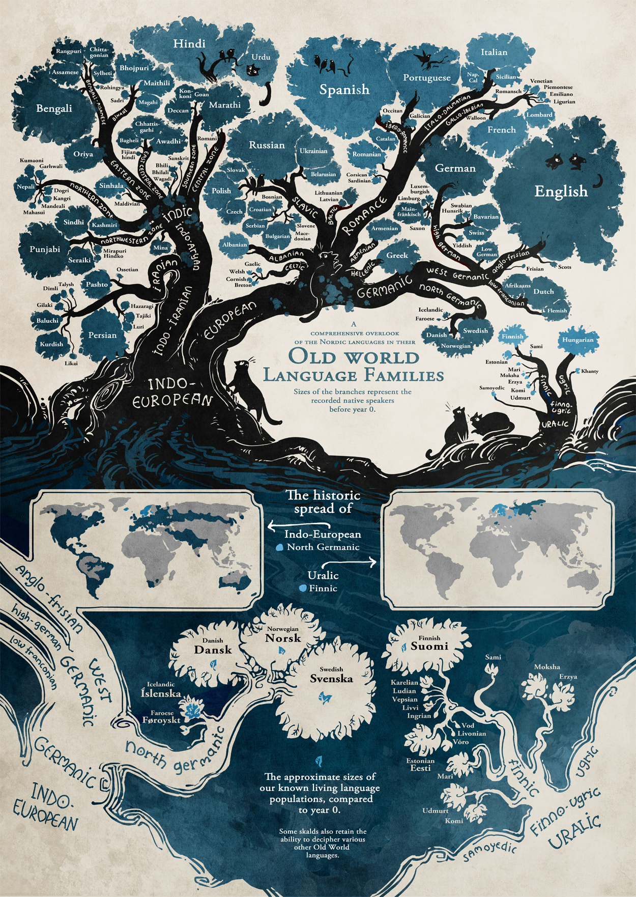
Old World Language Families

This isn’t a map, though there are small maps embedded, but an awesome graphic using the tree metaphor to detail the spread of languages.

The size of the foliage represents the approximate population of speakers of each language. The graphic contains Indo-European and Finno-Ugric families so while it contains much of the world’s population, it does not include African, East Asian, Middle Eastern or indigenous languages. The author, Minna Sundberg is Finnish so there is extra attention given at the bottom of the map to the Finno-Ugric tree (detailed below) and North Germanic branch of the Indo-European tree.

-via Mappenstance


Wednesday, January 22, 2025

Latitude Twins

This map, on Reddit shows major North American cities replaced by European or Middle Eastern ones with the same approximate latitude.

It illustrates the interesting climate fact that because of the Gulf Stream, Europe is much warmer further north. Thus Chicago is equivalent to Rome and Toronto to Florence. One problem with this map is that the projection chosen confuses the issue. It makes Paris (Thunder Bay) look like it’s on the same latitude as Ljubljana (Quebec City) when in fact Paris and Thunder Bay are much further north.


Kuwait City’s counterpart on the Gulf (of Mexico, not Persia) just got a ton of snow!

Another problem with these comparisons is that many of the North American cities have very small or less well known Eastern Hemisphere counterparts (there’s a million people in Mersin, Turkey). Thus there are many complaints in the comments about why people’s home cities are left off the map. Also, there are some mistakes such as Tel Aviv showing up north of Haifa, way up there in Dallas. There may be others but I haven’t completely analyzed this map. One final complaint; the East Coast cities should either be labeled in black or the unnecessary bathymetry should be removed to make them more legible. Tirana, Cairo and Dubai really disappear into the whiteness of the continental shelf.


Wednesday, January 15, 2025

Los Angeles Wildfire Extent

The extent of the forest fires in and around Los Angeles is horrific and may become even worse in the next few days. The New York Times has some very detailed maps showing the extent of destruction. Here is a close up of Altadena from the Hurst Fire.

via New York Times - images reformatted to better fit this page

This one shows the Palisades Fire. I’ve broken it into eastern and western sections with a slight overlap to make it more readable, however the best way to see it is on their site, though there may be a paywall.

via New York Times

Here is a Los Angeles Times map showing the current extent of the major fires. There are other small ones including one in Ventura County. The red areas are mandatory evacuation zones, yellow is the evacuation warning zones.

Here is a detail of the Palisades fire better showing the fire perimeter and zone boundaries. The 1 and 27 are route numbers, not specific points of interest.

via Los Angeles Times