Wednesday, October 31, 2012

The Wind

Someone sent me a link to the Wind Map a while ago and I forgot about it until yesterday when a friend reminded me of it. Meant to help us see the potential of wind power, it's also pretty cool during a hurricane. Had I not been so busy yesterday trying to put together maps of power outages and downed trees, I could have posted a map that looked like this:

Here is a detailed view of Hurricane Sandy and its huge area of influence. I love the way it highlights our most important cities like Columbus.


 Today, conditions are a little more scattered but still pretty intense over the Midwest:

 
Here is what it looked like in southern Louisiana during Hurricane Isaac this past summer- this picture came from the Washington Post but the original link is broken:

Speaking of which the Post has an excellent graphic of the storm's impact:

Thanks to Molly for the Wind Map link.

Wednesday, October 24, 2012

Etch a Sketch Maps

There's been lots of talk about Etch A Sketches in our current presidential election. Those of us in Massachusetts have a long history of watching Governor Romney shake that thing clean.

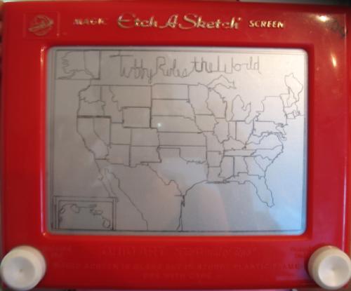
I was looking at something completely unrelated to politics, maps or vintage toys when I came across some wonderful examples of etch a sketch art, including a few maps. Here is the USA, from ivman's blague. This is supposedly from a young child and has a caption of "Tubby_Rules_the_World" - yes all the words have to be connected.


Africa:


Of course, there's an app for this. Here is a world map from the Etch a Sketch Mobile app. Yes the Mercator Projection continues its dominance in the field, pleasing the residents of Greenland.


Romney may want to study this world map after his statement in Monday's debate about Syria being Iran's route to the sea - as if they need one. There's a little problem called Iraq in between. Note all that blue stuff at the bottom of Iran. Picture form the Daily Banter.


Wednesday, October 17, 2012

Fans Boo Radar Map at Comerica Park

After an hour and 10 minute delay tonight's American League Championship Series game in Detroit was postponed - not because of actual weather, but impending weather. Fans booed the radar map when it appeared on the scoreboard - photo courtesy of CBS Sports.


Mapping the Gangs of Chicago-is there any value?

The Chicago Crime Commission creates maps of gang territories for internal use. Elliott Ramos from radio station WBEZ obtained these maps in a freedom of information request and made them available through WBEZ's web page. Here is a sample map.

With 59 or more gangs and 625 different factions you need the kind of crazy patterned symbols seen above to distinguish them all. Here is a sample legend for this particular west side neighborhood.
Ramos took these maps and created an interactive gang map, overlaid onto google maps.


There is an interesting discussion on WBEZ's Afternoon Shift with Ramos, Natalie Moore, author of The Almighty Black P Stone Nation, and CPD's Chief of Organized Crime, Nicholas Roti. Both Moore and Roti are very skeptical of the worth of making these maps available. They stigmatize neighborhoods and gangs themselves, many of which are not associated with any criminal activity. The maps also are out of date and in the case of many gangs oversimplify a more complex geographical structure. Roti also expresses concern that the maps could cause gang rifts by showing the uneven distribution of territory. Finally, there's the inevitable confusion that gang presence on a block means gang dominance or high crime.

So should these maps really be made public? Maybe not. Should I have posted them on this blog? Maybe not but I couldn't resist.

via The Atlantic Cities

Wednesday, October 10, 2012

The Pennsylvania-Maryland War

My mother reads Now I Know by Dan Lewis. She recently sent me his post about Cresap's War, a border dispute between Maryland and Pennsylvania. The map via Wikipedia effectively illustrates the competing claims.


Pennsylvania's charter references the Twelve Mile Circle* around New Castle, Delaware and it's intersection with the 40 degree latitude line as its southern boundary. However, the circle is well south of 40 degrees. Both colonies used this error to try and extend their claims. Maryland claimed up to the 40 degree parallel (the northern red line on the map), thus including Philadelphia, the capital of Pennsylvania at the time. Pennsylvania proposed that the charter's error should be compensated for by moving the border further south. Britain issued a proclamation in 1724 prohibiting the establishment of new settlements until the border issue was resolved.

The resolution of this border did not come easily and hostilities broke out throughout the 1730's after Marylander Thomas Cresap set up settlements and ferry service across the Susquehanna River while collecting taxes for Maryland. His presence was not welcomed by the Pennsylvania settlers. An agreement between the colonies was reached in 1732, and then reneged upon by the governor of Maryland. After much nastiness and many failed attempts to capture him, Cresap was finally arrested by the Lancaster County sheriff. As he was paraded through the streets of Philadelphia with "his spirit unbroken", he announced, "Damn it, this is one of the prettiest towns in Maryland!**"

King George II intervened and in 1738 the parties signed a peace treaty in London. The 1732 agreement was upheld and the border was set at 39 degrees, 43 minutes and various seconds (it is not purely a line of latitude.) Mason and Dixon surveyed the line from 1763-1767 and it went on to greater fame as a political, cultural and metaphorical line.

* The Twelve Mile Circle is also an interesting historical anomaly, with it's own border disputes and may be worthy of a future blog post - stay tuned.

 ** This quote is from John Gibson, ed., History of York County, Pennsylvania via Wikipedia - the link to the original text is broken.

Boring Personal Note:  At the time of Cresup's War, all of Philadelphia lay south of the 40th parallel, now the line is well inside the city. When I lived in Philadelphia, I liked to imagine that when I was traveling up Bustleton Avenue, I'd cross from Kansas (home of my grad school) into Nebraska at Grant Ave - same latitude in other words. However due to an error, either on the map I was using, or my interpretation of it, I was pretty far off. The line is well to the south, approximately at Tioga Station on the elevated Market-Frankford subway line, or if you prefer, the corner of Broad and Clearfield. It also runs through the area depicted on this blog's header image.

Wednesday, October 3, 2012

"Dangerous" Mapmakers

The October 2012 issue of the Atlantic has an article by Robert Draper about redistricting called The League of Dangerous Mapmakers.The article profiles experts at drawing maps to the advantage of their political party. It also discusses how GIS software has enabled amateurs to get in on the action, often with messy or even counterproductive results. An example being the messy situation in Texas that cost that state an early primary, highlighted here in January. The illustrator (uncredited, possibly the author) had some fun with the districts.