Have a great New Year, stay warm and dry!


 The locations are color coded and you can click them for more information. Unfortunately no pictures come up but some of them have web links such as Nick's Lights. Thank you Nick Diaz. Happy holidays!

 The map allows you to switch between the plans for the university and an aerial view (left) and is "the only physical link to an entire institution which does not yet exist."
 The 8 mile route takes me 25 minutes with no traffic, 35-40 minutes typically and can be up to an hour in bad traffic situations. I can ride my bicycle there in 40-45 minutes when I don't get whacked. Public transit is a 3 bus system and takes an hour and 20 minutes. Walking? I haven't tried that one yet.
 a higher concentration of African Americans. However, the Vigorous North blog takes this even another step beyond to show how the shallow ocean waters of the Cretaceous Period influenced the soil types and thus the suitability for cotton and thus the racial settlement patterns and thus the election results in the cotton belt counties.


 Robert Nakata has some of the most "artistic". Here are his renderings of Toronto and Brighton (England)


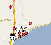 Need a hotel? Here's a map of available hotel rooms in San Jose del Cabo, Mexico. Click a dot and make the reservation!


 This map in today's Boston Globe reminded me of Middle East expert John McCain's various gaffes (Iran, Iraq, Sunni, Shiite, who can tell the difference?) Here's a map of his "Iraq-Pakistan Border" courtesy of Matthew Yglesias and the Atlantic Monthly.

 This entry is entitled "The world is colorful and beauty" and was done by Ferina Tjahyana from the Pelita Harapan Junior High School in Tangerang, Indonesia. She was 13 at the time this map was done (2003).

 For a nice, detailed general reference map of the region click here.
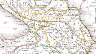 This is an interesting historical map of the region produced by American cartographer Thomas Bradford in 1835. Clicking the image will bring up a window so you can zoom and pan to get more detail.
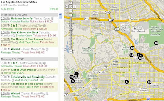
 You can mouse over the dots to get basic information and a click on them will get pictures, diagrams, architectural drawings, links to schedules, game rules and much more. What's lacking is a mileage scale so it's not clear how close these places are to each other. Also some transit and/or parking/driving tips would be helpful. You can find that information in the "Spectator Guide"s but they could have put it in a more obvious place.
 Webexhibits has this page where you can analyze the evidence and make your own decision about the authenticity of the map. If you want pages of detailed info. click the map above and you'll get it!
 Take away the traffic lights, train tracks and the fact that drivers in other places actually use turn signals and you get the picture. Technically I hit the car but I couldn't stop that quickly - she could and didn't. Anyway I'm still alive and well - just a bit beat up. I thought I'd look for some good bicycle accident maps but there's not much out there. Ghostcycle did a cool thing placing "ghostcycles" at accident sites in Seattle to raise awareness. Unfortunately their google mashup doesn't work (don't try the map-your computer will be sorry).
 A couple of disclaimers about this map from their site:


