

18 years ago


 I've spent a fair amount of time looking over this subway map of Tokyo for the similarities and they're not obvious. However, there is a detailed description of the various lines and the how changes in web traffic affect the placement of sites.
 Further information on this project and more maps can be found here.
 I was really looking forward to the Maps on Purpose exhibition because I am a big fan of these type of community mapping projects. After all who can resist this map of the Oakenshawe neighborhood? Every few weeks they change the focus to a few selected Baltimore neighborhoods. My week the theme was "Neighbors". There were a number of displays about personal
  connections within neighborhoods, some of it based on the Arpanet map from the Maps exhibit. Interesting, but not very mappy. There was one cool map of the Hamilton Hills/Lauraville neighborhood.
  The map shows income and other variables by block and is surrounded by pictures, stories and commentary by area residents. This was easily the highlight if this exhibition for me.

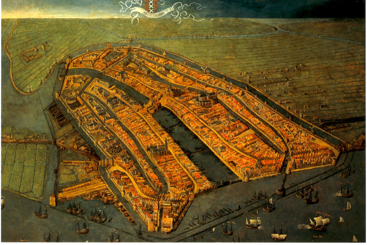 This oblique painting of Amsterdam was very large, striking and beautiful. This image is nice but can not convey the feeling you get when you're staring up at it on the wall. Go see for yourself!
 This Buddhist world map (centered around mythological Mount Meru) offers a nice alternative perspective as did many of the other non Western maps. I also really liked a map that I believe I remember as having been drawn by the King of Cameroon though I can't seem to find any information on it from the web. They also had a stick chart from the Marshall Islands but I've already done that.
 Finally: The London Glove Map that was used in the promotional materials is really quite small. In fact it's the size of a glove. They tried to compensate by putting it in a large display case but that made it so you can't get close enough to it to read the details. Better to look at the pictures online if you want a good look at it.
