

I spent lots of time staring at this Mercator map wondering how he got so much detail in Siberia - or did he just make it up? Then I finally looked at my own continent and saw how the St Lawrence River dips down into Texas and realized that of course he made it up. Gorgeous map anyway. That Antarctica sure is huge!
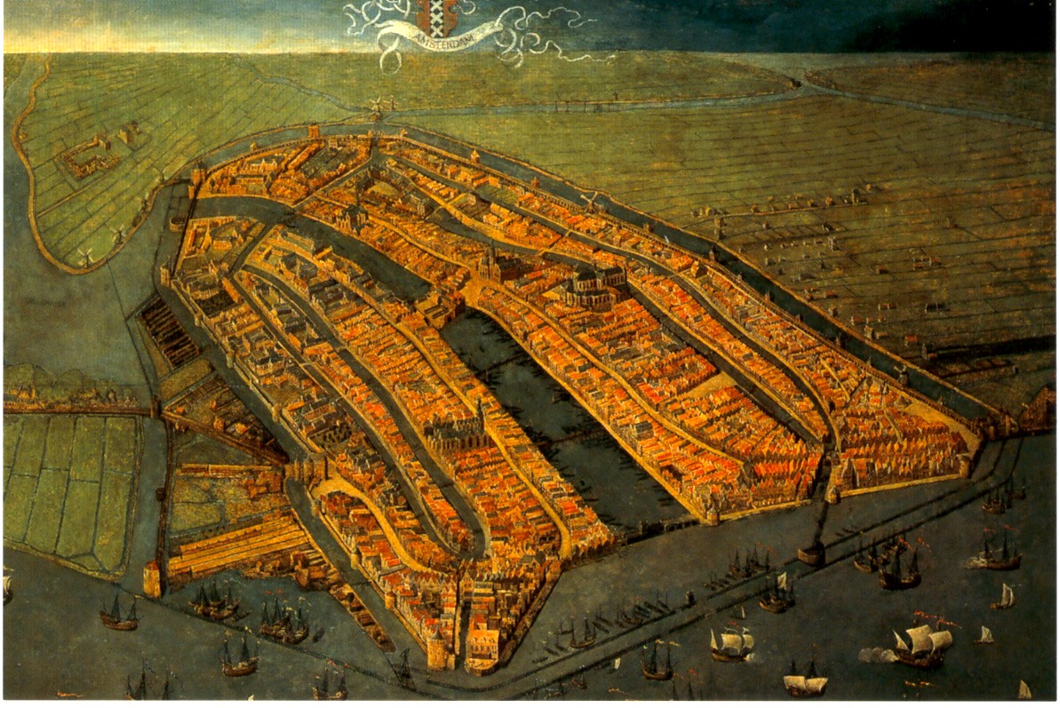 This oblique painting of Amsterdam was very large, striking and beautiful. This image is nice but can not convey the feeling you get when you're staring up at it on the wall. Go see for yourself!
 This Buddhist world map (centered around mythological Mount Meru) offers a nice alternative perspective as did many of the other non Western maps. I also really liked a map that I believe I remember as having been drawn by the King of Cameroon though I can't seem to find any information on it from the web. They also had a stick chart from the Marshall Islands but I've already done that.
The lighting at the exhibits was poor in order to protect the maps but it made reading the details difficult. Maybe not a big problem for most people but I got a bit frustrated trying to see things.
 Finally: The London Glove Map that was used in the promotional materials is really quite small. In fact it's the size of a glove. They tried to compensate by putting it in a large display case but that made it so you can't get close enough to it to read the details. Better to look at the pictures online if you want a good look at it.


No comments:
Post a Comment