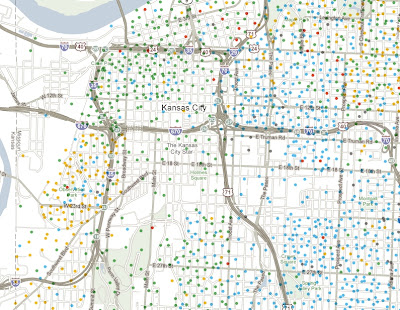
and income:
The entire country is covered so you can zoom, pan or choose a location. If you zoom too far in you lose the patterns a bit and also get some misleading information because each dot represents multiple people, not individual households.
To really see the patterns of segregation, zoom out.
Here's a larger city with a more diverse breakdown.
The income map reveals the inner city income holes that are prevalent in older cities like Baltimore, but less so in Washington D.C. where there is much more inner city wealth.
If you zoom out a ways the dots seem to follow county boundaries. Zooming in arranges them in a more realistic pattern. I'm not sure what algorithm produces that result.


Happy Holidays and may your next year be filled with new census maps!


1 comment:
Sweet sample maps. Killer ap.
Post a Comment