Wednesday, October 30, 2013

What's Your State?

A recent study of America's mood by state, published in the Journal of Personality and Social Psychology, is featured in Time Magazine. There is a test you can take to see what state matches your personality. With all the discussion about introverted, neurotic people from the northeast, I figured I fit in perfectly but much to my surprise that wasn't the case.

Oregon????? I must have answered some of the questions more wishfully than truthfully. The regional patterns here are pretty clear and the article has interesting explanations for some of them. The west coast is clearly a separate region but I don't usually think of Arizona or New Mexico as part of that region and certainly not North Carolina. Texas is another odd one but they've seen lots of in-migration and immigration so maybe that state is more complex than the cliches suggest. Plus, according to another Time article and magazine cover, they are our future. Nice cover art!

http://content.time.com/time/magazine/article/0,9171,2154995,00.html?pcd=pw-magic

By the way, if you take the test and enter the default value (neither agree nor disagree) for each question, you end up with Texas. Have fun taking the test. You too may end up in an unlikely place.


Friday, October 25, 2013

Literary St. Louis, The Arch Enemy

The World Series heads to Saint Louis this weekend. Not only do they have baseball and toasted ravioli but according to artist Dan Zettwoch they also have "book 'n writers 'n stuff."

His blog post details the evolution of this drawing, done for an article in the Riverfront Times. The original idea was for a pop up book.
This proved to be too difficult so he went back to 2D space and used some "vectors" (GIS data?),
added some figure drawings...
.. and finally some color to get the finished product. Click the first picture or the detail below for a larger image and explanation of the numbers.


Wednesday, October 23, 2013

What Each Country Leads the World In

The web comic Dog House Diaries recently posted this map - click for the large version.
Though the map looks goofy, it is based on mostly credible sources which are listed here.

Some of the most interesting stats involve small countries so you really need to do some zooming and panning to see these. Here are some examples.

Most bad driving - this is judged by road deaths per 100,000 cars and the award goes to Togo - incorrectly placed in Benin. Yes I had to check that too to be sure they got it wrong.

Happiness - Costa Rica

Brazil Nuts - Bolivia, not that other place

Highest High School graduation rates - Portugal

Home ownership - Bulgaria

Highest valued currency - Kuwait

Use of social media - Philippines

Highest quality of life - Ireland

And finally the award for longest alphabet goes to Cambodia

You might want to get a hot drink and a Mohnflesserl and do some exploring.

Saturday, October 19, 2013

Great American Menu?

This map, posted on Deadspin is getting lots of attention. It is accompanied by an article that is snarky, nasty, ignorant and pretty damn amusing. Many humor-challenged* people are commenting with the inevitable regional fights over who has better pizza and whether anyone outside of the Philadelphia area is qualified to rate cheesesteaks (they're not.)


The crappy color scheme represents the ranking categories. Blue is great, yellow good, red is "better than a finger in the eye" and black is "being hit by a car," a distinction reserved for Ohio. Nevada also gets a unique color for having nothing distinctively authentic. Whether it is fair to judge a whole state by one bad Cincinnati chili experience or not is open to (lots of) discussion as is everything else on this map. Enjoy the map and article and be sure to leave your angry comments like everyone else has.

*Many of the comments are actually pretty funny - some even intentionally so.

Wednesday, October 16, 2013

Maps Recycled Into Art

Artist Matthew Cusick creates art from pieces of maps for a series called Map Works. There is much goodness to see online including waves,
 highways,

 blue horses,
landscapes,
and people, many in various states of undress.
Thanks to friend of the blog Rafael who sent me a link to this artist over a year ago. Sometimes it takes that long for me to find the right time to post something.

Wednesday, October 9, 2013

Musician Inspired by Population Map

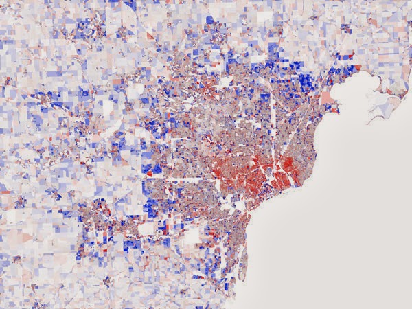
Vienna Teng's new album Aims features this map on the cover. It shows population migration within the Detroit metropolitan area.

The map is from Stephen Von Worley's Data Pointed blog. I'm not sure why the colors look so washed out in Teng's cover. The original is much more "pretty"
The inspiration comes from digging beyond the typical narrative of population flight from the inner cities (red is population loss) to see that there hope in the small patch of blue located near downtown. This is not really a new story, people have been moving into downtown areas for several decades now. Still, it's a good reminder that our cities still have much to offer as places to live. There are lots of other striking images of various US metropolitan areas to see on Von Worley's blog post, most of them showing a similar pattern.

Thursday, October 3, 2013

Unrelated to anything

Someone pointed me to some great map links on the Census Bureau's website but since that part of the government doesn't exist right now you can't see them. Instead I'll bring you the latest Onion Sports Network poll map. The geographic distribution is as meaningless as some of the categories.


If you like this map there's plenty more here.