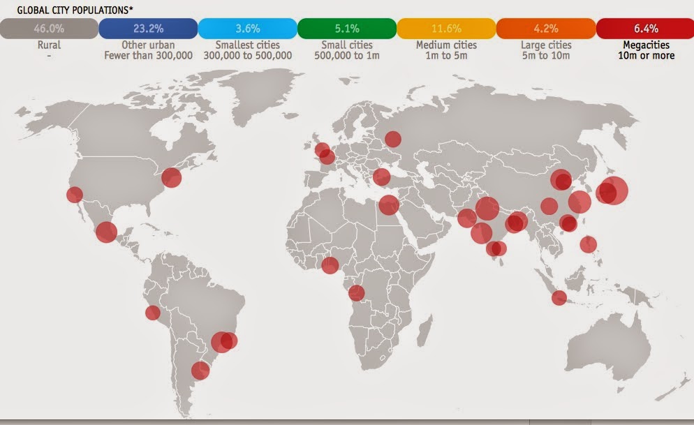
The Economist has a bubbly interactive map/video of the world's megacities (those with a population of 10 million or more) from 1950 to 2030. According to these population figures, from the United Nations,
nearly 9% of the world's population will be living in 41 megacities by 2030. The video is a bit slow because it cycles through every year for the 80 year time period. Here are some stills from now, then and the future.
Megacities are shown as red proportional circles. In 1950 (above) there were only two megacities, New York and Tokyo. Today (2015) there are numerous megacities, mostly in Asia.
By 2030 the most noticeable growth of cities will be in Africa.
The UN data are usually for metropolitan areas, including suburbs, but some of the populations are listed for the "city proper." These inconsistent figures provide good ammunition for the complain-y comments at the bottom of the page.
You can search a city or click on one for a graph showing that city's population curve.The vertical line indicates the chosen year, in this case 2014.
Beware of the constantly changing y-axis when comparing cities.
You can also click the legend at the top to turn on or off size categories of cities. So if you want to only see the megacities of 2015, you get this.
The UN has its own version of these maps. They're not as flashy but they shade the countries by percentage of urban population which is a nice touch.
The smaller circle sizes create less drama but the map still effectively tells the same story.
Megacities are shown as red proportional circles. In 1950 (above) there were only two megacities, New York and Tokyo. Today (2015) there are numerous megacities, mostly in Asia.
By 2030 the most noticeable growth of cities will be in Africa.
The UN data are usually for metropolitan areas, including suburbs, but some of the populations are listed for the "city proper." These inconsistent figures provide good ammunition for the complain-y comments at the bottom of the page.
You can search a city or click on one for a graph showing that city's population curve.The vertical line indicates the chosen year, in this case 2014.
Beware of the constantly changing y-axis when comparing cities.
You can also click the legend at the top to turn on or off size categories of cities. So if you want to only see the megacities of 2015, you get this.
The UN has its own version of these maps. They're not as flashy but they shade the countries by percentage of urban population which is a nice touch.


No comments:
Post a Comment