Wednesday, December 27, 2017

ThingsMaps

Some people see geography everywhere. I once mapped a New Jersey-shaped sidewalk crack. French Cartographer Jules Grandin has a collection called #Thingsmaps that labels cartographic features seen in clouds,
doors,
coffee,
crosswalks,
 and salad greens - this one looks pre-arranged.
Even fantasy worlds-here's Westeros, from a gap in the trees.
Scroll thru the collection here

Wednesday, December 20, 2017

Bubble Wrap Map

I love the satisfying sensation of popping bubble wrap. Now you can pop with purpose - to show your travels through the world, or at least through Budapest.
Sator Space, designer of the previously featured Egg Map, is back with Pop Map.
From their press release:
PopMap is not only an unconventional, playful tourist guide, it also serves as a great tool to release nervous energy while exploring the world. Several studies have shown the stress-relieving effect of popping bubble wraps and the way it relaxes people. Plus Bubble Wrap Appreciation Day is a REAL thing, celebrated around the world on the last Monday of January. So pop through the sights with your therapeutic map and leave not a bubble behind.
The map is nice and colorful. Here's a close up view.
and a view from underneath.
Here's a view showing part of the legend.
For now, they only have Budapest in stock but there other cities that will be pop-able soon.
For more info see their product page, to puchase see their web shop. The shop also features other cool products like the Metroshka, based on the Russian matryoshka (nesting dolls) -  nesting transit.
If you're Hungarian and want to read it in your native language go here.

Vidd magadal az utazásaidon és ne hagyj egy buborékot se érintetlenül ezen a terápiás térképen!

Thursday, December 14, 2017

People Mapping With Street View

In a recent article in Places Journal, geographer Richard Campanella used Google's Street View images to document the rebounding population of New Orleans after Hurricane Katrina devastated the city. He created a grid throughout the city and counted the number of people visible on Google's images in 2007 and 2016.
The legends on these maps are hard to read at this size but darker colors means more - in this case people. Here are bicycles.
What these maps show is not so much population as "public space occupancy"-people are walking down the street, sitting on their front steps, sitting at outdoor parks and cafes, and riding bikes. The percentage increases here are quite a bit higher than the population and tourist increases in the city. This suggests a more vibrant city where improvements to infrastructure have encouraged more people to occupy the public space. Campanella takes care to point out that not all of this occupation of public space is from happy gentrifiers. There is a cost in the displacement of:
"lower-income residents-who, we should remember, occupied streetscapes in their own way, with elders on stoops and children playing in the streets. (Rare is the sight of either in the French Quarter today.) It’s also important to note that some of the patterns in these maps do not represent people contentedly occupying the public space, but rather relegated there."
A by product of gentrification is an increase in graffiti, as seen proliferating in the same neighborhoods.

The article suggests that public space occupancy is an important and overlooked consideration in urban planning. It also shows that Street View data, while very imperfect can and should be used, possibly with automated processes to enumerate these phenomena.

Friday, December 8, 2017

Halifax Explosion

100 years ago Halifax, Nova Scotia suffered a horrific explosion that killed about 2,000 people, injured many more and destroyed much of the city. Windows 50 miles away were shattered.
http://payload393.cargocollective.com/1/4/146378/10173407/TheHalifaxExplosionNEWSPAPER3-01_3683.jpg
Two ships collided, one carrying explosives that were meant to go to France during World War I. The ship with the explosives caught fire and drifted towards the city. As people watched the burning ship it exploded, instantly killing almost 2,000 people. The explosion resulted in a Tsumani that killed even more people and wiped out a Mi'qmak First Nation community in Dartmouth.

The Halifax Herald put together this remarkable graphic showing the destroyed buildings in great detail, UPDATE: No it didn't - see below
as well as a timeline of events.
Pretty amazing to have produced this map on such notice and under such trying conditions - that was my original text. It turns out this was a recreation by Snodgrass Design. Fooled again!

More on the explosion can be found on Wikipedia.

Wednesday, December 6, 2017

Paris Election Map, 1869

Cartographers have been trying to figure out how to best show election maps for a long time. Here in the United States, the typical county map can badly represent vote totals when large counties with tiny populations dominate the map. In 1860's Paris, a cartographer named Louis Montigny used this interesting approach to map the city's neighborhoods.
https://cartographia.files.wordpress.com/2008/05/montigny-combined.jpg
A square centimeter represents 1000 votes, with the political parties color coded. This clearly shows who won each neighborhood but also gives a great picture of how well each party performed. Yellow represents the governing party of Napoleon III, while opposition parties are colored blue, pink and red. Socialists are orange. Viewing the entire city, there are some pretty clear patterns of strength and weaknesses of the different parties.
https://cartographia.files.wordpress.com/2008/05/montigny-combined.jpg
As you approach the city's edge, the larger, less populated neighborhoods get the appropriate level of visual prominence.
https://cartographia.files.wordpress.com/2008/05/montigny-combined.jpg
I discovered this map on Cartographia, a blog has been inactive for many years. The blog post illustrates the historical importance of this map as it shows the beginning of the decline of Napoleon III's empire. His party was clearly losing popular support as shown by the absence of yellow on much of this map. Shortly after this election he began a war with Prussia in order to boost his legitimacy. The Franco-Prussian War was a disaster for France and spelled the end of the Second Empire. A detailed history can be found on the blog post.


See a large, high resolution version of the map here.

Thursday, November 30, 2017

Vancouver Neighborhoods as Simpsons Characters

The following tweet from a Vancouver radio station woud benefit from a map so I made one.

I don't know many of these neighborhoods and this may not be an original idea but I like it. I made the assumption that "West Van" is the municipality of West Vancouver, not the west side of the city. Upon further research it looks like the west side is called "Vancouver West" so I guess it's OK.

Interesting that no actual Simpsons show up in this tweet-that's some deep character mining!

The base map is from OpenStreetMap - I "artified" it a bit and lightened up the colors so the characters show up better. Unfortunately some of them came out pretty light. With more time I could make them pop a little more but I'm having a busy week. Another problem is the need to zoom way out to accommodate the eastern suburbs. Here is another version focused on the main parts of the city-because I want to see for myself what it looks like.
Agree?

Wednesday, November 29, 2017

The Number 2 Cartography Blog

Last week I got an email from the founder of Feedspot saying that "Map of the Week" has been selected as one of the Top 40 Cartography Blogs on the web.
https://blog.feedspot.com/cartography_blogs/
My first thought was to wonder if there are there even 40 cartography blogs to choose from - and it turns out they only list 33. The next question is did they rank them? Yes they do and this blog you are reading is number 2! Exciting! Also a little strange. Here is their ranking system.
These blogs are ranked based on following criteria
  • Google reputation and Google search ranking
  • Influence and popularity on Facebook, twitter and other social media sites
  • Quality and consistency of posts.
  • Feedspot’s editorial team and expert review
Many of the blogs ranked lower have significantly more readers, followers and Google search rankings. Therefore much of this must be based on the non-numeric items (editorial team, quality and consistency) in which case I fell quite honored!

Number one on the list is the Cartographers Guild.  Congrats to them and well deserved too. Their specialty is maps of fictional places (Westeros, Middle Earth, etc) but all other types of maps appear. As a forum for mapmakers there are valuable insights on how the maps were created.

I'm not going to review the whole list but there are some notable omissions such as Strange Maps, Maps Mania, and National Geographic's All Over the Map - all of which are more widely read and probably better researched than this blog! Anyway here is my badge. I'd wear it but it's only a jpeg.

For the complete list click here

Tuesday, November 21, 2017

New Hobby

Anyone who reads this on a regular basis can probably tell that I have a fondness for hand drawn maps. However, I haven't made any myself since I was a child making up imaginary places. Even in my pre-computer carreer, we used special drafting equipment (a subject for another time) to make maps. I recently began trying my hand at making maps with colored pencils. Back in the old days we would trace over US Geological Survey maps on a light table. These maps are not traced but drawn freehand after carefully looking at some DeLorme atlases.
Burlington, Vermont-Doug Greenfield, 2017
Above is a map of Burlington, Vermont, a city I have spent a fair amount of time in and know the landscape of well. I used a similar color scheme to the DeLorme atlas and was pleased with the level of accuracy. Not every street is shown, just enough to give an idea of the street pattern.

Next, I tried Williamsport, Pennsylvania, a city that I've only driven through the edges of but one with an interesting settlement pattern.
Williamsport, Pennsylvania-Doug Greenfield, 2017
This was more of a challenge as I am much less familiar with the area. The map got gradually less accurate and more impressionistic the further I dug into it. It was liberating when I gave up on the idea of trying to be too accurate.

I don't have a new project yet but I hope to continue in a more impressionistic direction and to find a different map source to add some variety of looks and scales.

Monday, November 20, 2017

Baltic Sea Traffic

This is gorgeous and mesmerizing. That is all. Have a good day.

Wednesday, November 15, 2017

Water: An Atlas

Guerilla Cartography is an organization that uses creative and artistic mapmaking to foster collaborative knowledge and promote cooperative ideas towards today's major problems. They created an excellent food atlas. Their second one, Water: An Atlas is being printed and should be ready to ship by the end of November. You can pre-order a copy here. They were nice enough to send me some sample pages. Here are a few details from some of the maps.
The map above is from a page titled "Water Availability for Food Security in African Cities" It looks at the challenges of a rapidly growing and urbanizing continent. City dots are sized by population and major cities have an outer circle divided into three colored sections indicating whether water and wastewater are separated and whether the city has a master plan for managing each.

There is also a diagram of the water cycle and a graph running diagonally down the page showing the availability of improved water (dark blue) wastewater treated (gray) and water consumption (the bars underneath) in daily liters per person.
Here is a small version of the page to show how these graphics fit together.

Another map was a commission from the Scotland Environmental Arts Festival by Andrew McAvoy showing the area with a focus on the water courses.
The hand drawn map is presented at three different scales. Above is the larger Southern Uplands region, while below is a detail around Morton Castle, the festival site with suggested exploring routes.
More maps and photos from the festival can be seen here.

Finally, "Pink Salt Lakes" maps out water bodies that are colored pink due to two types of reddish algae.
The map has a kind of checkerboard pattern with pictures of some of the lakes interspersed. Below is a picture from California's South Bay Salt Ponds-I once flew over these and wondered why they looked so weird.
Australia has many pink lakes including one named Pink Lake.

Thursday, November 9, 2017

More Mario Zucca Illustrations

Self-made thousandaire (his own words) Mario Zucca, creator of the National Parks map also has a series of great city maps, including Kansas City,
http://mariozucca.com/projects/kansas-city-map/
Buffalo,

http://mariozucca.com/buffalo-news-features-buffalo-map/
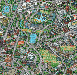
and Cleveland (University Circle Area).
http://mariozucca.com/projects/university-circle-map/
There are also maps of Phoenix, Pittsburgh, Portland, Atlantic City, Minneapolis and a map of Denver's bicycle loop - see the portfolio on his web page for these.

The Philly Island Map shows the"Strait of Disinterest" that exists between the city and the rest of Pennsylvania-a popular sentiment among Philly folks.
http://mariozucca.com/projects/philly-island-map/

Wednesday, November 8, 2017

Our National Parks

Illustrator Mario Zucca has created this gorgeous hand drawn map of America's National Parks.
https://mariozuccamaps.com/national-parks
Some detailed images below.
There's also a cute animation panning through the map. Here's a sample.
You can show your passion for our parks by purchasing a copy here.

Wednesday, November 1, 2017

Ancient Maps on Globes

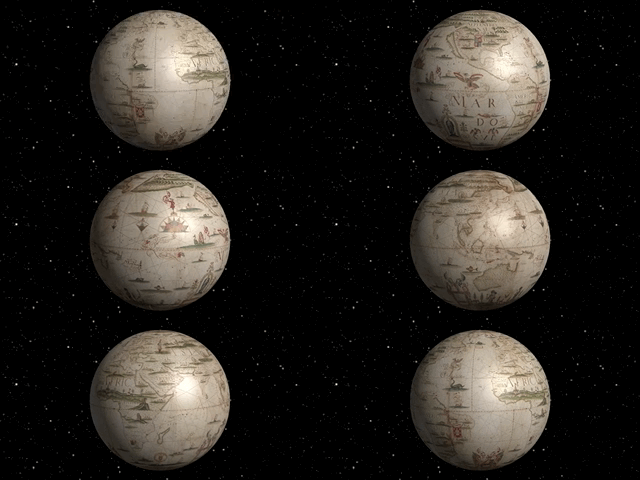
The DX Lab out of the  State Library of New South Wales in Australia is experimenting with placing 17th and 18th Century maps from their collection onto globes.
http://digital.sl.nsw.gov.au/delivery/DeliveryManagerServlet?dps_pid=IE3538803
The map above is a 1706 world map by Portuguese cartographer Joseph Da Costa e Miranda. Below the map is "unprojected" onto a globe that you can watch in motion here - it may not work on all web browsers.
http://dxlab.sl.nsw.gov.au/meridian
The experiment, called Meridian, reverses the typical paper map process. Instead of projecting the globe onto a flat surface, these maps are "unprojected" from paper, back onto the globe. Here it is in motion:
http://dxlab.sl.nsw.gov.au/meridian/?globe=miranda
This was done manually which sounds painful. Here's a description from the making page.
We didn’t have access to map projection software, so I manually distorted the image by eye, gradually vertically squashing the image more and more as it got closer to the top and bottom.
They have also worked on a globe by Vincenzo Maria Coronelli, who created a series of copper engravings of globe gores as seen below.
 With this result. Click to see in detail.
http://dxlab.sl.nsw.gov.au/meridian/?globe=coronelli1
The lab is expecting to add more globes shortly. You can read about the process here.