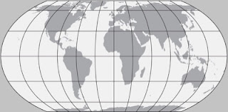
Equal Earth is a new map projection introduced this past fall. It aims to solve the problem of showing countries at their true sizes projected from a spheroid to a flat piece of paper. The most commonly used world projection is the Mercator, great for navigating but terrible for distorting relative landmass sizes - here's an example.
By contrast here is the Equal Earth Projection.
In addition to the comically monstrous Antarctica, the commonly cited comparison is Greenland vs. South America. Of course many of us in the upper latitudes like the Mercator because it makes our countries look larger and therefore more important. It also makes Russia look scary.
The problem is that people's perceptions of country and continent sizes once formed are hard to shake. This problem has been amplified by Google's use of Mercator in their maps. Google Maps is so popular that they have created a de-facto standard that most other digital world maps have followed.
One remedy to showing such unequal areas has been to promote the Gall-Peters projection, a rather ugly (my opinion) projection that cartographer Arthur Robinson described as continents that look like wet laundry hung out to dry.
The Boston Public Schools recently began using these maps in their classrooms. As a response Bojan Šavrič (Esri), Tom Patterson (US National Park Service), and Bernhard Jenny (Monash University) developed this new projection. It is based on Arthur Robinson's projection. Here are comparisons of the Equal Area Projection with Gall-Peters,
and with the Robinson Projection.
The projection has been very well received and is already being used by organizations such as NASA. and major GIS software companies.
In addition to the projection, they also created some very attractive, downloadable world maps designed for classroom use. These maps have three versions, one centered on 0 degrees longitude for best viewing Europe and Africa, one at 90 degrees west for the Americas and one at 150 east for East Asia, Australia and the Pacific.
There are two versions, a Political map,
and a Physical Map
For the maps and more info visit their home page.
By contrast here is the Equal Earth Projection.
In addition to the comically monstrous Antarctica, the commonly cited comparison is Greenland vs. South America. Of course many of us in the upper latitudes like the Mercator because it makes our countries look larger and therefore more important. It also makes Russia look scary.
 |
| from The Growth of Russian Imperialism - Cornell digital library. |
One remedy to showing such unequal areas has been to promote the Gall-Peters projection, a rather ugly (my opinion) projection that cartographer Arthur Robinson described as continents that look like wet laundry hung out to dry.
The Boston Public Schools recently began using these maps in their classrooms. As a response Bojan Šavrič (Esri), Tom Patterson (US National Park Service), and Bernhard Jenny (Monash University) developed this new projection. It is based on Arthur Robinson's projection. Here are comparisons of the Equal Area Projection with Gall-Peters,
and with the Robinson Projection.
The projection has been very well received and is already being used by organizations such as NASA. and major GIS software companies.
In addition to the projection, they also created some very attractive, downloadable world maps designed for classroom use. These maps have three versions, one centered on 0 degrees longitude for best viewing Europe and Africa, one at 90 degrees west for the Americas and one at 150 east for East Asia, Australia and the Pacific.
There are two versions, a Political map,
and a Physical Map
For the maps and more info visit their home page.


No comments:
Post a Comment