Wednesday, April 29, 2020

Mapping Your Neighborhood Under Lockdown

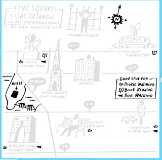
Bloomberg Company's CityLab and the New York Times have both asked readers to submit maps of their neighborhoods under lockdown. The Times one, via Instagram includes this map from Nate Padavick,
https://www.instagram.com/p/B_clPHJA__o/
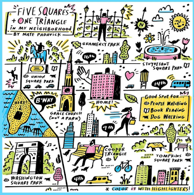
and some directions on how to make it.

Here are some reader submissions that I like.

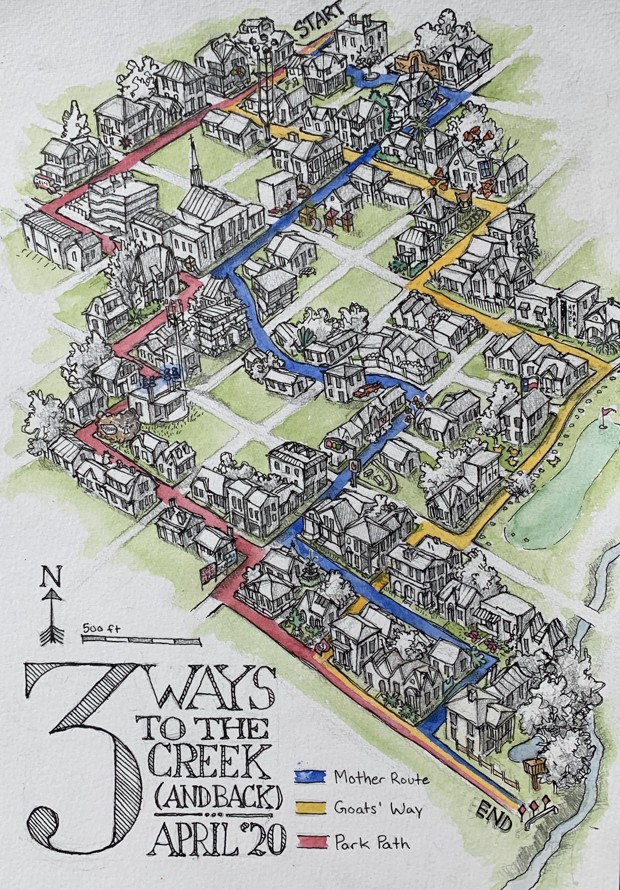
Three ways to the creek in Austin, Texas by Champ Turner
https://cdn.theatlantic.com/assets/media/img/posts/2020/04/Champ_Turner_Row_174/98f2ea959.jpg
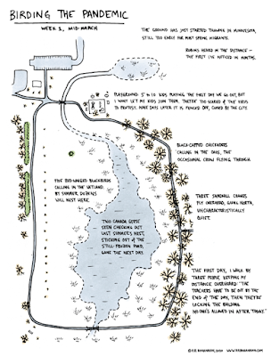
Birding the Pandemic by Rick Bohannon of Minnesota.
https://cdn.theatlantic.com/assets/media/img/posts/2020/04/Screen_Shot_2020_04_17_at_4.23.58_PM/90b0eeffa.png
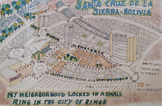
Santa Cruz de la Sierra, Bolivia is known as the City of rings for its network of Ring Roads. Augusto Javier León Peralta's shows his neighborhood "ring" incuding the route from home to the market and back. "We can even see some animals in the city that were not seen before"
https://cdn.theatlantic.com/assets/media/img/posts/2020/04/Screen_Shot_2020_04_24_at_10.52.06_AM/f0a6b3aff.png
Here is one from Calais via Twitter
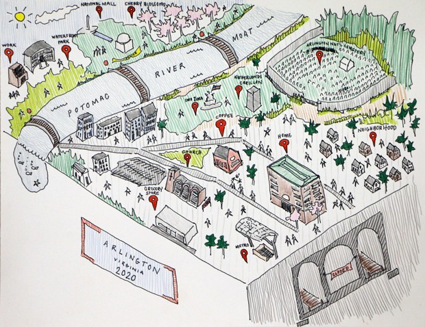
A map from Lauren Nelson of Arlington, Virginia showing the "moat" that the Potomac River has become.
https://cdn.theatlantic.com/assets/media/img/posts/2020/04/Lauren_Nelson_Row_81/4f5455341.jpg

Finally, one from the NY Times Travel Instagram- a nice, simple pen & ink from Emily Bouchard in Chicago.
https://www.instagram.com/p/B_iDBDOliuj/
For more from instagram click here, but you need to wade through a bunch of stupid, gorgeous photos to find the maps. For the more maps go to CityLab

Wednesday, April 22, 2020

Maps of Televsion Places - Part 1 of ?

With much of the World's population under some sort of lockdown a lot of TV is being consumed. I was watching an old (they're all old) rerun (they're all reruns) of The Office the other night when I noticed this map on the wall.
https://auction.screenbid.com/view-auctions/catalog/id/105/lot/64031/
I had wondered about the frequent mention of these places - wait a minute, where's Stamford? Much more obvious is the giant Pennsylvania map in Michael's office. Both of these maps can be bought on Screenbid.
https://auction.screenbid.com/view-auctions/catalog/id/105/lot/64037/

https://auction.screenbid.com/view-auctions/catalog/id/105/lot/64037/
In past blog posts I have covered shows such as The Simpsons,
Bonanza,
and Batman.
These are just the ones I remember off the top of my head. There are probably more that I've covered over years of blogging. The world of television is full of maps of places both real and imaginary. One map the caught my attention a few years back but I never got around to featuring it. Here is Pawnee, Indiana from Parks & Recreation.
https://www.zmonline.com/media/16765487/ibn1uoxkhyorft0bng1_6ohucpxyhbx2dttvrzjdqkm.png
An article from New Zealand's zm shows how this map was taken from Christchurch.
https://www.zmonline.com/media/16765487/ibn1uoxkhyorft0bng1_6ohucpxyhbx2dttvrzjdqkm.png
 Here is the Land Use and Important Facilities Map of Pawnee.
https://i.pinimg.com/originals/16/85/a3/1685a34c43593e441aff2015765b4c36.jpg
Image stolen from Pinterest who stole it from Buzzfeed?
There are plenty more of these places to map (I could probably do an entire post on Westeros) and there will probably be future posts. Especially if we're all stuck inside for a couple more months.


Friday, April 17, 2020

The San Francisco Model

The San Francisco Model has been digitally assembled by the David Rumsey Map Collection
The Map Collection page describes it as 

"a 42 by 38 foot wooden replica of the city of San Francisco as it was in 1940 in 158 pieces at a scale of 1 inch to 100 feet. The pieces contain about 6,000 removable city blocks. The model was built by The Works Progress Administration in the late 1930's, under the New Deal. It was first displayed in sections in the Golden Gate International Exposition on Treasure Island in San Francisco Bay in 1939. In 1940-1942 it was displayed in San Francisco City Hall. The model was used as an urban planning tool by San Francisco city agencies and departments through the 1960's. In 1968, the downtown portion of the model became a research and planning tool in the Environmental Simulation Laboratory in the College of Environmental Design at UC Berkeley. The model has not been on public view, in its entirety, since 1942. UC Berkeley is the current owner of the model. The intent of the makers of the model was to have it updated as the city changed over time and they conceived of it as a tool to help understand and plan for changes in the city's built environment."

The entire model can be browsed here. Here are some samples:

Alamo Square Park. To the right is Steiner Street where everybody in San Francisco lives according to Hollywood. I don't know if the painted Victorian houses were painted back in 1940 and the street looks notably less fashionable from this view.
The entrance to the Golden Gate Bridge, though the bridge is not shown.
 A residential area in the south part of the city.
To see more go to their viewer page.

California Stories on the Map

The Oakland Museum of California has an interesting looking exhibit, You Are Here: California Stories on the Map. While closed at the moment due to COVID-19, this exhibit runs through 2022 so there is plenty of time to see it.
https://museumca.org/sites/default/files/styles/exhibits-640x425/public/field/gallery/1.4.2_Holt.jpg?itok=zEmKYzrm
There are some nice maps on their web page but unfortunately without credits or details.
https://museumca.org/sites/default/files/styles/exhibits-640x425/public/field/gallery/maps-69.jpg?itok=pSjTF--i
Here is the description from the Museum:
"We all use maps in our everyday lives—to navigate public transportation, find places to eat, and visualize big data like weather patterns or political opinions. But have you ever considered the deeper stories maps tell us? In You Are Here: California Stories on the Map, you’ll discover there’s more to maps than meets the eye. Showcasing a diverse range of maps from Oakland, the Bay Area, and California—from environmental surroundings and health conditions to community perspectives and creative artworks—experience how maps can be a powerful tool to share unique points of view and imagine a better future. Explore new perspectives of familiar places through maps made by the community, and mark your own stories on the community map inside the exhibition."
https://museumca.org/sites/default/files/styles/exhibits-640x425/public/field/gallery/maps-55.jpg?itok=nCJgOAS6
Here is a group of possible BART maps,
https://museumca.org/sites/default/files/styles/exhibits-640x425/public/field/gallery/maps-52.jpg?itok=WYJfqXeU
including poet Kenji Liu's "Decolonized Area Rapid Transit" map.
https://museumca.org/sites/default/files/styles/exhibits-640x425/public/field/gallery/decolonized%20bart%20map.jpg?itok=xQKOx6ZE
This map alters the concept of "ownership" of places. You can read more about the creation of this map and even buy a T-shirt on Indiegogo.


Wednesday, April 15, 2020

Joe Talbot's Frisconian Field Guide to San Francisco

Joe Talbot, director of the Last Black Man in San Francisco, created this charming map - via SFGATE
https://s.hdnux.com/photos/01/10/26/04/18964755/3/1024x1024.jpg
The idea was to capture what places have been priced out and what still exists. Here is the title block.
https://s.hdnux.com/photos/01/10/26/04/18964742/3/1024x1024.jpg
Here are some details.

https://s.hdnux.com/photos/01/10/26/04/18964743/3/1024x1024.jpg
Here lies the ghost of a football stadium as people in hazmat suits dump  green stuff into the bay.
All these pictures were lifted from SFGATE where you can read and see more details.

Monday, April 13, 2020

Chinatown San Francisco

Blog Note: This week is San Francisco week. A few years ago I did New Jersey week. Why? Because I had a lot of New Jersey stuff. Same reason now. Also Wednesday (415) is San Francisco day. There will be some bonus map posts here and additional content on Twitter.

This map grabbed my attention when I saw it at the Leventhal Map Center's America Transformed exhibition.
https://collections.leventhalmap.org/search/commonwealth:0r96fp62n
Chinatown is one of the oldest continually inhabited ethnic enclaves in America. The 1929 map is cool and also a bit disorienting. A map of a US city labeled in another language and script gives a new perspective.The map is also flipped with west at the top.
Chinese people came to California during the gold rush and worked on the railroads. They suffered significant discrimination but found safety in their own ethnic enclaves. Despite racist policies, the government was unable to remove them from the neighborhood.
I like the little arrow-bubble above which I'm told by a Chinese coworker merely says "San Francisco Chinatown". I also like the little trolleys. Here is a nice illustration of the ferry building,
and here are some ferry lines from a regional map in the corner of the page. This map is oriented with north at the top unlike the main map.
I assume this text is showing the property owners.
Here is the north arrow with the sun rising in the east.


Wednesday, April 8, 2020

Land Grab Universities

This map from Margaret Pearce appears in the latest High Country News.
Map by Margaret Pearce for High Country News

The article details how the Morrill Act created land grant universities by confiscating Native American land (in purple above). Here is a detailed view since the map above is hard to read at this size.
Map by Margaret Pearce for High Country News
Interestingly the land seizures were not just for college campuses but also lands far away that were taken to grow the university endowments. This map shows parcels of land owned by the University of California. Another map shows Cornell's lands stretching all the way across the country.

Map by Margaret Pearce for High Country News
There is now an interactive website where you can choose a school and see the lands ceded with some nice looking 3D graphics.
https://www.landgrabu.org

 Here a map of many colored dots shows lands taken in the treaties of Mendota and Traverse des Sioux in 1851, relinquishing nearly all Dakota territory in Mni Sota Makoce, “The Land Where the Waters Reflect the Clouds.” The treaty was signed only after withholding rations, threats of violence, and the destruction of agriculture and game.
Map by Margaret Pearce for High Country News
Many more great maps and the article are here, and there's a lot to explore on the interactive website

Wednesday, April 1, 2020

Data Atlas of the World

Carrie Osgood, data designer and owner of CLO Communications has created the Data Atlas of the World. Her unique signature of representing countries as circles, mostly sized by population provides an interesting perspective. The images below have been shared with kind permission by Carrie Osgood; This work is licensed under a Creative Commons Attribution-NonCommercial-NoDerivatives 4.0 International License. Examples include a map of languages,
© Carrie Osgood | CLO Communications | DataWorldAtlas.com
and religion. Christianity is blue, Islam green, Hindu reddish brown, and Buddhist orange. Yellow is other, and gray is atheist/agnostic.
© Carrie Osgood | CLO Communications | DataWorldAtlas.com
These maps are available via a subscription service. Here are a couple more examples that she has kindly provided me with. Note that due to both screen limitations and by request from the publisher these maps are only partially shown.
Here are some more -  the world sized by size!
© Carrie Osgood | CLO Communications | DataWorldAtlas.com
Income inequality via the Gini Index. Blues are more equal, reds are the most unequal.
© Carrie Osgood | CLO Communications | DataWorldAtlas.com
I really like this population change map.
© Carrie Osgood | CLO Communications | DataWorldAtlas.com
Each concentric ring represents another time interval and the orange and red ones show future projections. Blues are 1960, then 1975, greens are 1987 and 1999, and yellow is 2011. Projected values are for 2025 (orange), and reds for 2040 and 2060. It gives an excellent sense of when each country grew or will grow the most.
Other maps include economic factors, quality of life measures such as access to drinking water, and change in life expectancy.
There are also environmental factors such as carbon dioxide emissions per capita,
© Carrie Osgood | CLO Communications | DataWorldAtlas.com
and percentage of people living at sea level.
© Carrie Osgood | CLO Communications | DataWorldAtlas.com
You can see previews of most of the maps and sign up for a subscription here