
A recent article in Bloomberg discusses how SEPTA, Philadelphia's transit authority is trying to improve wayfinding including creating a new map with new nomenclature. While most of you probably don't care about SEPTA, I navigate this system almost every time I visit my Mom so this is personal.
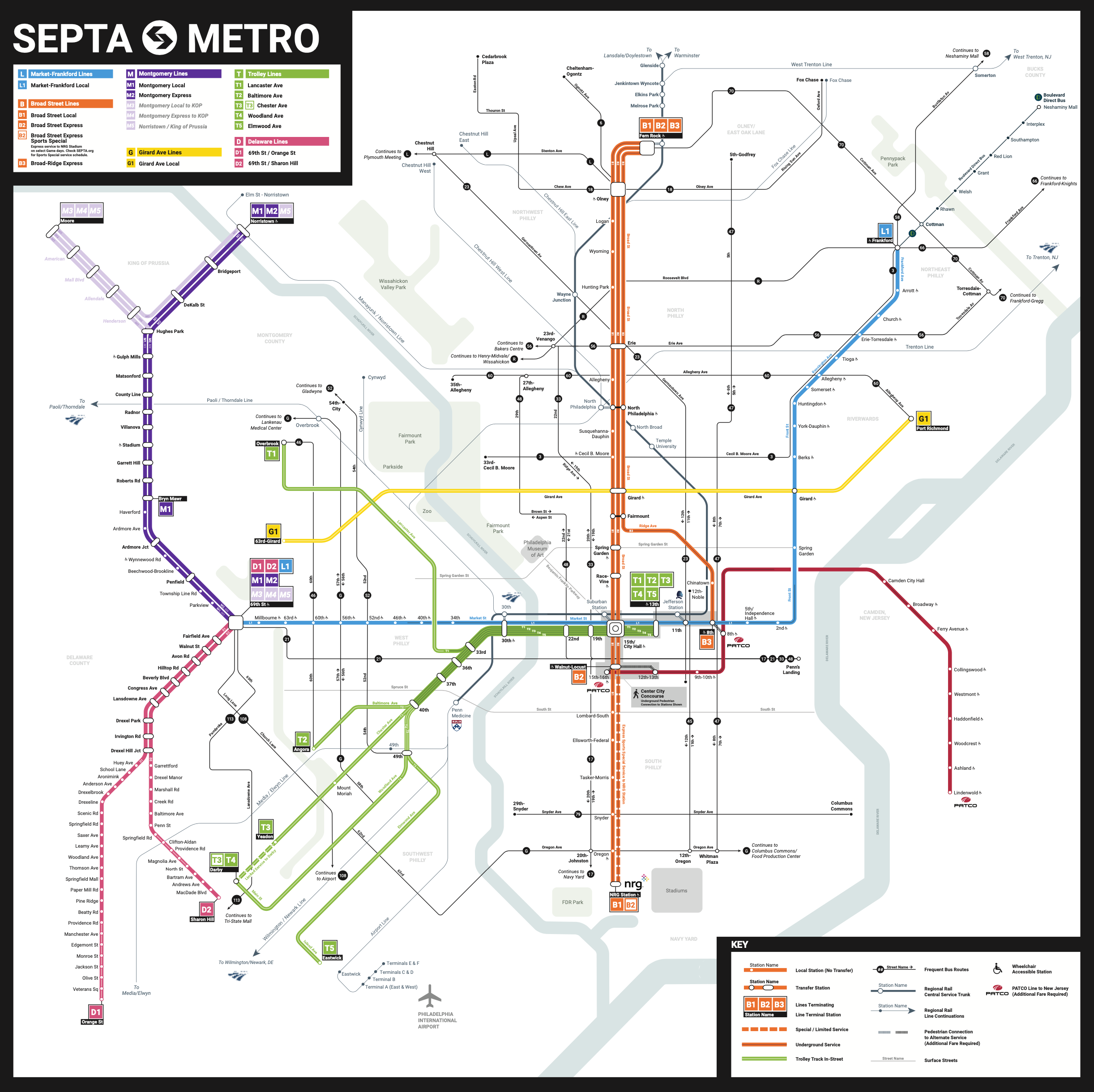
The system is very difficult to map, complicated by subways, both elevated and underground, commuter trains, buses and various types or trolleys, some running along streets, others with their own dedicated rights of way. Additional complications come from the many different agencies that run lines through the area such as Amtrak, PATCO and New Jersey Transit. While trying not to go full negadelphia on here, the more I look at this map the less I like it.

My first big complaint is this triple line representation. It creates a lot of unneeded visual clutter to just show local and express routes separately. The current map. does just fine with one line.


Also, notice the mess created at 69th St Station by separating local and express lines.
The complete lack of visual prominence of the heavily used regional rail lines is also not good. I get how they create a lot of clutter on the current map but they went too far the other way. I'm OK with making the more frequent rail lines more prominent but one of the problems here is that the less prominent lines are almost indistinguishable from the seemingly random* occasional street. See how the width changes at Penn Medicine** below and then compare the thin line below it with Spruce Street.


* I understand why they chose the streets they did to include but by only having a couple of non-transit streets, it gives those decisions a random feel.
** I could really go on a rant about corporate station names but that is a decision SEPTA made without consulting me. Jefferson Station is particularly bad as the name says little about its location to anyone not very familiar with that part of town. This is also one of the busiest and most tourist-y. stations in the city. Also, if you're visiting from out of town and want to see your sports team (most likely) beat us, you're just supposed to know to head to "nrg"


1 comment:
Just came across your fantastic critique of new SEPTA map. I have been ranting for 3 years! They changed suburban lines from letter R with numbers to new names according to destination years ago. Now they are the opposite to subways! And the L1?????? So stupid. M, G D????? MORE STUPID. The problem is merely poor, mislabeled, missing, insufficient,confusing signs. Period.
Post a Comment