
There was much talk, if not much action, at the recent COP27 conference about wealthier countries compensating poorer ones for the impacts of climate change. The poorer countries see the largest impacts, while contributing the least to the problem. This map illustrates the problem well. Unfortunately, I could not find a clearer version of it-this one is from Al-Monitor
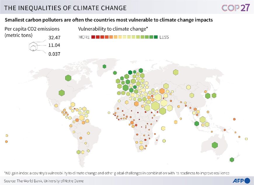
The larger hexagons show higher per capita carbon emissions while the redder colors represent vulnerability to climate change.
There is another version of the map via Arab News-this one has a truly bad and confusing color scheme (the "more" colors should be reversed) but the text is identical. In other words, read this map for the details but use the other one to see the pattern-this one just muddies the message.


No comments:
Post a Comment