
Note to readers on this platform: I also publish this blog on Substack. You may find that the pictures below show up a little better than here.
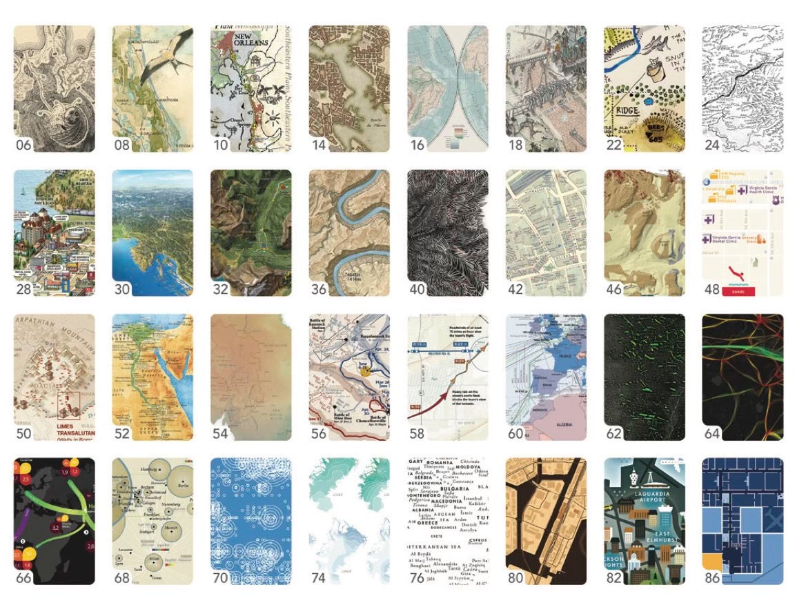
The Atlas of Design is a biannual production of the North American Cartographic Information Society (NACIS). It highlights some of the most beautifully informative maps, chosen by NACIS members to highlight thoughtful design and communication. I last reviewed one of these volumes back in (checks notes) 2015 (Volume 2) - time gets away from us all. One of my favorite features is the sample image table of contents.


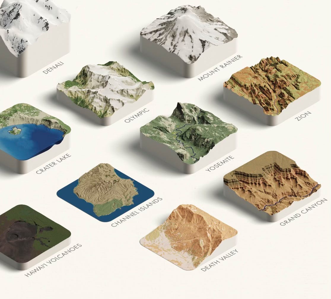
The project is called “A Delicious View of US National Parks” by Wendy Shijia Wang and R J Andrews.
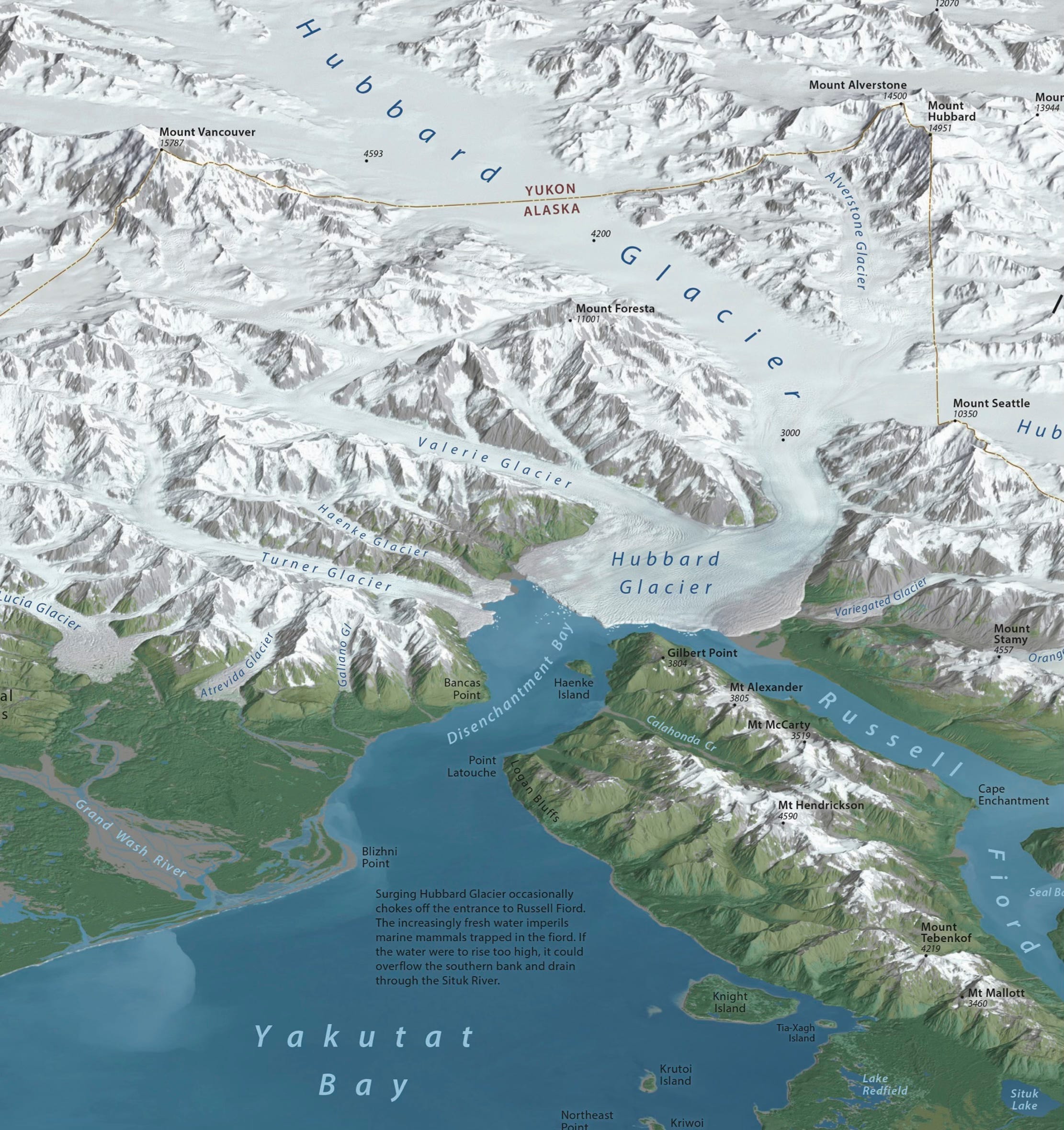
I’ve long admired the gorgeous 3D mapping of Tom Patterson who created this panorama style view of Malaspina Glacier for the U.S. National Park Service. This map seeks to visually unify an area that is divided between the United States (Alaska) and Canada (Yukon).
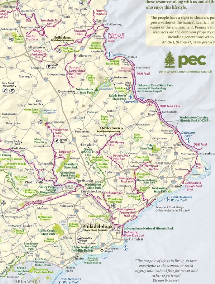
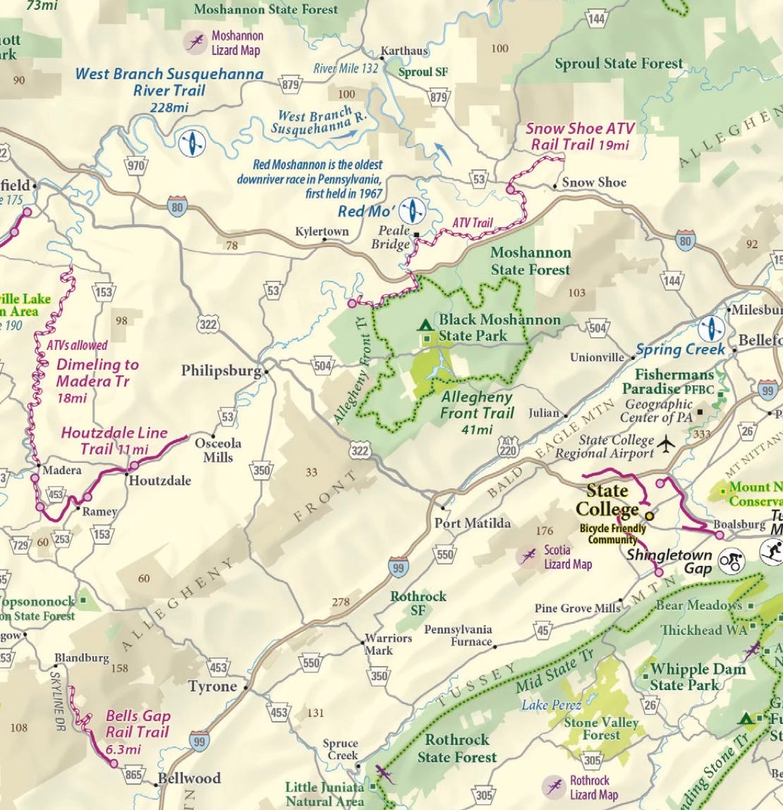
This outdoor recreation map of Pennsylvania uses purple (a color I probably would not have considered) for rail trails and a more traditional green for hiking trails. The purple really stands out from the rest of the color palette to emphasize these trails.
Above is the area I grew up in while below is an area with a much lower human footprint. The purple lizards (“this could mean anything” from the legend) are a nice touch.
I’m quite fond of the Journey to the West map by Yue Zhang, Jinnuo Duan and Xi Tang of East China Normal University. The map shows the pilgrimage route from what is considered one of the great Chinese novels. The geography is a blend of real and fantasy. It begins with familiar shapes in the far east,
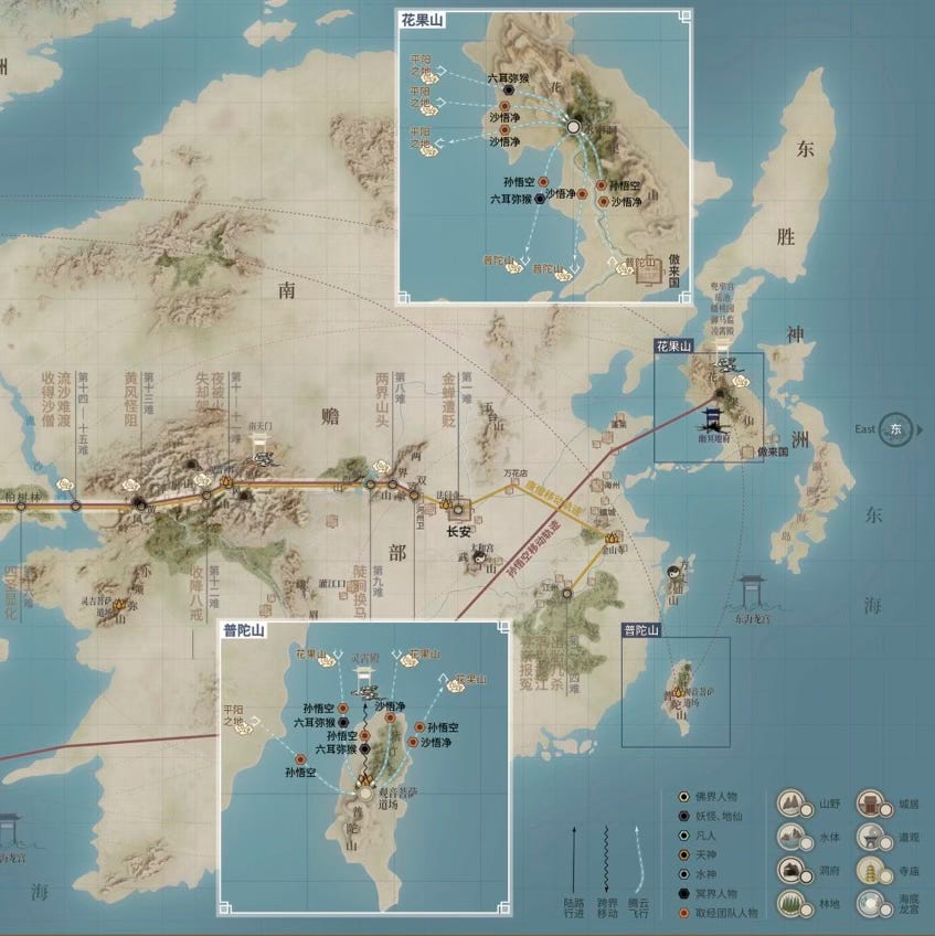
while getting further from reality as the journey moves westwards.
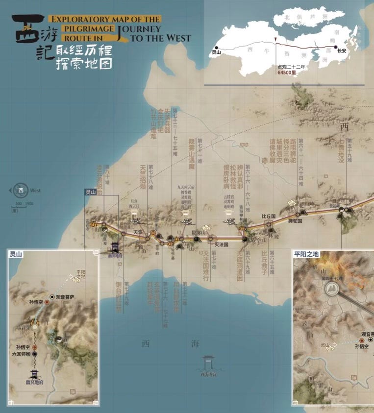
The map also distinguishes different types of movement (“flying, walking, escaping and so on,“) in different realms of mortals, ghosts and heaven.
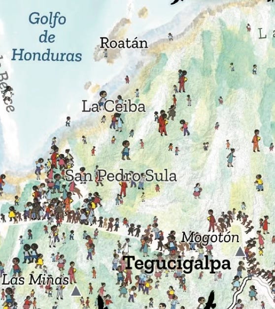
Another map I’m very fond of is called “Centroamerica se mueve” (Central America Moves).
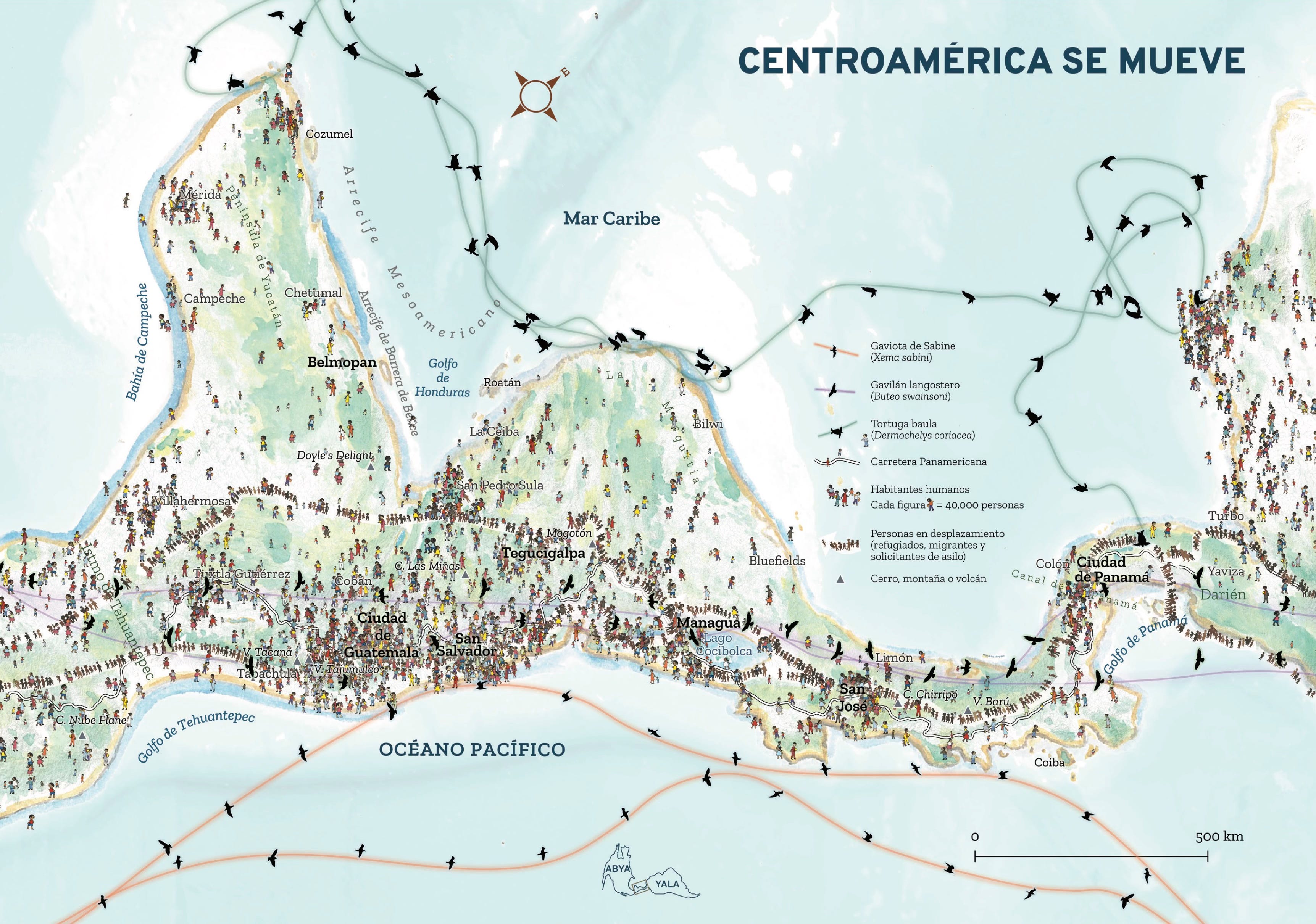
It is an empathetic map showing the movement of people as well as several species birds and animals. The orientation is shifted from north to emphasize the travel corridor through the area. The drawings of individuals remind us that these are people seeking a better life, not criminals trying to poison our blood and walking thousands of mile just to vote illegally (or get transgender surgeries) as dishonest politicians claim.
Finally, here is an otherwise beautifully laid out map with a questionably (to me) bold color scheme. This may be a matter of personal taste or cultural differences. The map is of a National Park in Malaysia.
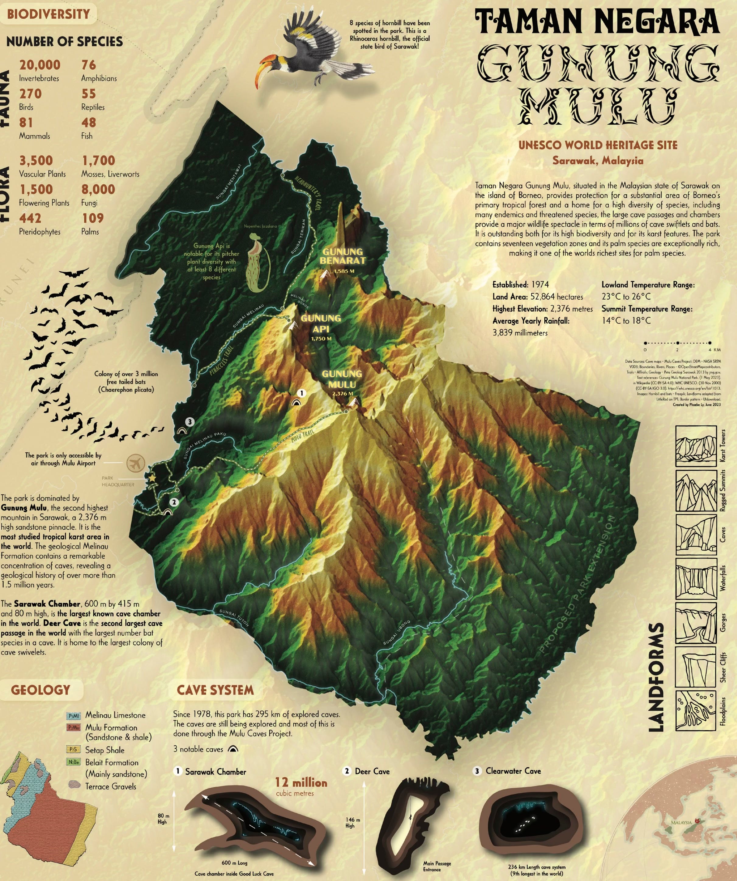
The map is dense with a ton of information including cave systems, landforms and my favorite touch; the bats coming out of the cave to the left. I find the yellow at the highest elevations to be distracting while the very dark low elevations make those areas hard to read. Otherwise this is a really well done map.
One suggestion for the authors is to have a line or two about what medium was used for each map. If hand drawn was it ink, watercolors, colored pencil or something else. If computer generated what type of software (drawing program, photoshop, GIS etc.) was used. I don’t think the exact software or technique needs to be revealed but a general idea of how the map was compiled and drawn would be very useful.
The endpapers show the contents of the previous six volumes.
I will be returning to some of these maps for a future post. You can order it here.


No comments:
Post a Comment