Wednesday, November 27, 2024

The Salt Front

The salt front is the point where a river becomes too salty to be safe for drinking water. The front moves upstream from the river’s mouth as less freshwater flows downstream to dilute it. I’d never heard of a salt front until I read about it in a recent article in the Philadelphia Inquirer. The region’s severe drought in November caused this front to move significantly further upstream than the median monthly location.


On the map above, via the Delaware River Basin Commission (cropped for ease of reading), the pink area is the median salt front location and the pink arrow shows the normal location of this front in November, near Wilmington, Delaware. The blue arrow shows the location as of November 18, 2024. 

The DRBC monitors freshwater flows to keep the salt front from migrating too far upstream. This protects drinking water and industrial water intakes. There are major drinking water intakes for both Philadelphia and New Jersey at the blue box on the map. One way to keep freshwater flowing is to release water from various upstream dams.

The worst droughts were in the mid 1960’s-this shot from one of their videos shows the most upstream movement of the front on November 20, 1964,


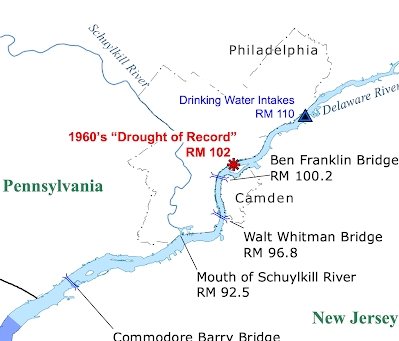
and here is a still map showing more specifically the salt front’s furthest upstream location during the “drought of record”


Finally, here is a screen shot from the hydrologic conditions dashboard, showing conditions on November 23, 2024.


Wednesday, November 20, 2024

30 Day Map Challenge-Admiring the Work of Others

For the past several years November for me has meant working on the 30 Day Map Challenge. This year I’ve been too busy to participate - also I really needed a break from it. Not participating means I’ve been able to admire the work of other cartographers. Here are some highlights from the first 15 days. 

Since I am no longer on Twitter most of these are from Mastodon or BlueSky but I’ve tried to post links to the author’s own sites where possible. I really like the above representation of population as peaks by Cédric Vidonne for Day 13 (use a new tool). In a mountainous country like Switzerland, the population is mainly in the flattest areas so this is almost a reverse reality. You can read more on his Github page.

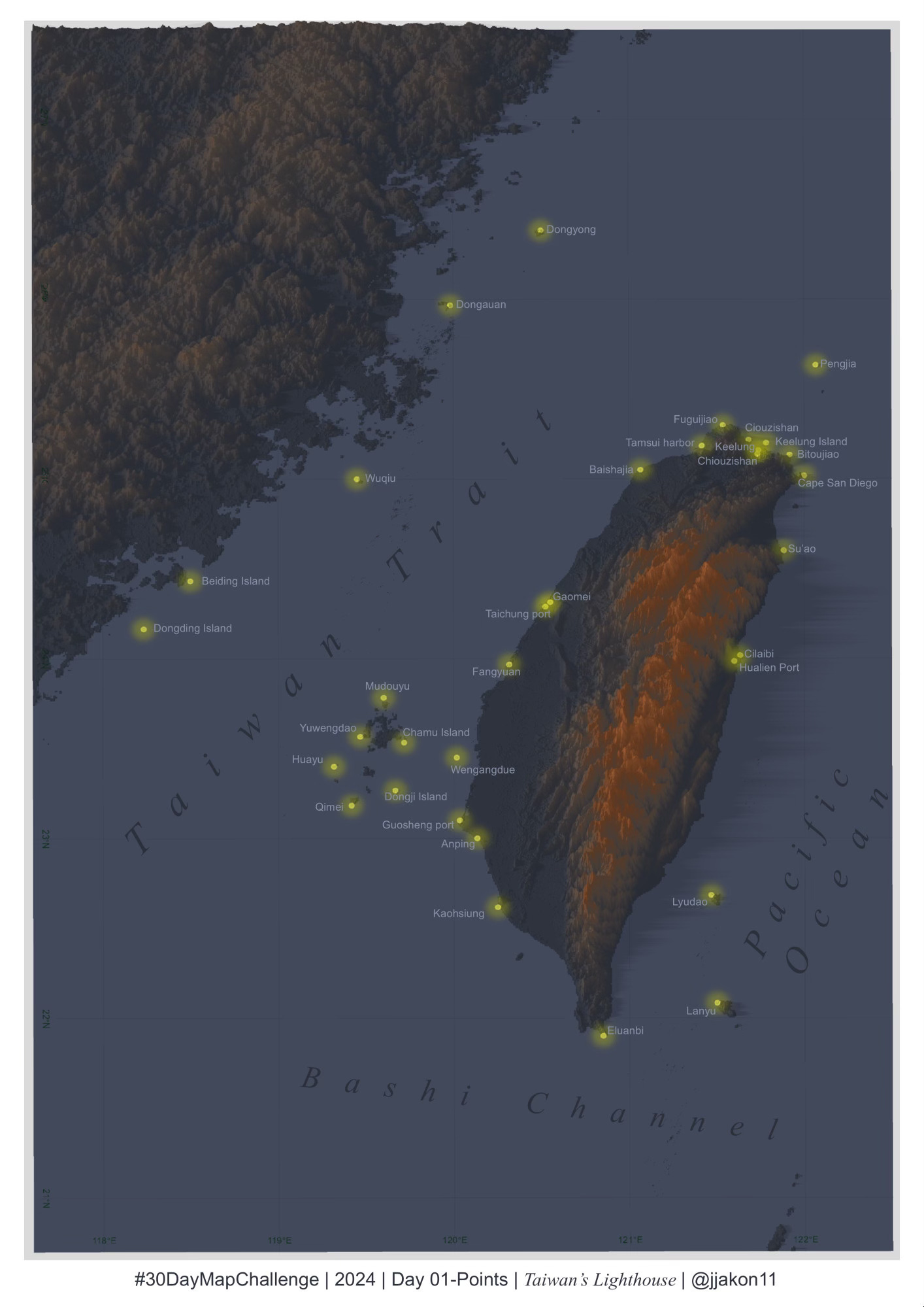
This map of lighthouses in Taiwan by Chen-Chia Ku is a nice pick for Day 1 (points)

For Day 2 (lines) here is a nice hachure map of England’s Lake District by Jo Wood. Details and more maps can be found on his Obervable page.

Day 7 (vintage style) - here is a map of UFO sightings in Denmark by Kurt Menke.

Day 11’s theme was Arctic. Here is a language map of the region by Bluesky user terence. 

Day 15’s theme was “my data”.  Erwan Rivault mapped his change jar to show where he’s been.

Here is a cool antipodes map/video for Day 14 (World Map) from Steve Faeembra. 

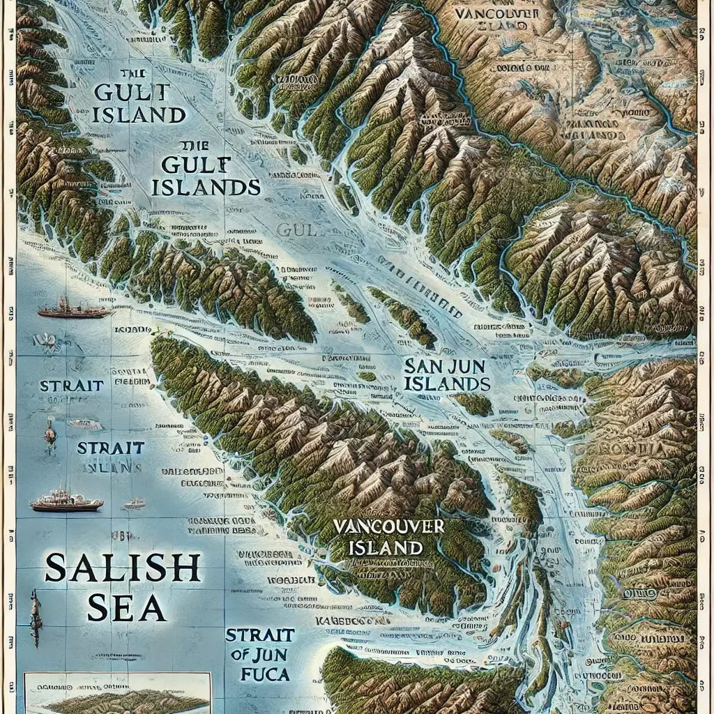
 Finally - the Day 9 prompt was to make a map using AI. I’m kind of fascinated with these two examples. User Tomasral asked ChatGPT for a map of the railway lines of Asturias in Spain. The result includes a bunch of alternate spellings of “narrow gauge” as well as the cities of Oviedo, Aviles and the Bay of Biscay.

Aquila Flower had a similar result with ChatGPT making a pictorial map of the Salish Sea in British Columbia and Washington State.


Thursday, November 14, 2024

Countries with Women Leaders

Here is a map from the Washington Post, via Reddit showing countries past & present with women as heads of state. Click it (and then again) for higher resolution.

We in the United States like to think we are the most advanced country in the world but by this metric we are well behind much of the world. Here is another take from Statitsa from April. This one predated the election of Claudia Sheinbaum in Mexico in October so imagine Mexico as yellow for the complete picture.

This map has some large differences from the first one in Africa where the Democratic Republic of Congo is shown (female prime minister but male president) as well as Mozambique, Mali, Ethiopia and Gabon. However, the second map does not show the Central African Republic, Myanmar (Burma)  or Bolivia. There are probably other smaller countries that are inconsistent between the two maps but these are the ones that jump out.

Thursday, November 7, 2024

This One

This one map (via New York Times) tells you quite a bit about what happened in the U.S. Election on Tuesday.


Aside from a few strange outliers (western Oklahoma, suburban Atlanta, northwest Michigan) The "red shift" happened across all regions and demographics. Hard to look at if you care about democracy, honesty, tolerance and basic decency but also undeniable. I have nothing else to say. Heaven help us - and Ukraine too.