Tuesday, July 28, 2026

Mapping Illegal Dump Sites

Way back in 1990 I went to Slovenia (then part of Yugoslavia) to volunteer for a mapping project. We mapped illegal dump sites in the Krka River valley. Unfortunately I don’t have any of those maps now, but here in Philadelphia they are doing a similar citizen mapping initiative as documented in the Inquirer.


Participants gathered at an event last week to mark up paper maps just like we did 36 years ago. Here is a better look at one of the maps.


-via Philadelphia Inquirer


The event was organized by the Trash Academy who also keep an interactive digital map of these sites with clickable content.


Here’s the citywide picture.


From their web page:

“Earning it the title of ‘Filthadelphia’, the trash and litter that defaces the streets of our city is an apt metaphor for the systematic devaluation of underserved communities.”

Wednesday, July 22, 2026

Illustrated Mapmaking Contest - 2026

 The Osher Map Library in Portland, Maine recently posted their 2026 Illustrated Mapmaking Competition results. These are maps made by school children in Maine in the 4th-6th grade range. First prize went to The Broken Islands by Jacob S., a 6th grader at Brunswick Junior High School.


Most of these maps are of fantasy lands, some from literature and other purely made up. I don’t have a strong familiarity with today’s children’s literature or movies so I am probably missing some of the references. Here are some of my favorites from the honorable mentions.

Rough Ridge Mountain Bike Trails by Foster B. of Montville.

Ipad Isles by Aster B. of Brunswick

I love how apps such as the weather and health are classified as boring.

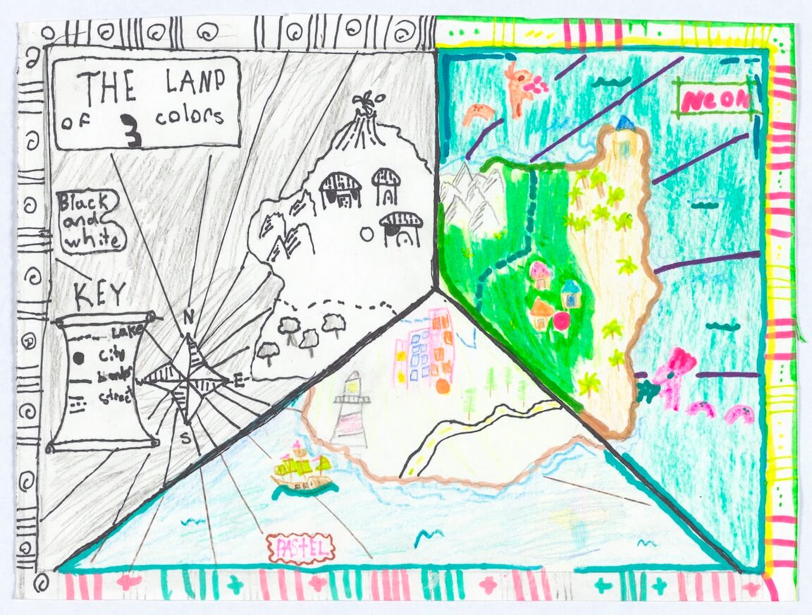
The Land of Three Colors by Erin Q. of Brunswick (a town very well represented here)

This is really three color palettes but I’m not going to get too uptight about that.

Pine Tree State by Darcy Q. also of Brunswick.


An actual place! Nicely done!

Finally, just in time for lunch, Pizza Island by Katie Cahoon of York.


You can see all of the maps here.


Wednesday, July 15, 2026

Cancer Maps

Dr. Jospeh Fraumeni, a pioneering researcher of epidemiology, died a couple of weeks ago. Among his achievements were the first maps of cancer deaths in the United States. Here are two early maps.

These maps eventually became an atlas of cancer mortality published by the National Cancer Institute. You can see the entire atlas here but be warned, it’s huge and may take a long time to load.


The atlas maps begin with overall maps, broken down by race and gender before breaking them down further by types of cancer.


There is a bias in that there are many more maps showing white people than black and no other races (or genders) are accounted for. Anyway it is interesting to see the male/female contrasts here-above is white male, below white female.


One difference that really stands out is “cancer alley” in Louisiana. Are males contracting cancer at work, where presumably there are fewer females employed in these chemical industries? Similar disparities appear in coastal parts of Georgia, the Carolinas and Texas. Here are the maps for blacks. Notice the they do not have the finer county breakdown, nor is there data for the earlier 1950-69 time period.


All of these maps show a similar pattern of lower rates in the southeast and southwest. You can see more, including interactive and story maps at gis.cancer.gov. Here is a sample from the urban-rural disparity story map. I manipulated this image slightly so the legend and map appear together.


This quote from the gis.cancer site summarizes Dr Fraumeni's ideas that led to developing these maps. “The spatial context in which people live is an important factor in cancer etiology and outcomes influencing a person’s risk of developing cancer, accessibility and quality of preventive and treatment services, and quality of life after surviving cancer.“

Thursday, July 9, 2026

Skpe a Scientist

Skype a Scientist is an organization that matches scientists with classrooms across the United States. Their annual United States of Science Challenge seeks to fill a certain number of classrooms in each state with donations. This map is a bit, ummm, unscientific maybe but it shows empty bubbles as classrooms waiting to be matched (?)


I’m not sure what the Philadelphia Flyers mascot Gritty is doing inside two of the three Wyoming bubbles, or for that matter why Wyoming only has three bubbles. He’s also hiding in small bubbles in Minnesota and Wisconsin. Also, the colors only seem to exist as some kind of regional differentiation. Most states appear to be full but there are still opportunities within most regions of the country. 

Thursday, July 2, 2026

Maps for the U.S. Semiquincentennial

Semiquincentennial is a mouthful. So much that my spell check doesn’t believe it’s a word. The Bicentennial, which I’m old enough to remember well was easier to pronounce, and celebrate. I won’t make any grand statements, instead here are some fun, interesting or alternative maps of the United States to celebrate its 250th birthday.

I’ll start with the original inhabitants of this land. This is one of the maps of Jaune Quick-to-See Smith, previously featured here in this post.

Tribal Map 2000


You can see the whole map here.

License Plate Map (one of many)

-via Photowall

If the states were based on watersheds: The United Watershed States of America

-via Next City

The United States drawn as Fifty States with Equal Population


This is an attempt from Neil Freeman to make the Electoral College more fair - good luck either way that! More here.

Speculative fiction - USA in the Man in the High Castle


The Man in the High Castle is a 1962 novel by Philip K. Dick, which imagines a world in which the Axis powers won World War II. Map from Wikimedia Commons. It looks like Long Island might be safe. I’m not sure where some of these oddly specific boundary jogs come from.

A less depressing speculative map (unless you hate rail) - Sci fi coast to coast high speed rail network. 

-via Greater Greater Washington

Finally, for dessert here is the Most Popular Pie by State

-via Holiday Calendar


Wednesday, June 24, 2026

Cool Spaces

Europe has been very hot lately. The City of London created a cool spaces map last year highlighting indoor spaces, water fountains (the small blue dots), shade, and cooler areas of the city. 


The interactive map lets you choose what you want to see, filter for only air conditioned spaces and click points for more information. 


If you have your own venue, you can register it with the city to be on the map.

Here is a striking heat map from The Evening Standard, showing London’s hottest and coolest spots, from 2022 data. They are remarkably close together. Stay cool!

Wednesday, June 17, 2026

Atlanta Soccer Map

Veazy Studio, previously featured here for the ATL Rap Map, has a new Atlanta Soccer Map just in time for that city’s World Cup hosting duties. 


The map took “just under 100 hours to create” and he does a convincing job of selling Atlanta as a soccer destination. Here is a detail of the east downtown area showing stores, fields and bars where people go to watch games - assuming FIFA allows them to be shown.


There’s also a list of Atlanta’s soccer “culture makers“


Bonus map section (!!!!!!!!) - my sister alerted me to Veazy’s Barbecue Map, which is how I discovered the soccer map.


The above image is not very readable but here is a detail from the Costco Connection.


Thursday, June 11, 2026

The Mysterious "Frenchman's Map" of Williamsburg

While visiting family in Virginia this week, we made a trip to Colonial Williamsburg (CW), a good place to go during the 250th anniversary of the United States. While there I came across a cartographic mystery. The “Frenchman’s Map” was said to be instrumental in the restoration of the colonial village. The black and white version above is from Wikimedia commons. 


Here is a piece of a colorized version of the map that is for sale at the CW bookstore. 

There is a lot of detail but very little explanatory text, leading many to believe that this is merely a draft version with the final version yet undiscovered. This and the following conjectures are largely from In Search of the Frenchman’s Map, as well as the book The Mysteries of the “Frenchman’s Map” of Williamsburg, Virginia by Alan Simpson. Yes, there is an entire book dedicated to this map! It is speculated that the map was drawn for French troops who set up their winter quarters in Williamsburg in 1781-82. The map is similar to ones of nearby Yorktown and Hampton drawn by the Berthier brothers of France, but those maps are more complete. It is also likely that it was traced from another version given a series of pinholes in it. 

It is also a mystery as to who the “Frenchman” was. There is no signature on the map and the caption is not in the same handwriting as the rest of the text. Finally, the date on the caption is May 11, 1782, which would have been well after it was needed. 

While visiting the engravers shop in the village, I saw a tray she had been working on with the map etched into it. 
The map has some remarkable details, though described as “impressionistic“ in the article referenced above. It shows building outlines, fences and in some cases even indicating specific trees with dots. Here is the map followed by a detail from the tray’s engraving. 

The folded paper map they hand out to visitors has many nice details too and the building coloring is useful. This is most of the map, trimmed to fit the page better. You can see entire map and guide here
By contrast here’s the Frenchman’s version. 
The article on the CW site (the first one listed above) is an interesting short read. It goes into a lot more depth about these mysteries including details of how it was obtained after being lost for a century.

Thursday, June 4, 2026

Rose Hill Cemetery

Old Friend of the blog Michael Karpovage whose Pictorial Savannah map was highlighted here many years back has a new map of Rose Hill Cemetery in Macon, Georgia. This is “not just a cemetery map, but a passionately built tribute to the namesake and creative visionary behind the landscape”. Mr. Simri Rose was an urban planner, horticulturalist and historian who aided in laying out the City of Macon. 


This cemetery was part of the Rural Cemetery Movement, establishing cemeteries as parks and escapes from the crowded nearby cities. 

The map also includes the adjoining Oak Ridge Cemetery that was set aside for the city’s black population, segregated even in death. Famous people buried here include 4 of the 6 original members of the Allman Brothers Band, who are interred together in a family style plot. 


The map has a “mushroom tour” of Allman Brothers sites that you can follow on a purple dotted line. The mushrooms are an homage to the psychedelic imagery of their 1970’s era.


Included in the tour are the graves of Elizabeth Reed and Little Martha as well as Phil Walden, co-founder of Capricorn Records. A few pictures from their album covers and publicity shots were taken here as well. 

There is also a video tour that Karpovage narrates on his page. He takes you on his bicycle through many of the Allman Brothers sites as well as monuments to other significant residents such as Colonel Joseph Bond, whose original marble statue was confiscated en route to Macon and is now in a cemetery in Kentucky.


Wednesday, May 27, 2026

Boston in 50 Maps

The latest book in Belt Publishing’s 50 Maps series is Boston in 50 Maps. Living in the area and knowing author Andy Woodruff, I had the chance to attend the book launch at the Boston Public Library sponsored by the Leventhal Map Center. 

-Leventhal President Garrett Dash Nelson (left speaking) and Author Andy Woodruff (right)

As a non-native Bostonian Woodruff brings a refreshingly non-exceptionalist view to this book. While many Bostonians think their funny accents, sports crazed fans, history and food are unique in the world, he spotlights some truly uniquely Boston experiences. One of them is Storrowing, when larger vehicles, sometimes the moving vans of college students, get stuck or collide with the low clearance underpasses of the riverfront highways (including Storrow Drive) despite the many “CARS ONLY” signs.


A uniquely Boston historical event was the Great Molasses Flood of 1919 when a large tank burst spilling the sticky stuff all over the area and destroying buildings, wharfs and an elevated railway.


While many east coast cities were partially built by filling swamps, bays and rivers with land, a huge percent of central Boston was created this way.


What is most interesting to me is that these filled areas are also the ones with the highest risk of coastal flooding in the near future. This is best seen by comparing the white areas (areas with the least flooding risk) of the map above and the flood risk map below. In addition to the downtown peninsula, also note the South Boston/Dorchester Heights area, East Boston and Charlestown. 


One interesting experiment from Woodruff’s Bostonography site, was an online survey where respondents named and drew their neighborhoods. The overlays of these resulting in “consensus” neighborhoods as opposed to official city defined ones.


Neighborhood definitions can get controversial as I’ve discovered in my own work. Many people are proud to live in a certain neighborhood, and you don’t want to run afoul of them by telling them anything different. I know this from experience. The consensus map is as good a way of defining neighborhoods as I’ve seen. 

Boston is much more diverse than it often gets credit for. Part of the reason it is not seen as diverse is that most of the immigrant communities are far from where most tourists and business travelers go. This is part of a “small multiples” image showing some of the most common immigrant clusters in the region.


Here is one final Boston quirk. In Philadelphia, a square is just that - a square shaped park. In New York City it is sometimes a square but often a triangle where Broadway intersects a major avenue. In Boston a “square” is usually a haphazard intersection of many roads, often without a park. Woodruff creates a nice small multiples look at the squares of Boston. Here is a small piece of the larger graphic to give a sense of all the different shapes.


Other maps of local interest include unbuilt highways, discontinued transit lines, fall foliage, ducklings,  Smoots, and most importantly proximity to Dunkin’. If you crave more buy the book.