Wednesday, January 6, 2016

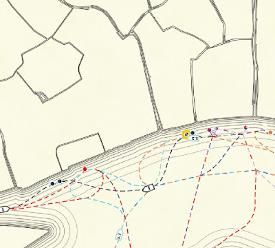
Live Gondolas in Venice

See live gondolas and other water buses (vaporetti) in real time with this interactive map from Edvardas Ščerbavičius
http://www.trails.lt/vosvos/venice-transport/
The map uses open data from the water transit company (Actv) to present real time movement of water craft. The boats, routes and stops are clickable for more information.
Or, if you don't feel like interacting you can just kick back and watch the show. The plot's a bit slow but I'm enjoying it.


Thursday, December 31, 2015

A Few Nice Maps from 2015

There are lots of best maps of the year posts on other sites. You could spend hours looking at the Maps Mania 100 Best Maps of the Year - not a bad way to spend your time if you have it. I also highly recommend Cartonerd's favorite maps list. I am not nearly that ambitious, nor can I pretend to have seen every good map that has been made in the past year. Instead, I will show three maps that I never got a chance to post during the year. I really like these, but will make no claims about their "best"-ness.

The Magnificent Bears of Finland - Annukkah Makijarvi*
http://grrr.fi/annukka-makijarvi/bears-of-finland-map/
This is a deceptively simple looking density map showing the population of bears by area.** If you look closely though the areas are made of of bears. A great synthesis of art and cartography.
* I think this map may be a couple of years old by now but it made the rounds on the map sites this year. 
** Not completely sure what the areal unit used here, a sort of bear grid perhaps.

Longyearbyen and Environs - Norwegian Polar Institute.
http://www.npolar.no/en/services/maps/printed/3d-longyearbyen.html
This map shows an area of Svalbard, an Arctic island off Norway. It is another artistically beautiful map. The International Cartographic Association's Map of the Month for November, 2015. Here are two zoomed in details.

Sculpteo's 3-D Printed Maps

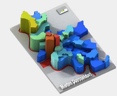
These "datasculptures" can be rotated in three dimensions, even in their preview views. They include several demographic maps, mostly from Germany. This example shows rents in Dusseldorf.
http://www.sculpteo.com/en/print/rent-level-duesseldorf-2012/Af3eGfhE?basket=1&noclickredirect=1&uuid=UZr77M6goy9bhc2drEzSRh

Looking forward to another year of mappy goodness!


Wednesday, December 23, 2015

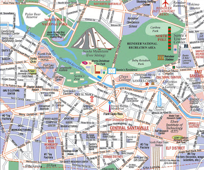
Metro Santaland

I've always thought of Santa's village as some quaint little place but according to Santa Lives Here, it's a pretty large city.
http://www.santaliveshere.com/
When you think about it realistically, of course you would need a large city in order to be able to be able to make and deliver toys for over a billion children. You need factories, but also amenities to keep the workers happy such as schools, parks and an eggnog district. So maybe my illusions have been shattered a bit but now I realize how complex the operation is. Enjoy your holidays and appreciate where all the good stuff comes from.

Wednesday, December 16, 2015

The Atlas of Design II

Last year the North American Cartographic Information Society (NACIS) published Volume II of the Atlas of Design. I looked at some of the online content, was very impressed and then stupidly forgot about it. This year with the holidays coming, I hinted to my wife that I might know of a nice Hanukkah gift. She took the hint and this fantastic book landed in our doorway. There's too much awesome to do it all justice but here are a few samples of what's inside. Note - since these maps are copyrighted, I only reproduced pieces that are already available on the Atlas site.

1. "The Road from Madison..." by Andrew Umentum
http://atlasofdesign.org/two/
This map chronicles a bicycle trip from Umentum's home in Madison, Wisconsin to New Orleans and then back again via Detroit. It is presented as a series of strips, inspired by Jon Ogilby's 1675 atlas of England and Wales - example here.

I love the details he brings out to give the map life. Also the way the lack of state boudaries and south(!) arrows force you to see these places from a different perspective. Rather than divide us, the states merge together into one continuous landscape.

2. "Map of the Beijing-Shanghai High-Speed Railway" by Dong Zheng
http://atlasofdesign.org/two/
Inspired by pre-modern Chinese maps that were primarily intended to be paintings, the map uses a birds-eye view. The modern railroad and buildings blend harmoniously with the ancient landscape and built environment.

 3. "The Heart of Canyonlands National Park" by Tom Patterson
http://atlasofdesign.org/two/
This was an exercise in using Terrain Texture Shader to generate improved hillshading. The author was inspired by Bradford Washburn's Grand Canyon map and by Swiss topo map techniques and shows that beauty can be found in cartographic algorithms.

4. "The Family Farm" by Alex Hotchin
http://atlasofdesign.org/two/
I love a good hand drawn map and this one tells a story of a particular place. Where exactly this is is not clear. The stories have no personal meaning outside of the author's family, yet he still makes you care about this place.

5. "The Asheville Map" by Bruce and Nora Daniel
http://atlasofdesign.org/two/
This fold-out paper map can also be found and purchased online. The base colors are unique (beige roads!) and were inspired by the colors of the nearby Blue Ridge Mountains. The map is artistic yet much more easily readable (and more accurate) than those touristy maps you often get when traveling.

There are many more maps here - 32 in total. Some are made by people I know. The range of techniques and styles is impressive. Most of them beautiful, all interesting in their own way. The previews don't do the maps justice and since in many cases they are not available online I guess you need to buy the atlas to see the full maps. If you're looking for a nice holiday gift for a map fanatic (or even casual map gawker) check it out.


Wednesday, December 9, 2015

Muslims Don't Support ISIS Either

We get a lot of confusing results when looking at how much support ISIS has in the Islamic world. This is because large numbers of unscientific opinion polls show widely differing results. Metrocosm created this map, based on six different scientific polls.
http://metrocosm.com/support-isis-muslim-world-perceptions-vs-reality/
Except for Syria, support for ISIS is very low - even 0% in Iran and Lebanon.* Contrast this with the perceived support in the United States:
http://metrocosm.com/support-isis-muslim-world-perceptions-vs-reality/

These are the types of perceptions that cause rednecks to throw pig's heads at mosques and this illustrates the dangers of the media relying on social media and other non-scientific opinion polls.

I am no expert of what makes a poll "scientific" but the questions and polls cited for the above map can be found here.

* 0% in any poll should arouse skepticism.

Wednesday, December 2, 2015

Chicago Transit, Frank Lloyd Wright Style

Last week's post featured some maps from Max Roberts. Another recent project is this map of the Chicago "El" in the style of Frank Lloyd Wright.
http://tubemapcentral.com/pod/chicago_flw.jpg
The map captures Wright's Arts and Crafts style aesthetic with the use of clean lines and fonts. I do find the font a bit difficult to read, however.
The map's outline and stop symbols were inspired by Wright's stained glass work, as seen clearly on the loop inset.

https://en.wikipedia.org/wiki/Frank_Lloyd_Wright#/media/File:RobieHouseWindows_ChicagoIL.jpg


One final nice detail is the diagrams of each line along the sidebar.
This map, the ones highlighted last week, and lots of other cool designs can be purchased at Roberts' Tube Map Central Site.

Tuesday, November 24, 2015

Peripheral Vision and Curvy Transit Maps

NPR's Science Friday had a nice piece last week on redesigning transit maps. The program features MIT’s Ruth Rosenholtz, a cognitive scientist and the University of Essex’s Max Roberts, a transit map researcher and lecturer. According to Rosenholtz, 99% of our visual field is peripheral. She analyzes maps from this standpoint and has an algorithm to show how they look in peripheral vision. For examples, Boston's MBTA map does pretty well...
while New York's subway map is much more blurry.
I do wonder if the white background version from the Other Map Flavors page would work better. Also we are comparing two very different levels of complexity here.

Max Roberts has designed circular maps for several cities, including New York. 
When I first saw this map, I was underwhelmed and a bit bothered by the geographical distortions but after hearing him explain it, I can see how it does help untangle the lines and make trip planning more straightforward. His Paris map on the other hand is an obvious (to me) improvement. 
Compared to the original.
These curvy maps do better on Rosenholtz's peripheral tests (though no examples were provided) and also did better on tests by Roberts. In his tests subjects were able to plan a trip in much less time.

I really like his treatment of Washington DC.

Chicago is interesting too. I'm not fond of the giant loop-a little too distorted for my tastes. Roberts explains that a diagram should show you how a network works rather than where things are. From that standpoint these maps work well. Just don't expect to be able to walk from Rosemont to Harlem on the blue line in the same amount of time as it would take to get from Jackson to Washington.