Wednesday, February 13, 2019

Cards Against Humanity Stops the Wall

Cards Against Humanity is a self-described "party game for horrible people." As a protest against a border wall that is by any objective standard an ineffective waste of huge sums of money, they have purchased a plot of land along the US-Mexico border and hope to delay construction by forcing a lengthy eminent domain case. Since the wall is "12th Century Technology" they have also purchased a trebuchet, a medieval device (not the font) for catapulting objects to destroy walls.

What does this have to do with maps? Well, they made one.
The map is filled with puns and some other strange things that I don't understand such as Smashmouth playing a concert in Mexico. You can also see the trebuchet doing some damage and people climbing over the wall with ladders.

More on the project here.

Wednesday, February 6, 2019

A Night Club Map of Harlem

This map was created in 1932 by E. Simms Campbell, the first nationally syndicated African-American illustrator in the United States. It appeared in the first issue of Manhattan Magazine, and was republished nine months later in Esquire.
The map features the most famous speakeasies and night clubs of Harlem (but not all of them as indicated in the title block below) during the Prohibition era.
For example "Gladys'" (Harry Hansberry's) Clam House where Gladys Bentley, who performed as a cross dressing lesbian, "wears a tuxedo and high hat and tickles the ivories."
The map is full of charming details such as "Seventh avenue or heaven", various famous personalities like Cab Calloway and Bill "Bojangles" Robinson, an "actual size" picture of a "shorty" of gin, Harlem's "national drink" and this unique north arrow.
The map also takes some interesting cartographic liberties such compressing the blocks along Lenox Avenue in order to reach up to the Cotton Club. The numbered streets are also deliberately misaligned on either side of Seventh Ave in order to emphasize the important clubs. The blocks between 131st and 110th street are compressed to allow Central Park to be shown.
The map, along with additional details can be found here.  A full resolution version can be found here.

Wednesday, January 30, 2019

Renaming Confederate Avenue(s)

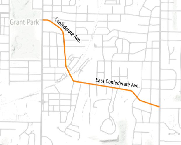
Last week the City of Atlanta renamed Confederate and East Confederate Avenue to United Avenue. They also renamed a small street, Confederate Court as Trestletree Court.
https://cdn.theatlantic.com/assets/media/img/posts/2018/09/Screenshot_2018_09_25_17.01.11/cbcdac3ff.png

Google and Apple Maps both responded quickly with the new names.


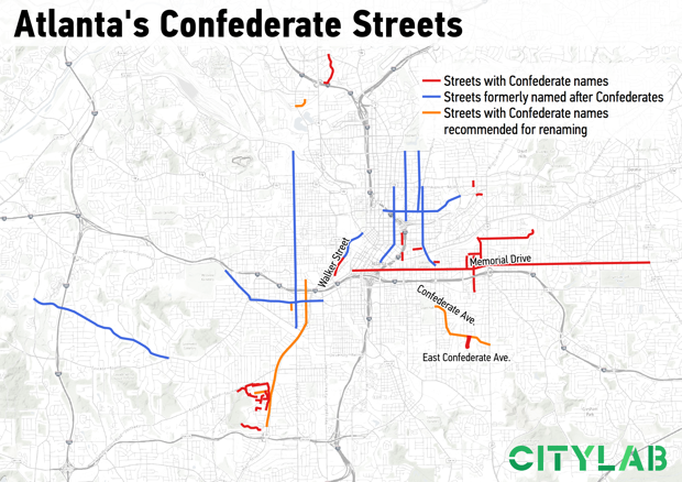
Over the years several streets with names honoring Confederate or Klan leaders have been changed. An article in CityLab includes this map showing streets that have been renamed in blue, recommended renamings in orange and other streets with Confederate names.
https://cdn.theatlantic.com/assets/media/img/posts/2018/09/confederate_names/f111126c0.png
Renaming streets is expensive and can be controversial. From CityLab:
 "The proposal must be reviewed by the city’s urban design commission, then its public works department, then the utilities committee, and finally the city council. If you want to suggest naming a street after a living person, that person has to be at least 75 years old (No, Bobby Brown Parkway is not named after the King of R&B). Just to get started, the application fee is $2,500, which is compounded by the costs to the city for replacing the street signs if approved. Which is, yes, expensive."
Also not mentioned are the costs to the residents and businesses for stationery, signs and other change of address inconveniences. Along Confederate Avenue most residents wanted to rename the street. In the future the city will look into much thornier renaming situations. Streets like Walker and Bell have less obvious associations but they are also named for Confederate leaders.


Wednesday, January 23, 2019

The Cost of Water

I found this map created by the Los Angeles Bureau of Power and Light in 1922 via the Cornell University Library's Persuasive Maps collection.
https://digital.library.cornell.edu/catalog/ss:19343636
It appeared on the back of an electric bill and was meant to explain the cost of water. There is a chart of water rates comparing LA favorably to other cities. I like the title "Why Not Free Water? Because of the Cost." It does a good job of breaking down the costs of the 250-mile aqueduct and distribution system.

I stumbled across the map above while looking for the one below. It appeared in some marketing materials and makes a nice modern contrast to the Cost of Water map. It is a different era but the water issues are even more urgent.
https://www.nycwatershed.org/about-us/overview/croton-catskilldelaware-watersheds/
New York City's water system delivers over a billion gallons of water each day to 9 million residents. The length of the aqueducts and reach of the system is impressive - 1,972 square miles of drainage systems flowing into an aqueduct that crosses the Hudson River. That's a lot of cost for water- think about that next time you leave the faucet running.

Wednesday, January 16, 2019

The Costs of War

This map via Smithsonian Magazine shows much* of the breadth of US military and government anti terrorist actions.
https://thumbs-prod.si-cdn.com/DepQcE5siDEClK1OMDdPaFRimKo=/1072x720/filters:no_upscale()/https://public-media.si-cdn.com/filer/76/45/7645fe6c-a982-4828-bdff-7043074884b2/counterterrorismmapweb.png
The map was developed by Brown University's Costs of War Project. Since the image is a bit blurry when zoomed in, here is a detail from their web page,
and also an enlarged legend.
 "We found that, contrary to what most Americans believe, the war on terror is not winding down—it has spread to more than 40 percent of the world’s countries."

Read more at: Smithsonian and even more at the Costs of War Project
  
* as stated in the article "U.S. efforts to combat terrorism abroad are likely more extensive than this map shows."

Thursday, January 10, 2019

The Great Molasses Explosion

January 15th will mark the 100th anniversary of the Great Molasses Flood. In Boston's North End, a tank filled with molasses burst sending a wave of molasses up to 25 feet high through the streets at 35 miles per hour and knocking buildings off their foundations.

Here is a simulation on YouTube of the flow. User ingomar200 factored in topography, building heights and the size of the tank to create this. He shows the velocity contours later in the video.
This is from a 1917 Bromley Atlas showing the area-via the Boston Planning & Development Agency.
Molasses was used in the manufacture of munitions, The tank is the blue circle. It was conveniently located near the docks and next to the elevated railway that was partially destroyed by flowing molasses. The tank was constructed in haste and inadequately.

21 people and many horses were killed. Some city blocks were flooded to a depth of 2-3 feet. Cleanup of the area took weeks and the harbor was brown for months. Victims brought a successful class action suit against the owners who tried to use fear of terrorism to avoid punishment, claiming that anarchists had placed dynamite in the tank.

Here is the Boston Globe from January 16, 1919 - via the Boston Public Library's flickr page.
and their diagram of the area.
 https://www.flickr.com/photos/boston_public_library/4901511527/in/album-72157624622085789/

Wednesday, January 2, 2019

Geopolitical Map Genres to be Vigilant of in 2019

This excellent Twitter thread by Steven Seegel, author of Map Men is a good way to start a new year. Rather than show all 11 tweets, I will post some highlights. You can see the whole thread by clicking on the first tweet below.

Here's a map I posted without considering its possible implications of "problematic" populations.