Wednesday, August 31, 2022

Correctional Facilities Shouted Out by Petey Pablo

I've been following the Hip Hop Map Project for a while but don't think I've posted anything from it. This is a map of all the correctional facilities in North Carolina mentioned by Petey Pablo in Raise Up. Admittedly the main reason I like it is for the innovative use of handcuffs as point symbols.

for a slightly more legible version click here
His music is full of geographic references though he says them so fast it's hard to keep on top of them all. Anyway, if you really want to dig into it there's a list of all the places mentioned on the project page.

Thursday, August 25, 2022

Drought Conditions

Many years ago I did a quickie blog post showing NOAA's Drought Monitor. The maps have not changed much (except being a bit easier to read) but the conditions lately have been bad enough to warrant a look at the latest map. 

The dark brown shows areas of "exceptional" drought, a step above "extreme" drought. S and L are for short and long term effects, many areas show both letters.

This NOAA map shows how much rainfall is needed to make up for the drought. In many areas it is well over a foot.

While parts of the Dallas area got over a foot of rain in the last few days, that kind of heavy rainfall tends to drain quickly and not help the situation very much. Comparing last week's map there is only a small decrease in the size of the exceptional drought area. 


Wednesday, August 10, 2022

Where Livestock Outnumber People

I just discovered Erin Davis and her site while looking for unrelated content. She's done some great work with maps and statistics including this map showing what counties have more livestock than people (data is from the USDA).

I love the big circle legend. It lets you dig into a complicated multi-variate color scheme so you can see that, for example the green areas (such as southwestern Wisconsin and northwestern Arkansas) primarily have a combination of cows (blue) and chickens (yellow) and not so many pigs. Black areas such as in Montana have more of all three than people.

 Scroll down the page and you can see the individual maps for each animal plus maps of counties with more goats, sheep and turkeys than people.

Finally, at the bottom is a map of the most common type of livestock by county.

For the entire map set go here.

Wednesday, August 3, 2022

Sleep Under the Stars

Next Monday is Sleep Under the Stars night. Cartographer Sarah Bell created this star chart styled map showing climbing spots and campgrounds in the United States

 Here is a more full view of the map. 

Wednesday, July 27, 2022

Summer Light Reading-Part 2

Here are some more maps to continue your summer light reading.

Captain Snow's Scetch of the Country

There's some questions online about who Captain Snow was but this is a beautifully hand drawn map of the lands south of Lake Erie with an interesting birds eye perspective. The fort across the river from "Log Town" is what is now Fort Pitt in the center of Pittsburgh. Some nice details of the forts and physical geography.

The "Obashee River" in the upper northwest corner confused me but I'm pretty sure it's what is now called the Wabash River.
 
Japan from Erwin J. Raisz's 1944 Atlas of Global Geography

"The good cartographer is both a scientist and an artist" - Raisz, 1938


The above image is a bit blurry so here is a close up of Europe for a better feel for his artistry.


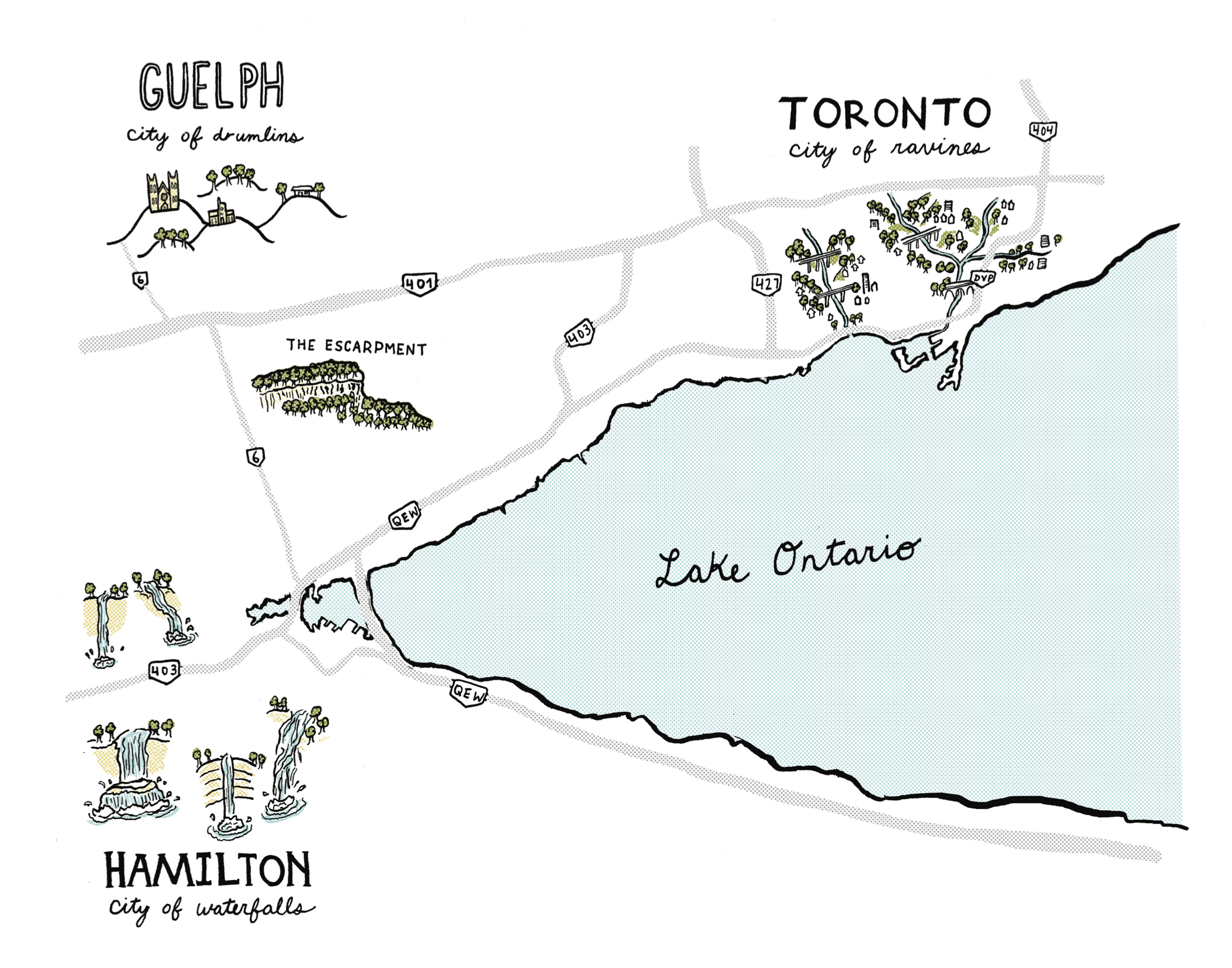
Cities of Ravines/Drumlins/Waterfalls by Daniel Rotsztain

Rotsztain is this month's GeoHipster. Here is his description of this map. "Southern Ontario’s physical geography is often derided as flat and boring, ignored behind 400-series superhighways and big box plazas. Beyond the highways, the landscape is dramatic! This map is an effort to re-assert these three cities’ beautiful landscapes into our geographic conscience."

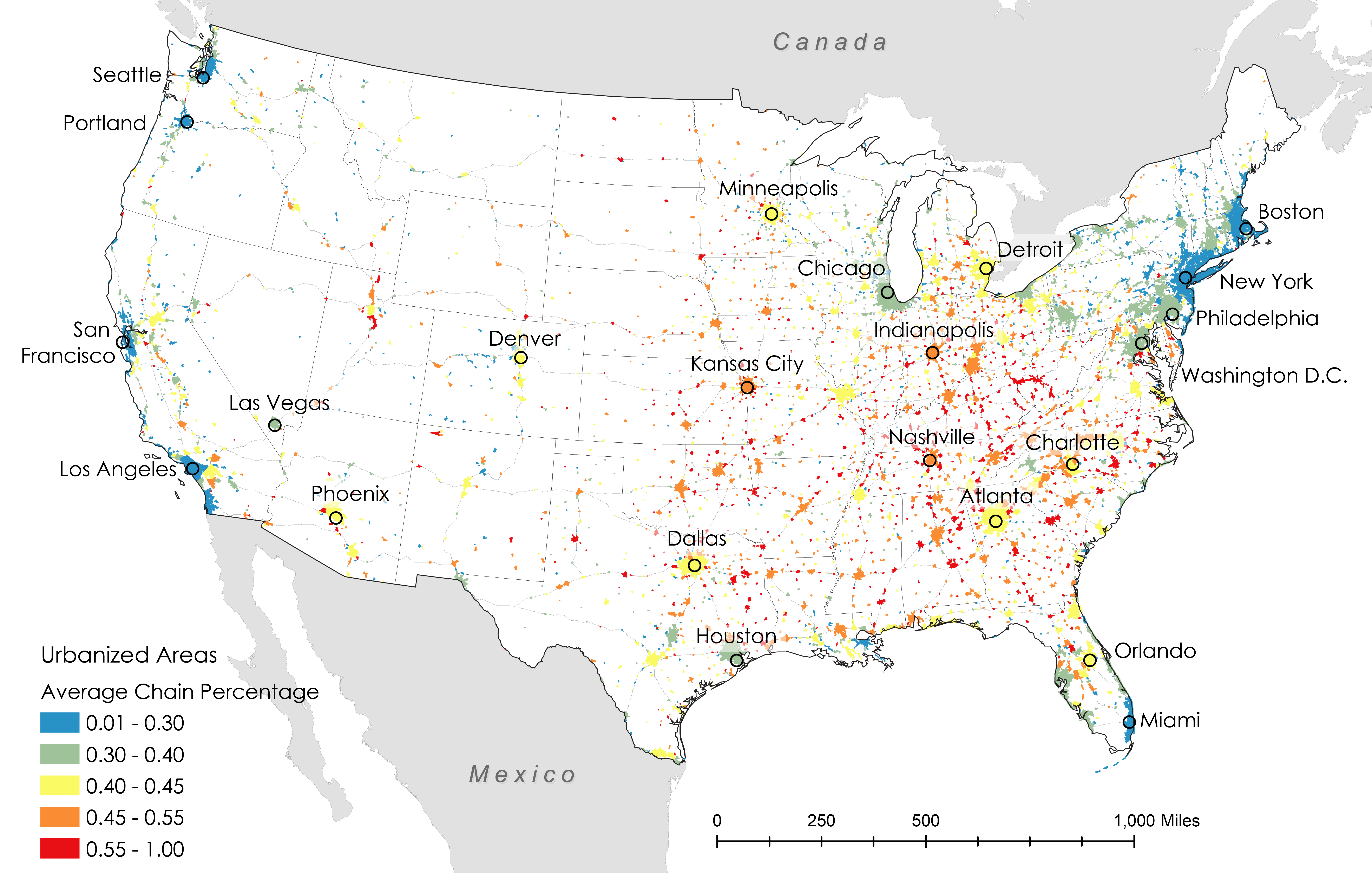
Chaininess

The Friendly Cities Lab at Georgia Tech made a series of maps showing the "Chaininess" (percentage of restaurants that are chains) by metro areas. Aside from a few poorly located cities (Boston and Seattle are way too far south) this map shows some clear patterns. The methodology can be found here.
 

Women's Tour de France

via Barron's
This event runs through Sunday.


Wednesday, July 20, 2022

Summer Light Reading

Here is a grab bag of maps I enjoy. I don't have much insight or commentary to add-let's just appreciate them!

SAS Airlines Map, 1965

via Airline Maps Tumblr
 

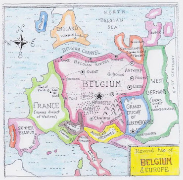
A "Belgocentric" map of Europe

via StrangeMaps

Melbourne Trams to the Beaches -Vernon Jones, 1930

available at the Transit Maps store

Vernon Jones was a printmaker who apparently did some work for the government of Victoria, Australia. I have not been able to find much information about him online the maps are truly a work of art. He used some really nice text styles too. Here is a detail from Trams to the Racecources, River and Zoo.

also from the Transit Maps store

New Jersey Lighthouses.

While on vacation at the Jersey Shore last year I took a picture of this map, hanging inside the Cape May Lighthouse.

Automobile Routes to Atlantic City sponsored by the Rudolf Hotel. I lost the original source of this one.

Hand drawn personal map of Detroit by 'jide Aje-not to scale! This is part of an exhibit/research project by Detroit Research.

via Detroitography

Walkway Over the Hudson - drawn by Maria Rabinky illustrating the bike/pedestrian rail trail bridge over the Hudson River in Poughkeepsie, New York.

The hand drawn cliffs are a really nice touch. Here's the whole map, complete with mountains and biplanes.

More to come....

Wednesday, July 6, 2022

Northern Expansion

I've seen plenty of map like this one, showing some ridiculous looking westward claims of US states and colonies before that.

via Library of Congress
If ridiculous seems like a strong word, just look at that South Carolina panhandle! What I've never seen before is this circa 1754 map showing some huge land claims to the north.
Sidney R. Knafel Map Collection/Leventhal Center
There is not much information about this map other than a simple title "An accurate map of the English colonies in North America, bordering on the river Ohio", and that it appeared in the Universal magazine of knowledge and pleasure. It's interesting to see New Jersey and Pennsylvania grabbing land in upstate New York, Maryland claiming much of Ohio, and Virginia reaching up towards Michigan. In some ways this makes sense given the north-northwesterly flows of the major rivers these colonies formed along, the Hudson, Delaware and Potomac.

I don't know anything else about this map or these claims but it's always interesting to see a different perspective on history.