Thursday, September 19, 2024

Soprano Land

 The Sopranos is having a bit of a moment with the recent HBO documentary about David Chase. Illustrator Robert Sikoryak made a nice map to orient fans to the New Jersey landscape of the show.

You can click above to see a larger version. I've only watched bits of the show so I can't comment too much on the plot elements. I can say that having traveled through this area many times, the intro really captures the North Jersey feel with landmarks like the Wilson's Carpet lumberjack statue under the Pulaski Skyway, Satriale's Pork Store,

and the "Drive Safely" gas tank, not shown on the map.

The legend is helpful for determining types or murder as well as other important activities like Ziti dumping and unmentionable sniffing.

Tony and Carmela's house is shown with its close proximity to the woods where Mickey Palmice was shot and to the Fountains of Wayne, famous for inspiring a band's name.

There's lots more to see on the map and other excellent illustrations on Sikoryak's web site.


Wednesday, September 11, 2024

The Auschwitz Exhibition

This past weekend I saw a traveling exhibition in Boston about the Auschwitz concentration camp. It contains over 700 objects from shoes to gas masks to implements of torture and experimentation. The exhibit was co-produced by the Auschwitz-Birkenau State Museum and has been in several other locations but is only up for a few more days in Boston. There is no information about where it might be next. You can read more about it on their site

The exhibit's tag line "Not long ago. Not far away." is a great reminder that those who do not learn their history are doomed to repeat it. In today's political climate where Holocaust deniers and Nazi admirers are given significant air time in the media, candidates for the highest offices use their rhetoric and they are winning elections in Germany, it is more important than ever that these stories and artifacts are presented to refute the denials. You came here for maps? This exhibit delivers plenty of them, more than I can easily show in one post. Here are some of the more significant examples.

Auschwitz is the German name for Oświęcim, a Polish town that began as a typical fenced medieval settlement. It became important as a railway junction and also for it's location on the border (at various times) of nations, provinces and occupied areas. This map highlights the railways lines and shades in the locations of the camps as well as the rubber factory that used slave labor from the camps.

The camp originally housed mostly Poles who did not completely cooperate with their occupiers but in time it became a death camp for Jews, Roma (gypsies), homosexuals, the disabled, and political prisoners. Here is a map of the Auschwitz camp and the expanded Birkenau camp to the west of it. 

via Yad Vashem

I took a picture of it but I'm using a copy from Yad Vashem, the World Holocaust Remembrance Center, because it is much more clear than what I was able to capture. 

The camps grew into a major network.

Jews were rounded up throughout German occupied and allied countries and deported to Auschwitz as this huge wall map shows.

In 1945 as the Russian army started closing in on the area, the surviving prisoners were subjected to even more brutality as they were forcibly marched, on foot and then in rail cars in the middle of winter to other camps deeper in Germany. This was in part to try to continue hiding Nazi atrocities from the rest of the world.

There are quite a few other maps including a world ethnographic map from 1897 exemplifying the racial attitudes of the time, a map of Madagascar, where it was proposed that Jews be deported and this map from 1936 of concentration camps and prisons, published by exiles seeking to dissuade international athletes from participating in the Berlin Olympics that year.

The exhibition runs through this weekend at the Castle at Park Plaza in Boston 

Here are some useful links for more information:

The exhibition's web site

Auschwitz-Birkenau State Museum

Yad Vashem


Wednesday, September 4, 2024

A Blue Map of China

This past weekend I finally got to the Leventhal Map Center at the Boston Public Library to see their exhibit, Heaven and Earth: The Blue Maps of China on one of its final days. Yes, I should have visited months ago when I could have encouraged readers to see it but though they have taken it down, you can still look at the digital exhibit. The main focus of the exhibit is two large map prints done in Prussian blue; one terrestrial and one celestial. Here is my photo of the geographic map as it was displayed.

Apologies for the yellowing effect that seems to happen on my phone. The lines and text are white. This map titled "Complete map of the geography of the everlasting, unified Great Qing Dynasty" was printed by making a positive image rubbing on a woodblock. Prussian blue, an iron based compound, was developed in Berlin but the Chinese learned to make it from local materials. 

Here is a description from the online exhibit: "Several geophysical attributes help to orient the viewer. The two vivid white lines trace out the Yellow River (north) and the Yangzi River (south). Just north of the Yellow River is a stippled band of white dots that marks the Gobi and Taklamakan Deserts. Wave patterns indicate oceans, including the Atlantic (top left) and Pacific (occupying much of the second panel from right). There are two prominent human-made structures. The Great Wall, with its distinctive crenellated wall pattern, runs between the Yellow River and the Gobi Desert. The Willow Palisade, which emerges close to where the Great Wall meets the sea, is shown with cross-hatched lines."

Here is a detail from the map.

The full map can be seen here. Place names are "encoded toponyms"- what this really means is that the place names are placed inside of shapes representing their administrative order. Here is a legend from the Leventhal Center web site,

and here is an older map where the shapes are placed next to the text instead.

I could talk about the star chart but that could be another entire post and I don't really have the knowledge to say much about it. Here is a sample.

via Leventhal Map Center

One final picture: the Leventhal Center usually has a map placed on the floor at their entrance. The one for this exhibit outlines some of the features for better comprehension. The lighting and size made it hard to get a complete picture but here is a sample.

You can read more and see many more maps and earlier versions of these on their online exhibit.

Wednesday, August 28, 2024

Everglades Restoration

The U.S. Army Corps of Engineers has invested over a billion dollars to restore Florida's Everglades as part of the Infrastructure Bill of 2021. The goal is to restore the natural flow that has been cut off by agriculture and urban development.

The original flow was from the Kissimmee River near Orlando, down through Lake Okeechobee, to the Florida Keys. As the area grew, wetlands were channelized and drained. This deprived the remaining wetlands of fresh water impacting the quality and quantity of drinking water, causing habitat loss and increasing invasive species. The plan will increase the amount of wetlands and restore much of the flow to the Gulf of Mexico, as seen in the left-most image. This and additional information can be found from the Florida Museum of Natural History.

The image above is from the museum. Since the background is transparent, I couldn't resist adding some artistic waves to the background.


Wednesday, August 21, 2024

Algal Blooming Across the World

NASA's Goddard Space Flight Center produced a video showing the increase in harmful algal blooms over the last 50 years.

If the above video does not load try clicking here. This version ends by opening the globe into a world map to show everywhere at once. There is another version that ends with a zoom in on Florida.

Algal blooms happen when algae grows out of control.  Red tide is a type of bloom that emits toxins that kill fish and cause irritating odors and respiratory problems. The video above is part of a larger video showing the problems facing our oceans and how the newly launched PACE satellite is helping to quantify them.

Here is a still from the video showing the algal bloom in Lake Erie that shut down the City of Toledo's water supply.

Here is colorful still of oceanic circulation patterns.

Finally, here is an image showing data collected from the PACE satellite.

More information and a full list of film credits is here.

Wednesday, August 14, 2024

Guided Across Switzerland by Hand Drawn Maps

The New York Times has a piece where the author ditched his phone and walked across Switzerland guided only by hand drawn maps from the people he met along the way. I love a nice hand drawn map and this article provides lots of good examples.

These maps illustrate the things that are important to the people making them. For example, the cheesemakers put most of their detail into the house where the cheese is made.

This one has some detailed mountains, flowers and oddly drawn cows.

A nice touch is the sign that reads "Wow!! How good is life?"


 Here is a nice one with some towns indicated by houses, a lake and some upside down mountains.


Finally, here is one super busy example, complete with footnotes.


Wednesday, August 7, 2024

Summer Light Reading 2024

Here is another installment of what is becoming an annual summer tradition. Just like the light beach reading, here is some light map reading. Not much to comment about, just some maps and related items I like.

First of all since the Olympics are in Paris, a nice papercut map you can enjoy, or buy here.

A very colorful map from Wikimedia Commons showing the different sections of the Rhine River. As one reader pointed out it looks like a water quality map and probably is as river quality tends to get worse as more cities and farms downstream dump pollution into them.

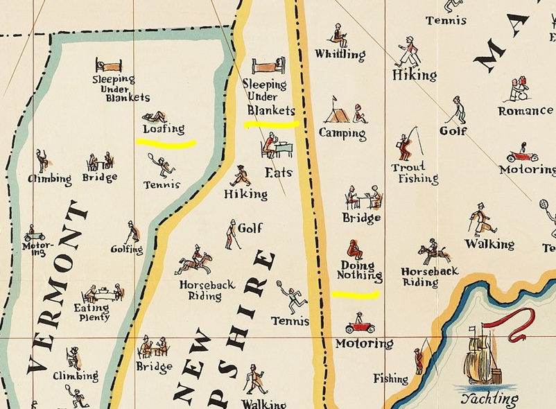
A map of things to do in New England. I copied a portion and highlighted some of my favorites such as "loafing", "sleeping under blankets" and "doing nothing".

Transit map of Kaohsiung on Taiwan. There are some great station names like Dream Mall, World Games and Oil Refinery Elementary School.

A screen shot from Yahoo Japan that I like for no specific reason.

Finally, Tsunami Generating Earthquakes. I think this originally came from some social media site that was once known as Twitter. Maybe from the U.S. Geological Survey.

OK, back to your beach read.