 This entry is entitled "The world is colorful and beauty" and was done by Ferina Tjahyana from the Pelita Harapan Junior High School in Tangerang, Indonesia. She was 13 at the time this map was done (2003).


1 year ago
 This entry is entitled "The world is colorful and beauty" and was done by Ferina Tjahyana from the Pelita Harapan Junior High School in Tangerang, Indonesia. She was 13 at the time this map was done (2003).
 Labels:
children
,
indonesia
,
international
Labels:
children
,
indonesia
,
international

 Labels:
cultural geography
,
USA
Labels:
cultural geography
,
USA
 For a nice, detailed general reference map of the region click here.
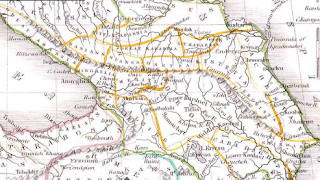 This is an interesting historical map of the region produced by American cartographer Thomas Bradford in 1835. Clicking the image will bring up a window so you can zoom and pan to get more detail.
Labels:
abkhazia
,
boundary disputes
,
caucasus
,
georgia
,
international
,
ossetia
,
russia
This is an interesting historical map of the region produced by American cartographer Thomas Bradford in 1835. Clicking the image will bring up a window so you can zoom and pan to get more detail.
Labels:
abkhazia
,
boundary disputes
,
caucasus
,
georgia
,
international
,
ossetia
,
russia
 You can mouse over the dots to get basic information and a click on them will get pictures, diagrams, architectural drawings, links to schedules, game rules and much more. What's lacking is a mileage scale so it's not clear how close these places are to each other. Also some transit and/or parking/driving tips would be helpful. You can find that information in the "Spectator Guide"s but they could have put it in a more obvious place.
Labels:
china
,
sports
You can mouse over the dots to get basic information and a click on them will get pictures, diagrams, architectural drawings, links to schedules, game rules and much more. What's lacking is a mileage scale so it's not clear how close these places are to each other. Also some transit and/or parking/driving tips would be helpful. You can find that information in the "Spectator Guide"s but they could have put it in a more obvious place.
Labels:
china
,
sports
 Webexhibits has this page where you can analyze the evidence and make your own decision about the authenticity of the map. If you want pages of detailed info. click the map above and you'll get it!
Labels:
history
Webexhibits has this page where you can analyze the evidence and make your own decision about the authenticity of the map. If you want pages of detailed info. click the map above and you'll get it!
Labels:
history
 Take away the traffic lights, train tracks and the fact that drivers in other places actually use turn signals and you get the picture. Technically I hit the car but I couldn't stop that quickly - she could and didn't. Anyway I'm still alive and well - just a bit beat up. I thought I'd look for some good bicycle accident maps but there's not much out there. Ghostcycle did a cool thing placing "ghostcycles" at accident sites in Seattle to raise awareness. Unfortunately their google mashup doesn't work (don't try the map-your computer will be sorry).
 Labels:
bicycling
,
Portland
,
seattle
Labels:
bicycling
,
Portland
,
seattle
 A couple of disclaimers about this map from their site:
Labels:
cambridge(UK)
,
england
,
traffic
,
transit
A couple of disclaimers about this map from their site:
Labels:
cambridge(UK)
,
england
,
traffic
,
transit


