Wednesday, October 28, 2020

The New York Times Covid-19 Site

 Much praise over the last six months has been lavished on the Johns Hopkins Covid-19 Dashboard. I have always found that site hard to read with too much information in one place. I find the New York Times graphics to be a huge improvement.

The color scheme is much easier on the eyes. One of the best things is that the data is by census tract (I'm pretty sure that's how it is aggregated) so you get a much better sense of where cases are. Also it keeps the mostly empty areas uncolored so the reader is not overwhelmed. Texas is a good example-you can choose any state to see maps and graphs. You can see how Hale County is considered a hot spot but within the county the cases are primarily around Plainview in the northeastern corner.

The graphs do an excellent job of showing the trends since March.

The state and territories are sorted by most cases per capita and you can see the difference between places that are having a huge uptick now (the Dakotas) versus ones that are having a second big wave (Guam, Utah, Idaho). It is also notable that Guam and Nebraska had much earlier first waves than Idaho and Utah.

Both these sites also offer the world view. It is interesting to see how the African countries have kept their cases very low, especially compared to Europe.


The "small multiple" charts are also a nice touch.

Much more to explore here.


Wednesday, October 21, 2020

What Can We Learn From Orientation

This week's popular distraction on the geo-webs is an app that draws every street in a city (or other location) colored by orientation. Here is one of my favorite personal places, Philadelphia.

While seemingly just a meaningless distraction the colors do tell you something about settlement patterns. Settled on a part of the Delaware River that runs due south and then west, the major part of the city is along an almost north-south (red) grid. However most of the river flows at about a 45 degree angle and much of southeastern Pennsylvania is on a grid shaped by the river's direction (the purple and blue lines). In the outer parts of the city these grids collide creating some of the more interesting urban spaces in the city (IMHO). Here is the southeastern part of Pennsylvania. I expected to see more purple but there is still quite a bit in the northern regions of the metro area where I grew up.

Note that the app allows you to change the background color. For most of these images I set it to black because the roads show up more clearly. 

For a more meta view here is all of Pennsylvania.
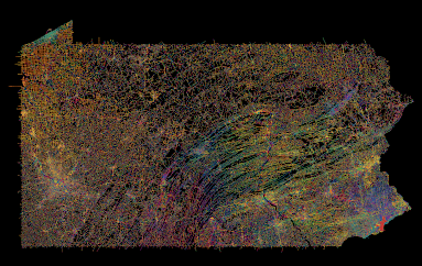
I do not recommend loading an entire state as it takes a while and may overwhelm your computer (and their server).

Points of interest include the colorful twists and turns of the central valleys and ridges, the separately unique Lake Erie grid, and the holes in the northern forests where no roads run. As a different type of city Pittsburgh, one of the toughest cities in the country to navigate, is quite colorful. There are still many grid neighborhoods but they run at all kinds of angles, often at the whims of the rivers.
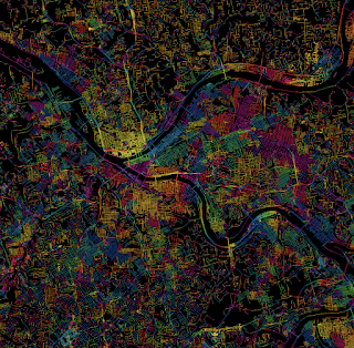
Pittsburgh-taste the rainbow!

For a suburban view, here is the area around my childhood home in Levittown, PA. The blue lines in the upper left corner are from a shopping mall parking lot.

Many cities in the western half of the United States strictly follow the township and range grid of the public land survey system. Often the downtown areas run at an angle either to follow a railroad or to accommodate an older grid system. Here is Denver. 
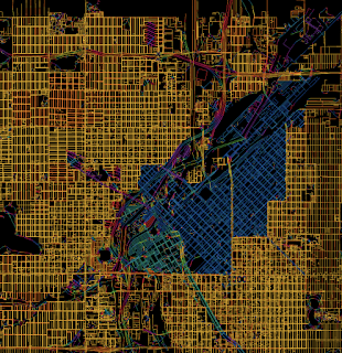
Denver-embrace the yellow!
As a proof of concept here are four other cities with a similar pattern.

I could go on about this for way too long but I'll end with an artistic mashup of some of the more interesting and colorful places I've explored in Philadelphia. You can explore you favorite places here.
 

Clockwise from top left - the art museum area, the effect of the Schuylkill River bends, roads curving around the airport runways, the way Roosevelt Boulevard breaks up the northeast grid, some curvy suburban colors, and a difficult to see Logan Circle.

Wednesday, October 14, 2020

The Folded Map

The North American Cartographic Information Society's (NACIS) annual meeting begins today. One of the annual traditions is the Corlis Benefideo Award. This year's winners are Tonika Lewis Johnson and Paola Aguirre Serrano for their folded map project. The project matches comparable addresses on the north and south side of Chicago with photos and links the residents of these addresses together. Here, some of the participating locations are shown. 

Using one of their interactive maps, I took some screen shots and created my own folded map with a huge amount of distance removed for comparative purposes.

The project includes side by side photographs of the address pairs and portraits of the residents, sometimes posed together at each other's houses.

There are also interactive maps where you can turn on and off layers to compare neighborhood amenities such as parks and libraries.


Wednesday, October 7, 2020

Of Maps and Manhole Covers

One of my first posts featured this map on a Seattle Manhole cover. 

Since then I have been exposed to a world of manhole enthusiasts and found various other cool map examples. An entire blog post on this subject, complete with video can be found on Geography Realm.

Here is Oklahoma City, via Kontraband. The dot shows you where you are. There is a bonus state map at the top!

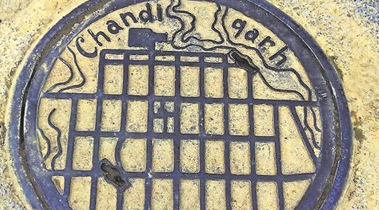
Chandigarh, India, a manhole possibly designed by Le Corbusier - via The Indian Express

Duluth, Minnesota with a dot pattern for Lake Superior- via flickr

Galicia - not a whole lot of detail here.
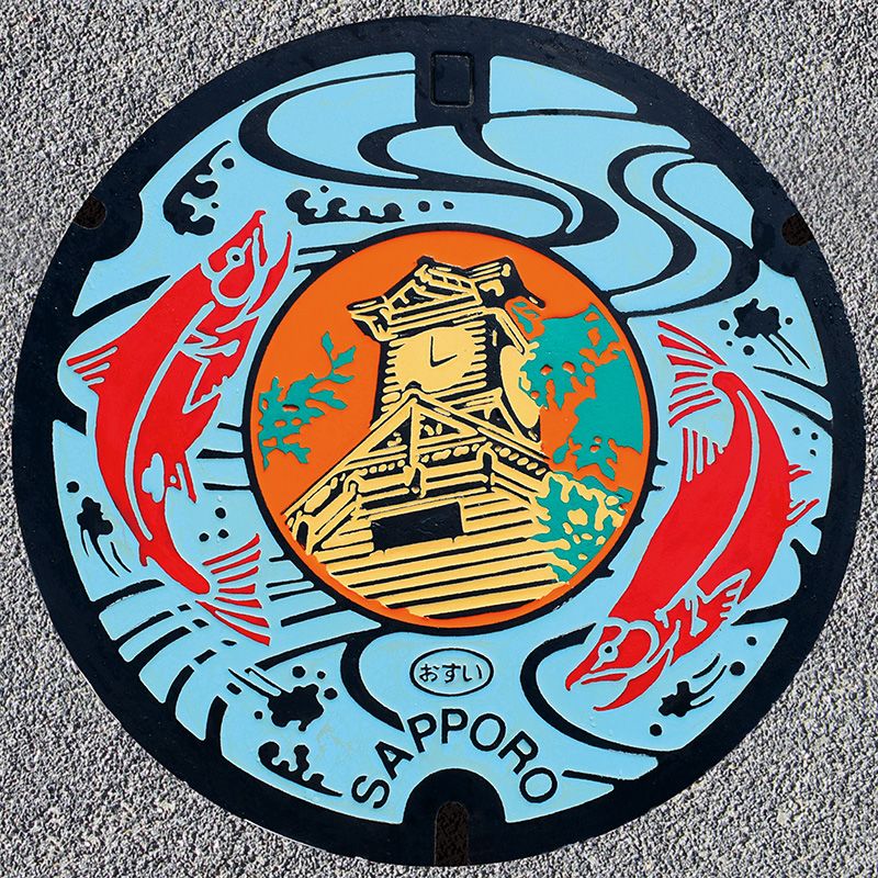
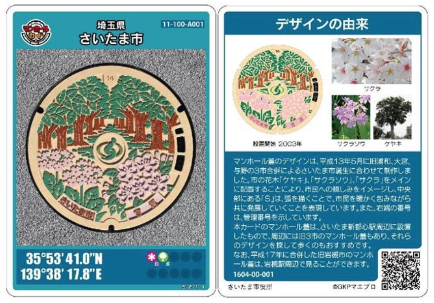
Over in Japan, colorful manhole covers are popular,

in fact so popular that there are sets of collectible cards. These cards have pictures as well as their gepographic coordinates so you can find them.

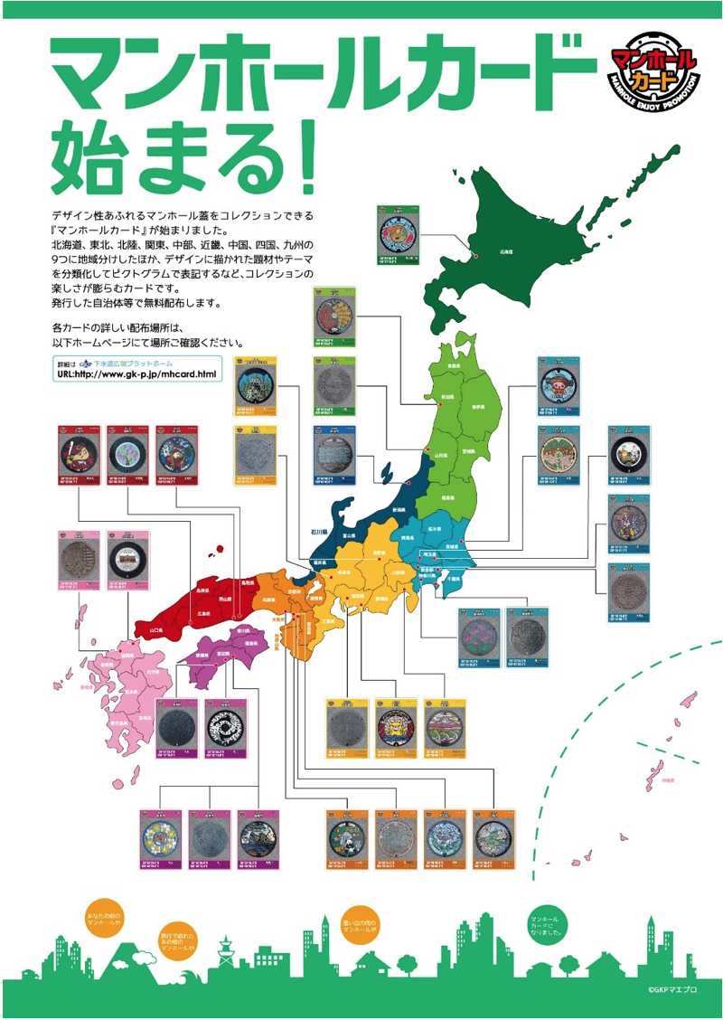
Here is a nice map, via guidable showing the locations of some of these cards. I'd like to be able to say more about this map but I don't know the language.

(Reference: Gesuido Koho Platform)

Wednesday, September 30, 2020

China's Internment Camps

The Australian Strategic Policy Institute (ASPI) is documenting the Chinese government's treatment of Uyghurs and other minorities in the remote northwestern province of Xinjiang. Using open data, satellite images and Chinese government documents they have created an interactive map detailing detention centers (a diplomatic term) as well as showing attempts to erase local culture by destroying mosques and cultural sites.

Here is a detail from the capital region of Urumqi with the legend included.

Clicking on a site brings up details. In this case the growth of a prison where forced labor and "reeducation" are practiced is documented by the number of buildings increasing from 15 in 2017 to 28 the following year.


For more on these detention centers there is a scrollable exploration on the web page.


Wednesday, September 23, 2020

Maps Hidden in Playing Cards

 In World War II The United States Playing Card Company designed cards for POW's in Germany with maps hidden between the paper layers. When soaked in water the cards could be peeled apart and prisoners could see secret escape routes. These "map decks" were closely guarded secrets and few survive, This one from a private collection may be the only surviving example - via Bicycle Cards.

There is a replica deck available on Amazon. The image gives a better idea of what they would have looked like.


Wednesday, September 16, 2020

The Maps of Pauline Baynes


Pauline Baynes was best known as a children's book illustrator. Her work on some of the most well known maps of the fantasy genre is less well known. She illustrated maps of Tolkien's Middle Earth and C.S. Lewis' Narnia.

Map of Narnia for Puffin Books U.K., 1972

After studying design at the Farnham School of Art, she started illustrating children's books. During World War II she joined the Women's Voluntary Service and eventually began making maps and nautical charts for the Royal Admiralty in Bath. This cartographic training served her well through her career. Her work was shown to J.R.R. Tolkien who was dissatisfied with his original illustrator for Farmer Giles of Ham. He was delighted with her work and hired her to illustrate the book.

Map for Farmer Giles of Ham-Pauline Baynes

Through Tolkien she got to know C.S. Lewis and was hired to illustrate and map his Chronicles of Narnia series.

1998 Narnia right book end sheet-via Peter Thorpe

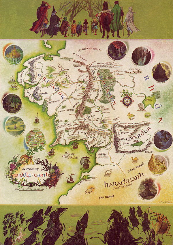
Baynes made a color map of Middle Earth published in 1970. Tolkien supplied her with various charts he made and annotated a map his son had produced for The Fellowship of the Ring in 1954. The annotated map was recently discovered inside Baynes' copy of the books. 


More details on this map can be found here. The finished product is below.

A little nice detail, including the cartouche.

To see more maps and artwork visit her tribute site.