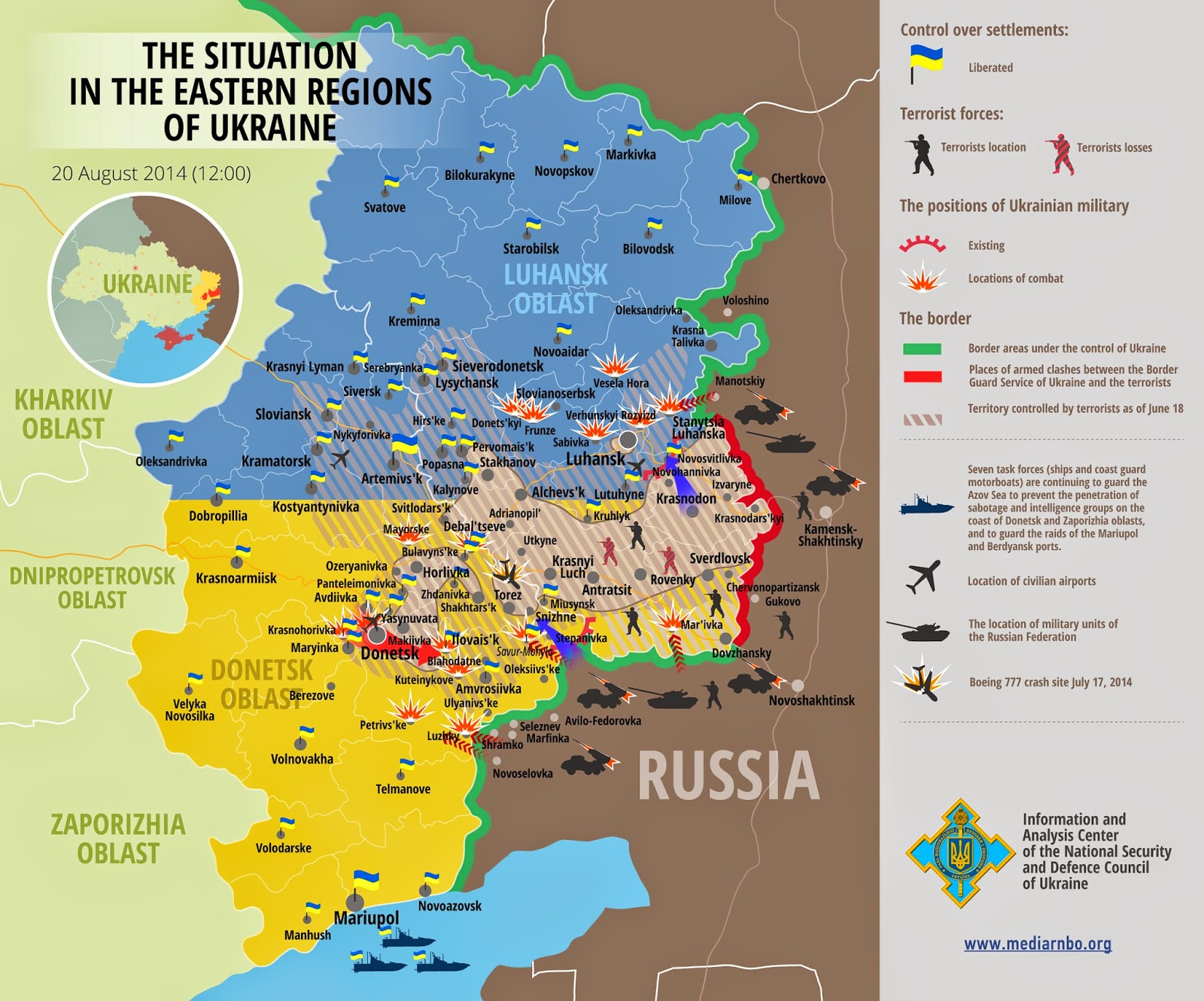
Ukraine's National Security Information and Analysis Center puts out and updates these maps showing the situation in eastern Ukraine. Click to see a larger version.
There's a lot to like about this map. It is busy but they keep it legible by using clean fonts and symbols. The small circular locator map uses a mostly consistent color scheme though the Crimea color is not explained. The legend is also pretty good, though not everything on the map appears in the legend.
Now the bad parts. First there's the obvious language of propaganda. Regardless of how anyone feels about the politics there, the use of terms like "liberated" and "terrorists" dumbs down the map. Then there's the color problems. It's a cute idea to use the blue and yellow Ukranian flag colors to represent the area but it also makes for a communication failure, especially if you don't realize what they're trying to do. After all, most people outside of the region probably wouldn't recognize those as the flag colors. Instead it creates the illusion of two separate regions divided by a curiously straight line. Also, the locator map only uses yellow for this region. One could also ask why the flag colors do not extend to the rest of the country. I guess they are trying to spotlight the eastern oblasts and make sure you know in no uncertain terms that these are part of Ukraine. Also, the use of flags to represent the "liberated" settlements should make this color scheme unnecessary.
The territory controlled by the pro-Russian, or "terrorist" forces is also confusing. Why is some of the area outlined with a background color and some of it just lines or varying darkness? There are also unexplained blue and red arrows and differing flag sizes. I can guess what all of these items mean but I may be wrong.
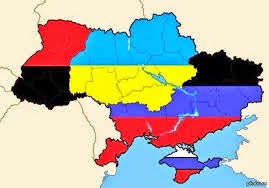
I want to like this map because it attractively conveys a lot of information, but it needs work. Still, it's much better than this ugly thing.


2 comments:
imho 'propaganda' is too strong word for the title.
Most likely you are correct. Thanks for your h. o.
Post a Comment