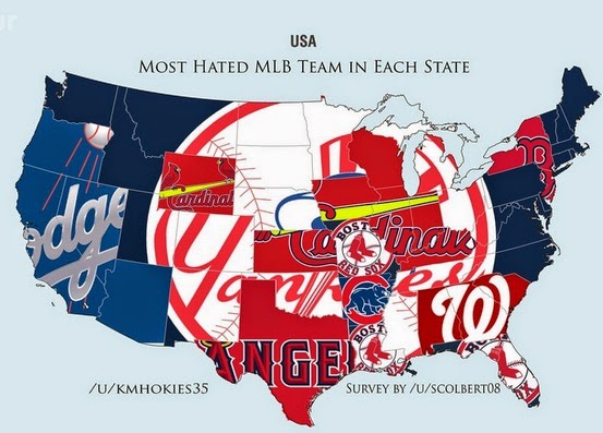
SB Nation put out "hate" maps for the major team sports in the United States. The data comes from asking Reddit users their least favorite team. The sample size is much smaller than the recent New York Times maps showing favorite teams. The data is much less granular (by state instead of by zip code.) Also these maps are not interactive - the NY Times map lets you hover over a county to see the stats. In other words, a much inferior product but since hatred is fun, let's have at it:

The implication here is that everyone hates the Yankees except on the west coast and a few other regional pockets (such as New York.) However, a look at the New York Times map shows that the Yankees are also the default team in most areas that do not have a nearby team.
This shows the problems of making these kind of assumptions. That said, lets assume away! Here's the NFL hate map.
There's lots of great regional hatreds represented here, particularly the fairly recent San Francisco-Seattle rivalry. The Eagles are hated in Texas (no surprise, the feeling is mutual) but Oklahoma too? The logos are cute but make the maps very hard to read. However in the case of the Canadian hockey map, they work quite beautifully.
The very small sample size leads to some wonderful oddities, for example the hatred in Canada's Northwest Territories for the San Diego Padres, or my personal favorite; Africa's hatred of the Winnipeg Jets.
I did not post the NBA maps because they are kind of boring, either you hate the Lakers or the Heat. You can explore this and lots more over at SB Nation.


No comments:
Post a Comment