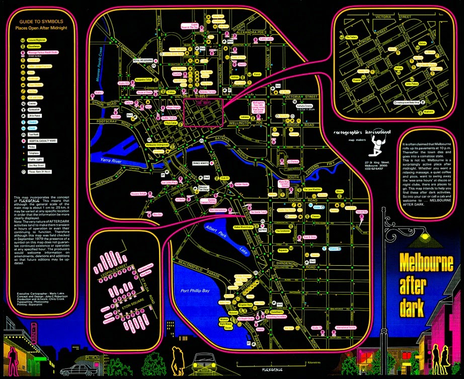
The International Cartographic Association (ICA)'s Commission on Map Design has been posting a map every day this year to highlight examples of great map design. Here is just one of the many maps worth highlighting - there may be more to come as time allows. This is a 1979 map by Cartographics International showing what establishments were open at night in Melbourne, Australia. These color choices were designed to be read at night under the street lights, while also creating a night-time look.
The detail provided on the ICA page shows a happening neighborhood full of places to eat, "massage parlour/health studios" (pink lanterns) and coffee shops. The full map has a couple of areas blown up and pulled to the side, the lower left one appears to be a red light district. The bottom of the map shows some nightlife images that add to the exciting and vaguely sinister feel of the map.
For a good writeup and the original images take a look at the ICA's page from June 25th.


No comments:
Post a Comment