Airline Timetable Images is a remarkably comprehensive collection, compiled from the collections of
Björn Larsson and
David Zekria. I have wasted many hours looking through their collection at vintage airline maps for example, Air Zaire, 1978.
The maps range in style from this highly schematic, barely legible 1970 Air Canada map,
to this geographically detailed schedule from Regie Air Afrique with artistic flourishes,
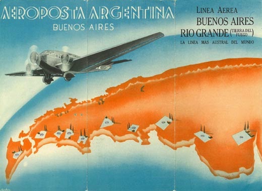
to this artistic take from Aeroposta Argentina from 1937 featuring a curved, oblique view showing airports(?) with their hangars and radio towers, or are those trees?
Click the image for a larger view.
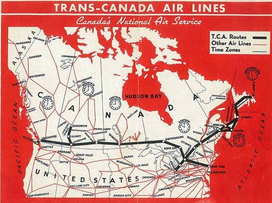
Air Canada's maps were not always this schematic. Here's what it looked like in 1945.
My first airplane trip was in 1972 on Eastern Air Lines, from Philadelphia to Houston with a change in Atlanta. Looking at their map from that year confirms that Atlanta was clearly their hub.
My memories from that flight were the breakfast sausage (we didn't get that at home) and thinking "we must be over Alabama now so those must be the covered wagons" - I had a little confusion as a child about where and when covered wagons existed.
Here is one of the oldest maps from Eastern - 1933.
I wanted to show a current map for contrast but there are not many on the site to choose from. Here is a 2010 map from Emirates with the familiar spiraling lines coming out from the hub (Dubai). This map features an overabundance of detailed topography. The mercator-like projection may be helpful for showing the large number of northern European destinations but also uses way too much map space on Siberia and northern Canada. The map also shows how much more important Toledo (Ohio, not Spain) is than you ever thought possible.
Try this at home! You might find a timetable or map for some of your flights.


No comments:
Post a Comment