Wednesday, September 30, 2015

Africa Re-Imagined

Swedish artist Nikolaj Cyon created this map of what Africa might have looked like if it had not been colonized by Europeans.
http://www.cyon.se/#!alkebu-lan/ck0q
The map uses linguistic, natural and ethnic boundaries. The straight lines that the colonizers drew are conspicuously absent.
The map was cobbled together from various historical maps such as this one from the Geography Department at the University of Dakar.
Other non-traditional aspects of the map include the use of the Hijri Year (AH) from the Islamic lunar calendar, a scale in iterus (an ancient Egyptian unit of measurement), alternate names for the "Ikweta" and tropics, and the orientation  - south is up. For those of us in the northern hemisphere think of colder part at the top and maybe it will make more sense.

Also, note the treatment of Europe, or Frangistan. I think this is meant to show a reverse colonization, but it is not explained on his site.
There are lots of beautiful cartographic touches such as the water lines and the effective National Geographic-style shading of the boundaries. The traditional craft evoking map borders are also nice.

Cyon has an online presentation where you can see more details of the process.

Thursday, September 24, 2015

More on Subway Map PIctograms

Several years back, I expressed my appreciation for Mexico City's Subway Pictograms.
http://mapoftheweek.blogspot.com/2011/05/map-of-week-mexico-citys-subway-station.html
These were designed by Lance Wyman, who also designed the Washington Metro map. There is a 50-year retrospective on his work at the Museum of Contemporary Art (MARCO) in Monterrey, Mexico. Hurry up though! The exhibition ends October 4th.
http://www.marco.org.mx/index.pl?i=1045
Wyman incorporated local elements to create symbols that would also be legible to people with poor language and/or literacy skills. He wanted to replicate his Mexico City icons in Washington.
http://transitmaphistory.com/metromapart/washington-subway/lance-wyman/place-and-space-lance-wymans-retrospective-in-monterrey/
Unfortunately Bauhaus killjoy Massimo Vignelli (designer of famous early New York City subway maps) prevailed on WMATA to remove the icons.
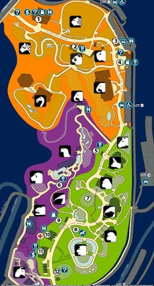
However, his icons were successfully used at the National Zoo in Washington, and you can still see them on their current interactive map.
http://nationalzoo.si.edu/Visit/zoomap.cfm
For more on Wyman and the MARCO exhibit, and the source of some of this info, see Transit Map History.

Tuesday, September 22, 2015

Mapping the Philly Pope-Fest

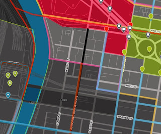
The Pope is coming to Philadelphia this weekend. Security measures include banning cars, closing bridges, transit and schools and building a fence around the event perimeter. To keep track of all this data scientist Lauren Ancona has created the Philly Pope Map showing all available public data.
https://phillypopemap.com
There is also a timeline for the various closures. Here's a zoomed in version.
https://phillypopemap.com/#15/39.9586/-75.1680
There's a bit of an assumption that you know what some of these colored areas are. If you're in the area you probably do but for the rest of us, a legend would be helpful. This map from the Philadelphia Inquirer helps explain the different zones, but doesn't have the same interactive pizzazz.
http://www.philly.com/philly/infographics/321846572.html
If you come in from out of town and you don't want to pay for an over-inflated hotel room, you can pay for an over-inflated campsite at "Francis Fields" in beautiful Fairmount Park. Of course, you'll have to walk the two plus miles each way.
UPDATE: Actually no, you can't - they just cancelled it due to lack of demand for over-inflated camping.
http://www.philly.com/philly/news/pope/20150910_Fairmount_Park_campgrounds_being_set_up_for_papal_visit.html
 Personally, I think I will wait at least a few more weeks before my next visit.

Thursday, September 17, 2015

The Carolina Gold Rush

The first gold rush in the United States was in North Carolina. The Reed Gold Mine in Cabarrus County, east of Charlotte, was the site of the first documented gold find.

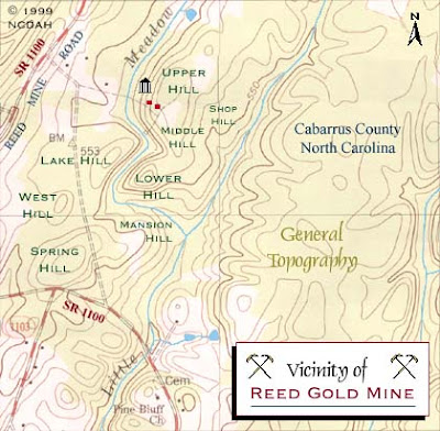
John Reed was a modest farmer when his son discovered a yellow rock in the Little Meadow Creek in 1799. They used it as a door stop for three years until a jeweler from Fayetteville identified it as gold. He offered $3.50 to buy it (a week's wages at the time but only a tenth of one percent of its value) to the unaware farmer. After being duped Reed started mining the creek bed. Within a year, a slave named Peter had found a 28-pound nugget.
http://www.nchistoricsites.org/reed/map2.htm
Reed and his partners were primarily farmers and did their mining in the off-season. As they found more gold they became quite wealthy and mining on the site expanded greatly. The map above shows the mine shafts in blue and houses in red that eventually populated the site.
http://www.nchistoricsites.org/reed/map1.htm

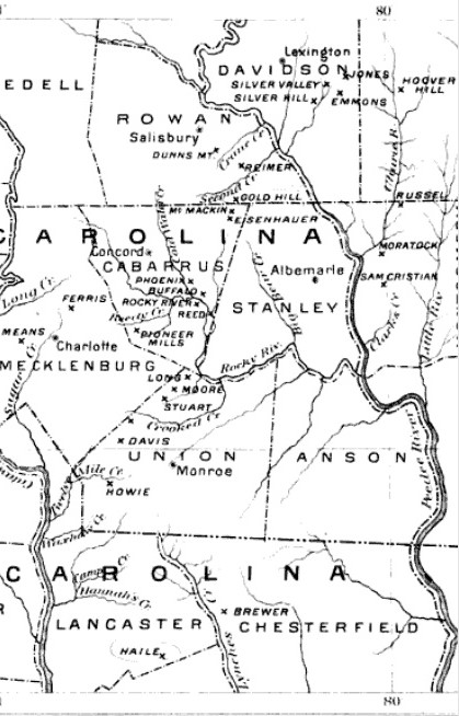
This discovery set off a wave of mining in the early 1800's in what came to be known as the Carolina Gold Belt. North Carolina led the nation in gold production until 1848 when it was eclipsed by the California Gold Rush.
https://en.wikipedia.org/wiki/Carolina_Gold_Rush
The Reed Gold Mine is now a state historic site with historical mining equipment and guided tours of the tunnels-more details can be found at North Carolina Historic Sites.

Wednesday, September 9, 2015

Vintage Campus Maps for Back to School

Here are some interesting old college campus maps to get you into the back to school spirit.
https://www.flickr.com/photos/uwmadarchives/5959328294
Nice details including the florist, Tiffany Gowns and "Ye Olde Fashioned Tea Shoppe." Also, the Harley-Davidson Rent-A-Bicycle. Motorized bicycles?

2. Baylor University  - Among other details this 1939 map shows the supposed 5th Street divide between North and South Campus, a predecessor of the Bearlin Wall. For more details about the Baylor "Civil Wars" see this blog post.
https://blogs.baylor.edu/digitalcollections/files/2015/04/full-map-BU-1939-1jlovsw.jpg
Also - we have a newly painted bench!  And a fire plug!

3. Princeton- via the David Rumsey Map Collection 
http://www.davidrumsey.com/luna/servlet/detail/RUMSEY~8~1~278741~90051805:Princeton-University
This map was made in 1932 by J. Riegel, Jr.,Class of 1912. "Stick yer bun out!"

Wednesday, September 2, 2015

Superior Wooden Bathymetry

Paul Meysembourg, a GIS lab manager at the University of Minnesota Duluth's Natural Resources Research Institute and one of my blog readers was inspired by the Wooden Bathymetry blog post to take his scroll saw and cut out Lake Superior.
He used GIS software to give it a high level of accuracy. In the words of the artist:
Being a GIS guy (about 24 years now, I was inspired to try and cut a much more accurate bathymetry map of Lake Superior since I live real close to it (Duluth, MN).   The ones I've seen are are very artistically done but "laughable" with regards to accuracy. Here's a picture of my just completed map. I massaged the DEM in ArcGIS and brought the individual layers into Photoshop to print them at actual cutting size.
Here's a colorized version.

More from the author
I jokingly will call this "My Old School, Green, Navigation Chart"  By the way, the actual dimensions are about 25w by 13h (the biggest I could get in my scroll saw).  Also, I stack cut them, so I have 2 more - I am going to donate one of them to my workplace to hang in the lobby and the other one I may try and sell, but I am not doing this for money.   Some details:  the frame is made from driftwood my son and I picked up last weekend from the shore in Superior, WI (there's a metric ton of it out there now after the big flood we had a few years ago).  There were about 40 island pieces (some really tiny ones) to cut and glue on for each one and I used seven layers of Birch plywood.  I left the guide paper on the top one before gluing it up but I actually prefer the look of the plain wood.
Last month (six months later) he gave me another update:
After that first attempt, even though I said I wasn't going to do another of Lake Superior,  I've completed another.  This time I stack cut 4 sheets at a time.  I also experimented with "pre-tinting" the whole sheets before cutting so the islands cut-out sections would be the same color.  I used water-based stain in increasingly darker shades.  I also upped the detail significantly since my scroll saw technique was much improved.  The problem with the increased detail was that now I had to keep track of about 90 island pieces (times 4) and then glue these pieces back into the correct location!  Some of these teeny pieces can easily get "vacuumed away" as I tried to keep the saw dust somewhat orderly.  It turns out this fine level of detail is making these more of art project instead of a woodworking project, in my opinion and I've never considered myself to be an artist.

Anyway, after all that work, they turned out rather nice.  I have since sold one that was hanging in a small local art gallery. I sold one on Etsy and I have one hanging in my family room and the remaining ones will probably be gifts.

I am planning on doing more, in the same fashion, but I just ordered a larger, hobbyist CNC router device and I am going to see if I can obtain the same detail level using fine router bits in solid slabs of wood.