Several years back, I expressed my appreciation for Mexico City's Subway Pictograms.
These were designed by Lance Wyman, who also designed the Washington Metro map. There is a 50-year retrospective on his work at the Museum of Contemporary Art (MARCO) in Monterrey, Mexico. Hurry up though! The exhibition ends October 4th.
Wyman incorporated local elements to create symbols that would also be legible to people with poor language and/or literacy skills. He wanted to replicate his Mexico City icons in Washington.
Unfortunately Bauhaus killjoy Massimo Vignelli (designer of famous early New York City subway maps) prevailed on WMATA to remove the icons.
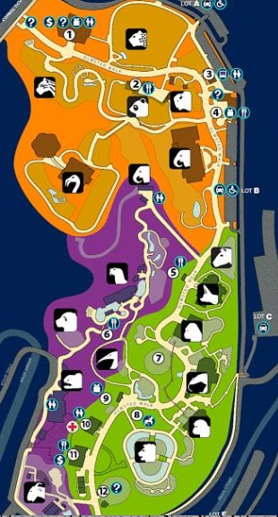
However, his icons were successfully used at the National Zoo in Washington, and you can still see them on their current interactive map.
For more on Wyman and the MARCO exhibit, and the source of some of this info, see Transit Map History.
These were designed by Lance Wyman, who also designed the Washington Metro map. There is a 50-year retrospective on his work at the Museum of Contemporary Art (MARCO) in Monterrey, Mexico. Hurry up though! The exhibition ends October 4th.
Unfortunately Bauhaus killjoy Massimo Vignelli (designer of famous early New York City subway maps) prevailed on WMATA to remove the icons.
However, his icons were successfully used at the National Zoo in Washington, and you can still see them on their current interactive map.
For more on Wyman and the MARCO exhibit, and the source of some of this info, see Transit Map History.


2 comments:
This post made me nostalgic for when Portland Trimet had color/icon zones for different parts of the city. Like this.
So cute and "Northwest-y" Kind of like when we had to design some temporary bus routes at work for school children and we called them names like "Red Octopus" "Purple Platypus" and "Blue Kangaroo" I got to design the icons and that was fun. Kind of like that but not really.
Post a Comment