Wednesday, October 28, 2015

Madrid Subway Complaints

This map shows complaints at subway stations-presumably from some 311-type of database. Complaints are color coded by type and given concentric, proportional symbols. The map is not easy to interpret but it makes for great art.

https://congosto.cartodb.com/viz/e5da12e2-9fe7-11e4-bc43-0e853d047bba/public_map
 The legend is in English, the popups are in Spanish.
As you hover over a station you can see the complaint type and frequency. Multiple complaints show up as concentric circles. The popup depends on what part of the circle you're pointing at. There are no obvious patterns, it seems like each station has its own discreet issues. Some of the data seems a little strange though.
For example,the 866 complaints about a breakdown at Nuevos Ministerios yet no other types of complaints. While most other stations have speed and access complaints (I'm guessing this means problems with tickets, turnstiles and/or maybe wheelchairs) there are none of these complaints here. That must have been one horrible breakdown.

Also, the dark base map is great for artistic effect but makes it hard to see where you are.
This whole thing would be easier to read with fewer categories and bigger circles but it would also be less fun. I enjoy watching how the artistic effect changes as you zomm further out.


Explore the map here.

Wednesday, October 21, 2015

Canadian Election Maps - The Good, Bad and Ugly

I hesitate to criticize another country's election maps but come on! This is Canada - you people invented GIS! I'll start with the ugly and work my way over to the good so I end on a positive note.

Here is the National Post's interactive map.
http://news.nationalpost.com/news/canada/canadian-politics/canadian-election-results-2015-a-live-riding-by-riding-breakdown-of-the-vote
Granted, this is interactive so you can zoom in as needed but still the emphasis on Canada's Arctic waters in the default view makes the smaller places (where almost everyone lives) hard to see. Also, it's ugly, and the Mercator projection makes it uglier and harder to read. Finally, being a conservative paper, all that red must be making their eyes water. Their non-interactive maps are much better (see further below)

BAD: Here is a cartogram from The Star.
http://www.thestar.com/news/federal-election/2015/10/19/how-the-parties-performed-in-each-province.html
 This is a cartogram? So the liberals won the north of every province and the conservatives the south? Compare British Columbia with the interactive version.
The cartogram is interactive. Click a dot and you will see that there is no relationship between its position on the diagram and its geographical location resulting in misleading information. If the goal is simply comparing numbers then the Globe and Mail version is the way to go.
http://www.theglobeandmail.com/news/politics/federal-election-2015/ridings/
When you click on the cells above, the map takes you to that individual Riding (I love that term!) Also, they have a nice list of key Ridings underneath their interactive info.
This map also came from the Globe and Mail - nicer looking, better projection and it includes St Albert among the important cities - what???

On the good side of things the National Post has this excellent graphic that lets you compare the vote from the last three elections.
https://nationalpostcom.files.wordpress.com/2015/10/na1020-election_map_1200.jpg

I like the detailed city maps - except they forgot St Albert!

Wednesday, October 14, 2015

Minneapolis Carto Quilt

The North American Cartographic Information Society (NACIS) begins its annual meeting in Minneapolis today. One NACIS tradition is the Carto Quilt, a cartographic collaboration. Quilt squares are different views of the host city. Here is this year's Minneapolis Quilt.
http://nacis.org/wp-content/uploads/2015/10/NACIS2015_CartoQuilt.pdf
Here are a few close-up details. Unfortunately the resolution won't allow for good legibility.


Hopefully someone at the meeting will take higher resolution images. Better yet, maybe NACIS can put readable (and find-able) versions of these on their web pages.


Wednesday, October 7, 2015

The "Unique" Map of California

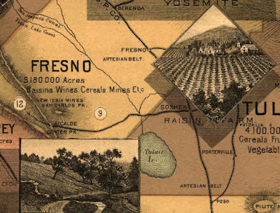
This map, circa1888 is a remarkable exercise in California boosterism.
http://www.loc.gov/resource/g4360.mf000063/
Details include a list of crops or products from each county, pictures of farms, scenery and cultural attractions, railroads and topography. Cities are notably not emphasized.
http://www.loc.gov/resource/g4360.mf000063/
 A nice touch at the top - the Sierra peaks.
 Also - "Big Trees"
There are additional maps showing average temperatures and soils. The soils map is full of cheery optimism about agricultural productivity - "some of this territory is doubtless arid lands. But portions of it once considered irreclaimable are now yielding enormous crops."

I especially like the bit in the lower left corner that shows how many other states can fit into California... 
...because it reminds me of that SCTV skit mocking 1970's Soviet propaganda. Diabolical laughter ensues as more countries are fit into Russia.
https://www.youtube.com/watch?v=1Zm6HzN5YVI
Argentina - "it looks like tiny sausage against a vast, colossal size of Mother Russia!"
BONUS VIDEO! (If the embedded video below disappears then click the picture above for video)

Note the geographical inaccuracy as he places Australia over Kazakhstan and refers to it as "Ukraine."