Wednesday, December 21, 2016

Freak Out!

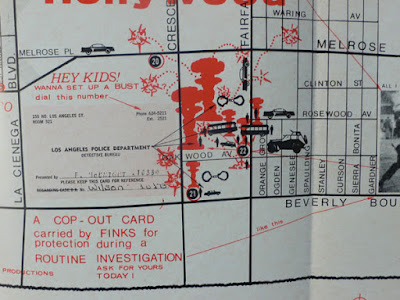
I missed this earlier in the year but 2016 was the 50th anniversary of "Freak Out!" - the first album by Frank Zappa and the Mothers of Invention. Early pressings of the album contained a fake ad for a "Freak Out Hot Spots Map" for visitors to Los Angeles.
http://frankzapppa.blogspot.com/2014/12/the-map-freak-out-hot-spots.html
This map is an extremely rare collectors item and there are not many good images online. RecordMecca once had a copy, but it is listed as sold. Here's a more clear detail  from their page.
http://recordmecca.com/wp-content/uploads/mqc/371_large_3.jpg

It is a basic street map annotated with popular restaurants and clubs as well as areas of police activity or in Zappa's words:
"where the heat has been busting frequently, with tips on safety in police terror situations." 
"See the hapless trustees in their stenciled shirts washing HIS cars. Hear bold Aryan operatives rave about longhair freakos and the last John Birch meeting at 720 N. San Vincente Blvd"
 Other details include the Freak Sanctuary in Laurel Canyon, various numbered ghettos and the cultural desert-an area that roughly corresponds to the Mid-Wilshire neighborhood but may be meant to include the rest of the LA metro area. Also, those weird symbols that look like chess pieces to me are supposed to be atomic blasts and they represent busts by the LAPD. A full listing of the numbered locations on the map can be seen in the Frank Zappa Newspaper.

Thursday, December 15, 2016

Ships Under San Francisco

A recent post on BoingBoing (via FoundSF) shows this map of ships buried under San Francisco's streets.
https://i1.wp.com/media.boingboing.net/wp-content/uploads/2016/12/ron-filion-01.jpg?w=1977
The area that is now the Financial District was once Yerba Buena Cove, a busy harbor teeming with ships during the Gold Rush. Many of were abandoned as the harbor began to be filled in. Recent construction projects have uncovered some of these ships. Here is an 1851 map from the FoundSF page showing the harbor being filled in. The original coastline is depicted as well as the old wharves.
http://www.foundsf.org/index.php?title=File:Downtwn1$1851-cove-map-closeup.jpg
The original map is from 2000 by Roy Fillon. FoundSF does not give details about the source for Fillon's map but they do show a nice, retro-looking adaptation of the map by Sam Manera.
http://www.foundsf.org/index.php?title=Ships_under_Financial_District
The FoundSF article includes links to pages about two of the ships that were converted to other uses, one as a hotel and another as a jail.
http://www.foundsf.org/index.php?title=File:Aframer1$niantic.jpg


Tuesday, December 6, 2016

The CIA is Watching Elephants Too

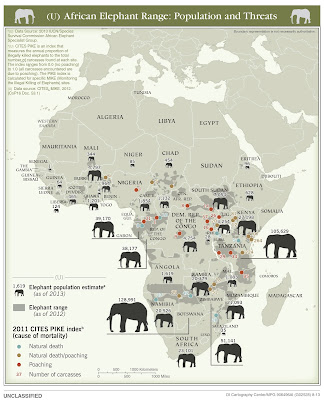
The US Central Intelligence Agency (CIA) recently declassified a bunch of their maps. You can see them on their flickr page. The most strikingly unusual one is this map of elephant populations in Africa.
https://www.flickr.com/photos/ciagov/30249979363/in/album-72157674854391962/
The map is dense with information, yet fairly easy to interpret. Each country is given a 2013 population estimate with an elephant sized accordingly. Elephant range is shaded in gray and places where dead elephants have been found are color coded by the 2011 CITES index-a ratio of natural deaths to deaths by poaching. Areas with heavy poaching have red dots. However, the map might benefit from proportional dots  - below the dot for the 31 deaths is the same size as the dots representing 1.
They also have a well done map showing ivory smuggling figures and destinations based on seizures.
https://www.flickr.com/photos/ciagov/30885483595/in/album-72157674854391962/


Wednesday, November 30, 2016

Under a Black Cloud!

https://www.loc.gov/resource/g4281p.ct000267/
This map is part of a paper addressed to the Republican National Convention of 1884. The purpose was to complain about the Northern Pacific Railroad holding title to "unearned" lands. These lands were granted to the railroad company for the purpose of constructing rail and telegraph links from Lake Superior to Puget Sound. The grants were made in 1869-70. By this date (1883) the company had only built a few small trunk lines, possibly just to keep their hold on the land in black above.

These lands were unavailable to homesteaders as long as the railroad held them. The company was accused of using stealth tactics to hang onto huge amounts of valuable coal and timber lands.
"The head of every true American should hang in shame that hair-splitting Congressmen have been found who, regardless of the duties of their office, have, at the command of their corporation masters, supported this contention by their arguments, their votes and their obstructive tactics."
The paper seeks a clear position of the party. "They do not want meaningless phrases or equivocal expressions, but earnest, honest words and work."
The map shows 40 and 50-mile limits from the proposed main and trunk lines in black as land unavailable to the public-"the crooked, tortuous and angular course of the railroad lines being only parallel by conduct of the Company itself."
Here is the edge of the "black cloud."

Tuesday, November 22, 2016

Tribal Nations Map

Thanksgiving is a time to honor Native Americans, who were here before most of us came over as undocumented immigrants. Aaron Carapella, a self-taught mapmaker from Oklahoma created Tribal Nations Maps. They feature the original names of hundreds of indigenous tribes throughout North America.
In many cases commonly known names of tribes, though in native languages, were given by European settlers. Sometimes these are derogatory names given by rival tribes such as Comanche, a Ute word meaning “anyone who wants to fight me all the time.*”  Carapella  researched the original names and added then to the maps.
There are maps for the continental United States, Canada, Mexico and Alaska. The level of detail varies quite a bit among regions. The Pacific Northwest is one of the most detailed areas.
The maps can be purchased on Carapella's web site. There is a also a high-resolution image on NPR's website.


* source - Encyclopedia Brittanica


Wednesday, November 16, 2016

Hate Trumps Love

Racist incidents have spiked significantly since last week's election. An article in Time Magazine documents many of these. The Trump Hate Map shows that this is not a regional thing but a nationwide phenomenon.
http://americasvoice.org/trumphatemap/
From Time:
“Since the election, we’ve seen a big uptick in incidents of vandalism, threats, intimidation spurred by the rhetoric surrounding Mr. Trump’s election,” Richard Cohen, president of the Southern Poverty Law Center told USA Today. “The white supremacists out there are celebrating his victory and many are feeling their oats.”
I don't normally like to spout off about politics on a map blog but anyone who cares about basic decency ought to be concerned.

Wednesday, November 9, 2016

Here's an Interesting Election Map

I'll be honest - I've been very sick of election maps for quite some time now. For the last four years we (maybe I see this more than non-mappers) have been exposed to constant re-hashes of the 2012 Presidential Election - cartograms, hexagons, county-level, even more detailed, should we make the close results purple, gray or black? 3D? It's kind of a shame because there are interesting cartographic problems and ways to solve them here but the overexposure kills it for me.

Anyway, I saw this map in the Washington Post and it's pretty cool. 
The presentation is a bit complex because there are numerous variables being shown. Each triangle is a county. The height represents the total votes cast while the width at the base is the margin of victory. Bold triangles represent landslides, defined as "50%" - I think this means 50% vote differential. These are most common in the largest cities and smallest rural counties, particularly ones in the rust belt where the election was decided. The typical red and blue color scheme is used.* The rotation with east up was probably done for better web presentation and causes momentary confusion because it looks "wrong".

I like that the red and blue states are subtly colored so they don't overwhelm the important data here. I don't expect this type of map will become popular - the message takes some reading to decode but it's a nice break from the usual maps and mapping debates that we'll be seeing for years to come.
The full map is here - it's the second map, the first one is worth a look too.

* When I first began making election maps in the 1980's, we had blue for Republican and red for Democrat. I think television news flipped this and now we all take these colors for granted.

Wednesday, November 2, 2016

Portland's Floor Plan

My wife recently bought me Portlandness: A Cultural Atlas for our anniversary. Maps were created by students and at least in one case, children. As a result there is plenty of creative cartography to see. One of my favorites is this floor plan, titled "Putting Our House In Order"
https://www.pdx.edu/insidepsu/mapping-portlandness
In order to not run afoul of copyright restrictions, I will only show what is available on the book's web pages. The map is full of clever metaphors - the river dividing the city is the front hallway, industrial zones are bathrooms, Pioneer Courthouse is the living room, downtown the office, and bedroom communities are bedrooms. It is easy to guess the nature of less familiar areas like Alberta (craft room) and Gresham (garage) - I also like that the bluffs are the balcony.

The map also shows up on the cover
You can see the entire map using the "look inside" feature on Amazon.

Friday, October 28, 2016

Torontonian Map of Toronto

Next week the GIS-Pro conference opens in Toronto. To help people navigate their way to and around the area, here is a map from the locals.
http://imgur.com/r/TOmaps/4rTqyxx
Judging from this zoomed in view of the area, you can now take the subway all the way to Lake Simcoe for some weekend foliage viewing. It's also helpful that they built a diagonal road from NYC to Buffalo.
Also, they move the British Isles much closer for your convenience.
Hope this map helps you enjoy your stay!

Wednesday, October 26, 2016

Land of Grated Cheese

This map hangs on the wall of my local cheese shop.
https://bolognauncovered.files.wordpress.com/2012/07/zona-di-produzione.jpg
It shows the "zone of production" for Pamigiano-Reggiano cheese. This includes the provinces of Parma, Reggio-Emilia, Modena and parts of Bologna and Mantua. The map has lots of nice quaint details but is also more geographically accurate than many pictorial maps.
According to Wikipedia, a combination of the morning's whole milk and the previous evening's skim milk are heated in copper vats, as in the detail above. The cheese is cooled, put into a wheel form and washed with brine. It is then aged for 12-30 months before it can be sold in town.
Or worn on your head -
- though Packers fans seem to prefer Swiss.

Wednesday, October 19, 2016

Favorite Maps-Part 3

 Swiss topographic maps have set a standard for cartographic excellence since 1838.

Since the early 1960's these maps have been based on the pioneering relief shading of Eduard Imhof.
Imhof employed the concepts of natural vision where colors of nearby objects are brighter than more distant objects. In the case of a map (from an overhead perspective) the higher elevations get the brightest colors, while the lowest elevations are a grayish blue tint. The map is illuminated obliquely from the left side and is enhanced by contour lines and rock drawings.

 The online interactive version seamlessly integrates raster information (scanned paper maps) with vectors (geodata) to the extent that it is often unclear which you are seeing. As you zoom out, the map seemlessly changes scale, while retaining its beauty.


I am also fascinated with the way they generalize features - as you zoom out buildings and other shapes simplify, merge and eventually disappear. Click below for a more legible image.
You can wander through the Swiss mountains here and/or purchase paper maps here.

Note - this is the last of the "Favorite Maps" series for now but I may have additional installments in the future.

Tuesday, October 11, 2016

Favorite Maps-Part 2

Erwin Raisz - Landforms of the United States, 1957
http://www.davidrumsey.com/luna/servlet/detail/RUMSEY~8~1~231095~5508485
Raisz was a Hungarian civil engineer. When he came to the United States he began working for the Ohman Map Company in New York City where he also taught one of the nation's first cartography classes at Columbia University. Eventually he ended up at Harvard University where he also curated their excellent map collection. His artistic talent, memory, eye for detail and scientific knowledge combined to make a remarkably detailed and beautiful map.
I first encountered this map in 1991 when working on the Historical Atlas of Massachusetts. We used the map as a backdrop for the a graphic showing the geology and ecology of the northeastern United States.
http://www.geo.umass.edu/faculty/wilkie/Wilkie/hist_mass_p3.jpg
 I've been fascinated with this map ever since. Here are some nice details.
He uses some gorgeous hand lettering-especially for the water features. Note the ancient glacial lake shoreline at the western edge of this section. I'm also intrigued by his space saving labeling of smaller cities ("S" for Sandusky, "Y" for Youngstown, etc.) This is one example of the kind of unconventional techniques that make me uncomfortable, but in a good (teaching moment) kind of way.
Another unconventional technique - where the landforms were either less well explored or not available, he created a mostly empty space with the text "Laurentian upland of low hills and many lakes." I find it curious that Mexico is mostly empty, except a small area along the California and Arizona boundaries, while Canada is mostly filled in.
The legend showing multiple features in one box - another unconventional but very successful approach.

 Dramatic landscapes look great...
...but even in mostly flat areas, such as this part of Kansas, he still managed to keep the features interesting.
You can browse this map from the David Rumsey Map Collection.

Raisz created similar maps for regions around the world.
A list of his and purchase prices can be found at the Raisz Landform Maps web page.

Wednesday, October 5, 2016

Favorite Maps-Part 1

People often ask me what my favorite map is. For whatever reason I don't do well with favorites. I don't have a favorite map, or song, book, etc. In attempt to answer I will post three separate maps (possibly more if they come up) that are among my favorites over the next few weeks. The order of these map does not reflect preference. If anything they will be ordered from closest to farthest away.

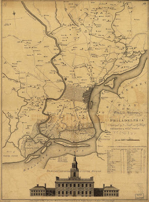
The first map is the one that appears in the header image of this blog. It also appears on my dining room wall. I've discussed this map before in public so some of you have heard my spiel before - sorry in advance for repeating myself.
http://www.mapsofpa.com/18thcentury/1777fadenscullheap.jpg
A PLAN OF THE CITY AND ENVIRONS OF PHILADELPHIA. Surveyed by N. Scull and G. Heap. Engraved by Willm. Faden 1777

Having spent much of my childhood in Philadelphia, this map resonates with me. I like looking at very urban areas I know fairly intimately and seeing them as farms or quaint villages. I realize they were probably not as quaint as they look on the map but it's fun to entertain that fantasy. There are many nice details such as...
The quaint, industrial village of Frankford, now sitting under an elevated subway line. A similar map is shown on a mural underneath the tracks as highlighted in a previous post. As seen throughout the map, homesteads are listed by family name. Many of these names are still prevalent in area place names.
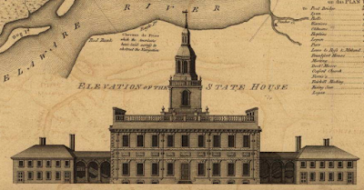
Elevation of the State House (now Independence Hall)
The entanglements laid across the river to disrupt navigation and protect the city in wartime. Also notice the nice flow lines in the river and around the islands. Those of us familiar with the city will also appreciate how much land has been filled in. The river is much narrower now and many of these islands are now part of the mainland. Many of the rivers and channels here are now underground. Also, I like that Red Bank shows up. I was born in Red Bank, New Jersey - a different (much larger) one.
I'm pretty sure that the shaded blocks are what was actually settled and the unshaded blocks were laid out but not yet built.
Point No Point!

Other nice details include forts, swamps. ferries, America's first paper mill, the calligraphy in the title block, and the table of distances to the "moft remarkable PLACES."