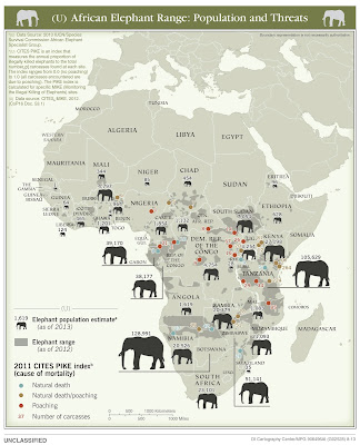
The US Central Intelligence Agency (CIA) recently declassified a bunch of their maps. You can see them on their flickr page. The most strikingly unusual one is this map of elephant populations in Africa.
The map is dense with information, yet fairly easy to interpret. Each country is given a 2013 population estimate with an elephant sized accordingly. Elephant range is shaded in gray and places where dead elephants have been found are color coded by the 2011 CITES index-a ratio of natural deaths to deaths by poaching. Areas with heavy poaching have red dots. However, the map might benefit from proportional dots - below the dot for the 31 deaths is the same size as the dots representing 1.
They also have a well done map showing ivory smuggling figures and destinations based on seizures.


No comments:
Post a Comment