Tuesday, December 18, 2018

What They Drop on New Year's Eve

I made  a map of objects that are dropped on New Year's Eve. It is based on this Wikipedia page. Click for a more readable version 
The density of points in Pennsylvania made it necessary for two inset maps - one focused just on the Harrisburg area, the center of dropping things according to Wikipedia. The high density of points in various locations made this an obvious candidate for an interactive map, so I created one - click the image below to see it. You can zoom in and click on an object to see the town or city and what the object is as that is not always clear. Beware - sometimes the interactive map does not load all points on the first try. If only a few appear, refresh the page.
https://douggreenfield.github.io/NewYearsEve/Newyre.html
Here is a zoomed in view of Harrisburg.
The static map was made mostly using QGIS, the interactive map is via Leaflet using a basemap from CARTO.
Notes about the data on the map
The Wikipedia page that was the source for this map is subject to changes at any time and may have already changed since this map was created. Some of the items listed on that page were either one time events or have been discontinued. These were not included on the map. There are two locations outside of the United States (Bermuda and Canada) that were not included but may be added at a later time. There is an obvious Pennsylvania bias in the results as much of this came from an article in Penn Live - this is also where I first saw some of these and got the idea for the map. See map notes below for how this was handled cartographically.
Mapping Notes
Most points are from canned US cities data sets and are not accurate when zoomed in too far. The locations reference cities or towns and are not meant to represent precise locations of the towns or drop events. In some cases they may be several miles away. The Key West locations were moved slightly so both objects would be readable. There are (at this time, December, 2018) no objects listed in Alaska or Hawaii. This allowed me to zoom the map in and not need the inset maps commonly seen for these states. Instead, I was able to use those spaces for Pennsylvania, which has such dense data that it needed two separate insets, one just focused on Harrisburg. A couple of other areas, particularly northern Georgia are also very dense. The interactive version was created for this problem.

Wednesday, December 12, 2018

Rabbit Proof Fence

Rabbits were introduced to Australia in 1859 by English settler Thomas Austin. According to Austin "The introduction of a few rabbits could do little harm and might provide a touch of home, in addition to a spot of hunting." The rabbit population quickly exploded and caused major damage to crops and pastureland. Staring in 1901 a 1,139 mile fence was built across western Australia to keep the rabbits from migrating from the east.
http://pandora.nla.gov.au/pan/43156/20040709-0000/agspsrv34.agric.wa.gov.au/programs/app/barrier/maps/pages/Rabbitproofmap_jpg.htm

An earlier fence proposal was ridiculed in this cartoon.
https://en.wikipedia.org/wiki/Rabbit-proof_fence#/media/File:StateLibQld_1_197791_Stevenson%27s_wire_fence.jpg
The first fence is the one furthest to the east. It was the largest unbroken fence in the world. Unfortunately rabbits were found west of the original line so a second and then third fence were constructed. By 1907 2,023 miles (3,256 kilometers) of fence were built. This map, via Wikipedia, has each section color coded.
https://upload.wikimedia.org/wikipedia/commons/6/64/Rabbit_proof_fence_map_showing_route.PNG
In the 1930's the fence was used as an escape route for three young indigenous girls back home from a settlement camp near Perth where they had been taken by force. Their route is shown in black above and and the story is recounted in the book Follow the Rabbit-Proof Fence.

Today, much of the shortest fence route still stands (as seen on the map below from 2001) as the State Barrier Fence of Western Australia.  It is used to control emus, wild dogs and feral goats and also serves as a fire break and disease barrier for various animals.
http://pandora.nla.gov.au/pan/43156/20040709-0000/agspsrv34.agric.wa.gov.au/programs/app/barrier/maps/images/fence3.jpg

Wednesday, December 5, 2018

Ukraine's Other Border Problem

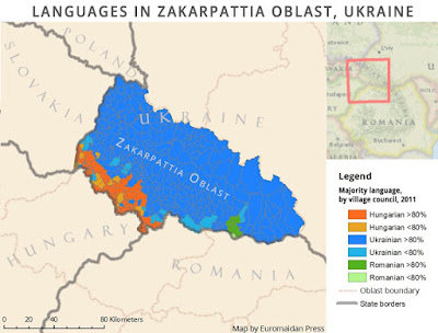
Russia's annexation of Crimea and occupation of eastern Ukraine have been in the news lately with tensions between the countries escalating again. However, Ukraine is also facing agitation on their western border from Hungary. Zakarpattia Oblast, Ukraine's westernmost province has a large ethnically Hungarian population. The map below, via Euromaidan Press,  shows villages that have a Hungarian speaking majority (in orange) on their councils.
https://i2.wp.com/euromaidanpress.com/wp-content/uploads/2017/10/Hungarian_language3.jpg?resize=960%2C730
The Hungarian government, while publicly not seeking to control these areas, has been sending development money and encouraging autonomy for these regions. They have also been issuing Hungarian passports to people living in these areas and some residents have been pledging allegiance to Hungary. Russia has also been actively promoting Hungarian claims to the region. In return the Hungarian government is campaigning to lift EU sanctions against Russia for military aggression in eastern Ukraine. For Russia this is also part of a divide and conquer strategy for the region as a whole.

Prior to World War II, Hungary expanded its borders to include minority areas of all of neighboring states and many Hungarian politicians openly dream of reconstructing this "Greater Hungary"
https://i2.wp.com/euromaidanpress.com/wp-content/uploads/2017/10/hungary2.jpg
Ukraine has helped this instability by passing a language education law that is unpopular with the Hungarians. This spring Ukrainians will vote in presidential and parliamentary elections with the current government hoping to improve ties with the west while Hungary and Russia are hoping to wield their own influence on the country.

More information and maps can be found on Euromaidan Press, and recent commentary can be found on EU Observer.


Wednesday, November 28, 2018

Sarajevo Survival Map 1992-96

25 years ago the city of Sarajevo was under siege. This map shows tanks, targets, tunnels and paths to avoid snipers.
https://i.redd.it/as3e2c5uo5l01.jpg

The Siege of Sarajevo was the longest siege of a capital in modern warfare lasting over four years. Almost 14,000 people were killed.

Here is a detail of the major road, Zmaja od Bosne, aka "Sniper Alley"
The map is mostly encircled with a red line marking the line of control of the Serbian army. The line is broken up at the airport which was under UN control. A tunnel on the far side of the airport linked the city to other areas of Bosnian control. This tunnel is preserved as a museum.
One final detail shows the chaos that existed in the city center.
To browse the entire map at high resolution click here

-via Reddit


Tuesday, November 20, 2018

California Wildfires

Despite the remarkably little press the massive wildfires in California are getting here in the eastern United States, the best sources for maps are from the New York Times and other non-California news organizations. The Times has a fantastic video of the smoke plume over the past week. Unfortunately the code they provided to put it below did not work so here is a small piece of it.
https://www.nytimes.com/interactive/2018/11/16/upshot/california-smoke-map.html
 You can see the entire country here - scroll down the the end of the page. Some of the smoke plumes are shown traveling completely across to the Atlantic Ocean.

Popular Science has a great map showing five years of fires-updated to six including this fire season.
https://www.popsci.com/california-five-year-wildfire#page-2
The best map I've seen showing the current conditions is from the BBC.
The Los Angeles Times has a great graphic (via DigitalGlobe) showing the Woolsey Fire near Malibu. To see some zoomed in views showing specific houses that were destroyed click here.
https://www.latimes.com/projects/la-me-woolsey-fire-progression/static/img/woolsey_overview_natural.jpg


Wednesday, November 14, 2018

Global Hip Hop

Global Hip Hop is an interactive globe that lets you travel the world of rap music.
http://goumprod.com/global-hiphop/
Choose a city or country and pick an artist to listen to.
The music is in the language of the country but the time period and styles are all over the place. It's interesting to see how some artists use elements from their local culture while others sound like rap music everywhere. I'm not sure how they was chosen but there you can suggest your favorite music. One of the authors is Jules Grandin who was featured here previously with ThingsMaps.

Explore here.


Monday, November 12, 2018

All Over the Map Book non-Review

For those of you directed here by TLC Book Tours, there will be no review of All Over the Map today because I have not yet received the book. Books are arriving very late, possibly due to and industry printing backlog.
 The cover looks great, but I have been told not to judge a book by its cover. I will post a review shortly after receiving the book. Stay tuned.


Thursday, November 8, 2018

Armistice and Occupation Map of Germany

A hundred years ago the armistice was signed ending World War I. One of the more interesting maps showing the situation at the time is from New Zealand History.
https://nzhistory.govt.nz/files/styles/fullsize/public/occupation-of-germany-1000.jpg?itok=w3Evv33h
The front line on Armistice Day is shown in purple. The gray area to the east was evacuated by Germany after the Armistice was signed. Yellow areas are parts of Germany that were occupied by Allied Forces. Germany was given two weeks to evacuate the gray area and four weeks to withdraw their forces across the Rhine. Lands to the west of the Rhine were occupied as shown as well as three 30 km zones around the bridges at Cologne, Mainz and Koblenz. These areas were to be occupied for 15 years according to the Treaty of Versailles. However, the occupation was ended a little early,  in 1930.


Wednesday, October 31, 2018

Canada's Declining Caribou Population

Canadian Geographic posted this map as a snapshot of the status of caribou herds.
https://www.canadiangeographic.ca/article/mapping-decline-canadas-caribou
This map, while visually appealing is a little hard to grasp. The colors represent groupings (referred to as "designated units") of caribou species and the text around the map is color coded to these groups.  The circles show the highest estimated population in gray versus today's estimated population, color coded to the designated unit.

In the words of Justina Ray, the president and senior scientist of Wildlife Conservation Society Canada
“We are a natural resource-driven economy, and limits to our footprint is anathema to most. Our system of monetizing does not extend to species. They have no value.”
more details here

Wednesday, October 24, 2018

The Quebec Election Cartogram

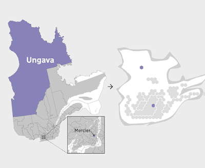
Quebec is a great use case for election cartograms. The map below (via CBC) shows how dominant the cities and suburbs are in population.
http://ici.radio-canada.ca/special/2018/elections-quebec/circonscriptions-resultats-cartes-vote-analyse-politique/
I like how they shaded the shape of the Province behind the hexagons. The geography be unrecognizable without it. The map at the bottom of their page illustrates how one Riding (district), Ungava covers over half of Quebec's area but contains a similar population to a tiny Riding in Montreal.
http://ici.radio-canada.ca/special/2018/elections-quebec/circonscriptions-resultats-cartes-vote-analyse-politique/
In the recent election the conservative Coalition avenir Quebec (CAQ) made huge gains at the expense of the Liberal and Québécois parties. Here are before and after maps. I rearranged the from the side by side view on CBC because the layout of this blog makes it easier to read this way.
Light blue is CAQ, dark blue Québécois red is Liberal and Orange is Québec Solidaire, another party that saw gains in this election. Above is before and below after the election.
Here is the side by side images as they appear on the CBC web page. The comparisons are easier to make when not distracted by the giant low density areas of northern Quebec.


Wednesday, October 17, 2018

Ghastly Halloween Poster Maps

What, where, why? It all started with a software tutorial using data from upstate New York. GIS software packages tend to open with random color schemes. When I brought the data into GlobalMapper, it gave a nice orange and black Halloween palette - the orange below got browned a bit when by Twitter.

Looking around the area I decided that the Syracuse street pattern provided nice, creepy look for a Halloween poster - I will put some boring technical details about the process for these at the bottom so you can skip that part if not your thing.

Next, I thought about spider webs and looked for a city with a nice, webby street (or highway) pattern. San Antonio works-when looking at the regional highway network.
Here's a final one - another S city inspired by my childhood skeleton costume.
Enjoy!

Technical details:
Each map was done using a very different process. For Syracuse I downloaded data from OpenStreetMap, styled it in QGIS using a fiery pattern, then exported an image which I altered using a ridiculous combination of GIMP, Inkscape and Photoshop. If I knew those packages better I could have surely done all that in one but I used the bits and pieces I know from each. I used an online font generator for the title and then styled and altered it a bit in Inkscape.

For San Antonio, instead of downloading the data, I made a screen shot from OpenStreetMap and then used Photoshop to select and remove certain colors, then manipulated it in Inkscape with various spider web pattern fills.

Seattle was mostly done in Photoshop by manipulating layers and tracing the major roads from a screen shot with bones. The background is a knee x-ray image that I smudged to fill in the non-knee-like areas of the city like West Seattle and Magnolia.

Thursday, October 11, 2018

Cha if by Land, Tea if by Sea

There's a very interesting post on Quartz, titled Cha if by Land, Tea if by Sea: Why the world only has two words for tea. Actually, its only one word, represented by the Chinese character 茶. This character is pronounced in most of China as "chá" but in the coastal provinces where the Dutch traded, it is pronounced "te". The Dutch brought tea back to Europe on ships where variations of the word were spread, while overland trade to other regions led to variations on chá, such as chai.

https://cms.qz.com/wp-content/uploads/2018/01/tea-map1.png?w=2520&strip=all&quality=75
The map above was clipped to fit this page better. To see the entire image with legend and credits click on it. Blue dots are variations of "te" based on the Min Nan (south coastal Chinese) dialect while magenta dots are variations of Sinitic (common to most forms of Chinese) dialects. There are a few scattered gray dots where other local words are used. These are mostly in native tea growing regions, where the crop developed independently.

 Countries along the Silk Road trading routes, as well as parts of East Asia and East Africa have "chá"-like words for tea while most of Europe uses "te"variations. Eurpoean exceptions include Portugal, whose trade was conducted through Macao, where chá was used, the Basque region, possibly due to proximity to Portugal, and parts of Eastern Europe where trade was likely to have been from overland routes.

For New Zealanders, who may be upset at the omission from the original map (wider maps show up less clearly in this format), here you go:
 

Wednesday, October 3, 2018

The Wealth of African Cities

Africa's economy is growing rapidly as are its cities. Population projections for 2100 show Lagos. Nigeria becoming the world's largest "megacity" with a population reaching over 88 million. This video shows the predicted top 20 cities in 2100, the top three will be in Africa. A map, via Visual Capitalist shows where private wealth is concentrated on the continent.
http://www.visualcapitalist.com/map-cities-hold-africas-wealth


Wednesday, September 26, 2018

Huge North America Pictorial

Last night, thanks to the Leventhal Map Center in Boston, I had the opportunity to see Anton Thomas discuss his amazing map project that has been four years in the works.
We all got to look up close at a copy of the map (from stitched together photographs of the original) as seen above. Magnifiers were also provided.
The photos above were taken with my phone under poor lighting conditions. Here is a detail from his web page to get a better sense of the map.
https://www.antonthomasart.com/the-north-american-continent.html
The project started with a drawing on the refrigerator in his apartment in Montreal. He recently visited and confirmed that the fridge is still there though it barely works.
https://www.antonthomasart.com/uploads/3/7/0/5/37051787/h-fridge-montreal_orig.jpg
Before embarking on the current map he did one titled South Asia and Australasia.
https://www.antonthomasart.com/uploads/3/7/0/5/37051787/8899799.jpg
There are lots of amazing details including the cityscapes, flora and fauna and music and he spent a ton of time researching each place. Below the Chicago skyline there is a guitar with music coming out of it - specifically the notes and rhythm of "Sweet Home Chicago."
Here is a picture of him showing a collection of bears and moose that he drew in various locations.
One of his challenges is what to do when an area is devastated by an earthquake. Here is Haiti with some of the major buildings of Port Au Prince ghosted in.

If you're interested in digging deeper, here is a video where he describes his process.

Thursday, September 20, 2018

Earth Animations

Earth is a project from Cameron Beccario showing a wide range of climatic conditions that can be animated. Here are the winds animated from Hurricane Florence as it made landfall on September 14th.
At the same time an even more intense Typhoon Mangkhut battering the Philippines.
You can choose to look at air or ocean currents, waves, water and air temperatures (at different heights)  and various other factors. You can even switch map projections. Here are ocean waves using the Waterman Butterfly projection,
and ocean currents in the North Atlantic, looking very Van Gogh-like.
Data are from various global sensors, the geographic data comes from Natural Earth. The visualizations are created in the browser using javascript programming. The color schemes are intuitive enough that no legend is required. Here is the three hour precipitation accumulation over North Carolina from the hurricane.
Another option is the probability of seeing an aurora.
Explore more here


Wednesday, September 12, 2018

Boston's Highway Dreams

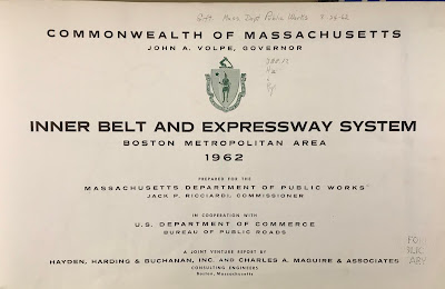
Recently I went to a meeting at the public library in Medford, Massachusetts. With some time to kill beforehand, I browsed their map collection and came across this atlas put out by the state (excuse me, Commonwealth) in 1962.
It shows the existing and proposed highways. Here is an optimistic assessment of the reduction in travel times that would result from the proposed expressways.
The green lines are the travel times in 1945 while the red lines are the forecasted times in 1975 after the highway system was expected to be complete. Dotted gray lines are the proposed highways, most of which were never built due to a combination of powerful local opposition and budget constraints. Note how the red lined areas expand along these corridors. With or without expressways the notion of getting downtown within 15 minutes from most of the area below is very quaint.
The plans included a central ring, the Inner Belt or Interstate 695, that was to be built through neighborhoods of Boston, Brookline, Cambridge and Somerville. There were also proposals for a northwest expressway connecting Route 3 to I-695 and one for the Southwest Corridor alignment of Interstate 95.
Much of the housing along the Southwest Corridor was cleared for the highway by the time the project was cancelled. This land was repurposed for a linear park with a transit route for the MBTA Orange Line and Amtrak's Northeast Corridor. Yes, the Southwest Corridor became part of the Northeast Corridor. Here is a detail showing an area of Roxbury that would have been traversed by I-95.
I'm not sure what the orange-green color scheme is for but it clearly shows how the neighborhood would have been split - like an Atlantic Record.

Here is the interchange between 95 and the Inner Belt. This map has south at the top so it's disorienting. Even more so because so much of this neighborhood was wiped out without the highways being built.
Finally, a detail that hits close to home because it is close to my home - the never built Northwest and Route 3 Expressways.