Wednesday, January 31, 2018

Map Acquisition Syndrome

Map Acquisition Syndrome - is there a cure? I have been given so many maps by people clearing out their apartments that it has overwhelmed my filing system. Many have been sitting in shopping bags for a year now while I figure out what to do with them. Here are some paper maps people have foisted on me knowing I can't say no. This is therapy-before I file them away I need to show off my bounty.

Insight FlexiMap of Budapest - so shiny it's hard to get a good picture.
For contrast here's the Budapest tourist agency map  
Details from the shiny flip side of the Insight map - the road to Lake Balaton and the Metro
 
Rand McNally map of Italy-an undated map from a Fodor's travel guide. The credits mention a Stuttgart office that no longer seems to exist. 
Here is a newer Fodor's map of Naples. This one produced by the British map company Lovell Johns.
Old Quebec - a nice pictorial map  
"Marco Polo" map of Russia. These maps come with stickers so you can mark places of personal interest. 
Same company-Thailand, Vietnam, Laos and Cambodia. Note the delicate task of naming Saigon. 
Official City of Rome tourist map with pictorial details.
Monte Carlo tourist agency map
Bilbao Turismo
Bilbao Transportes 
AAA map of Tucson
Sorry for the poor quality of some of these pictures. I don't have a professional map photography setup. There are many more - stay tuned for another installment.

Wednesday, January 24, 2018

The Four North Poles

There are many interesting facts to unpack from this excellent map by Chris Brackley, cartographer for Canadian Geographic
The map was featured in the March/April 2017 issue and on their best maps of 2017 page. It accompanied an essay detailing the history of claims in the Arctic region. The exclusive economic zones (200 nautical miles offshore) are shown for Canada, the United States, Russia, Norway, Iceland and Denmark. It also shows the huge amount of sea ice lost since 1974.

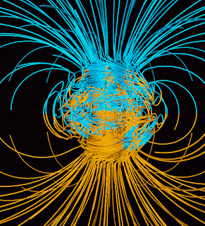
Four north poles are shown. There is the geographic pole (the center of rotation and northernmost point where longitude lines converge) and the magnetic north pole, where magnetic needles become vertical. There is also a Geomagnetic North Pole. This is where magnetic north would be, if the earth's magnetic field was a straight line from the core to the surface of the planet. Instead magnetic poles are driven by convection currents within the earth's molten iron core. Magnetic poles wander more than geomagnetic poles. The movements of both poles since 1900 are shown on the map above. The best explanation I have found for the difference between Magnetic North and Geomagnetic North is on this page from StackExchange, and includes this cool yarnball of a diagram.
The blue lines point towards the earth's core, while yellow lines point away. 

The fourth pole is the pole of inaccessibility. This the most difficult to reach point. In this region it refers to the spot in the Arctic Ocean furthest from land.
Remember back in the early 1990's when you could reach Magnetic North by land? Those were good times!

Wednesday, January 17, 2018

Extermination of the American Bison

Artist David Buckley Borden created this wonderful, sad map showing the demise of the bison.
http://davidbuckleyborden.tumblr.com/post/85623204515/american-bison-extermination-map-digital

Borden adds many clever touches to his maps including the downward facing buffalo head.
The map is based on conservationist William Hornaday's 1889 map that showed the declining range of the bison throughout North America. Hornaday is credited with preserving the bison from extinction. The present day (2003) tiny distribution of bison herds is shown in the tiny upside down* map in the bottom right corner.

Hornaday's original map is also quite striking.
https://digital.library.cornell.edu/catalog/ss:3293847
 Here is a detail-you can click on the map above for a full, zoomable version.
*The upside down map is a theme of Borden's. Here is a detail of his Ecological Distress Hydroscape Map. I like the clever use of arrows to indicate distress points-including the City of Ecological Sin.
http://davidbuckleyborden.com/wild-west-at-bodega/
In Borden's words:
No disrespect should be shown to the map of the United States of America; the map should never be displayed with the Great Lakes down, except as a signal of dire distress in instances of extreme danger to life, property or landscape.

More of his maps can be seen on this page.

Wednesday, January 10, 2018

Trip Happy

TripHappy, an online booking site created some nice visualizations, showing trips planned using their online booking tool.
https://triphappy.com/blog/world-drawn-by-travelers/21#viz-instructions
Points represent stops along a travel itinerary. Land and water are removed to emphasize the patterns. They are colored based on clusters - places that show up on the same itineraries. The pattern in the Western Hemisphere is unremarkable but the Eastern side has some interesting clusters. Northern and Eastern Europe cluster together. Southeast Asia is more connected to Australia and New Zealand (left off the image below due to space constraints) than to China, and Russia is connected to parts of the Middle East.
There are also some interactive graphics showing the number of trips per city and country. One bug is that each city is listed by country name instead of city name.
These interactive visualizations were created using Tableau Public, which I don't know much about but seems to have some great visualization tools. Finally, here is a map showing country connections though without any other geographic aids just looks like one of those rubber band balls.
The list below it explains the connections better. Here the most connected countries.
    1    Hong Kong to China
    2    Brazil to Argentina
    3    Tanzania to Kenya
    4    Macau to Hong Kong
    5    Macau to China
    6    Netherlands to Germany
    7    United Kingdom to France
    8    United States to Canada
    9    Uganda to Congo
    10    Germany to Czech Republic
    11    Thailand to Cambodia
    12    France to Spain
    13    Vatican City to Italy
    14    Turkey to Greece
    15    Germany to Austria

To see the maps, visualizations and more details click here.

Tuesday, January 2, 2018

Snark Map

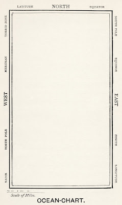
It's nice to start a new year off on a clean slate so here is the map of the ocean from Lewis Carroll's nonsensical poem "The Hunting of the Snark."
https://upload.wikimedia.org/wikipedia/commons/6/60/Lewis_Carroll_-_Henry_Holiday_-_Hunting_of_the_Snark_-_Plate_4.jpg
The poem is divided into eight "fits"-  the map is described in the second.
He had bought a large map representing the sea,
   Without the least vestige of land:
And the crew were much pleased when they found it to be
   A map they could all understand.

"What's the good of Mercator's North Poles and Equators,
   Tropics, Zones, and Meridian Lines?"
So the Bellman would cry: and the crew would reply
   "They are merely conventional signs!

"Other maps are such shapes, with their islands and capes!
   But we've got our brave Captain to thank
(So the crew would protest) "that he's bought us the best—
   A perfect and absolute blank!"
This was charming, no doubt; but they shortly found out
   That the Captain they trusted so well
Had only one notion for crossing the ocean,
   And that was to tingle his bell.

The poem was published on April Fool's Day in 1876. Artist Henry Holiday created nine illustrations for the poem, including the map. His text along the margins is interesting. Cardinal directions are as expected but the positions of the equator and poles are random. He also included geographic concepts such as Zenith, Nadir and Equinox as if they were places.

The entire poem can be found here.