Wednesday, August 28, 2019

The Battle for Germany, 1944

My wife found a treasure trove Life Magazines from the 1940's on the curb. The issue from 75 years ago today has some excellent maps showing the war situation.

In addition to this overall map are three maps showing greater details of the western, southern and eastern fronts.
A zoomed in view shows the slow movement of the line of Allied control in Normandy between June 6 and August 18th, 1944.
The Southern Front map shows the recent landings in southern France.
The simple and clearly readable topography is a nice touch. Here is the Eastern Front.
Here is a little detail with the August 18, 1944 battle line clearly shown.

Getting Personal at the La Jolla Map Museum

For a final post of my Spring visit to the La Jolla Map & Atlas Museum I want to spotlight a few maps that are interesting to me for various personal reasons.
Photo courtesy of the La Jolla Map & Atlas Museum
This map by William Faden shows the movements of George Washington's troops against the King's army in New Jersey in 1776 and 1777. Faden's 1777 map of Philadelphia hangs on my wall and part of it appears on the header image at the top. The New Jersey map has lots of bits of historical information but this less important detail in the southwest corner is what interests me the most.
My childhood home is at the bottom of the map, just a little south and east of Middletown (now Langhorne, but the surrounding area is still Middletown Township). We would often take the drive to Newtown to get ice cream and visit the stores. It was a nice country drive to a nice little town. Newtown is still a quaint olde towne but is now surrounded by a partial beltway and a sea of ugly (IMHO) housing developments. I like seeing this view of Pennsylvania before runaway development.

Woodblock map of Edo (Tokyo) ca 1840 from the Shogun period.
Photo taken at the La Jolla Map & Atlas Museum
I have always been fascinated with Japan and especially Tokyo. I also love woodblock maps and all the tiny details found within them.
There is a detail page on this map on the museum's web site.

I took this photo and then rotated the map, out of habit of wanting to see north up. The map is actually reverse "oriented" with west at the top. My rotation was a kind of accidental mistake but I've left it this way because it fits the blog dimensions better. Here is the description from the museum's page.

"beautiful woodblock map of Tokyo from the golden age of Japanese woodblock map printing. Combining the elements of traditional Japanese map-making: rice paper, woodblock printing, delicate application of colour, the inclusion of topographical views into the map proper, and all text seems to radiate from the centre of the map; with a more modern western-influenced directional orientation with north to the right of the image. "  
Here is a bird's-eye view of Avalon on Santa Catalina Island in southern California. I've never been there and I don't know exactly why this map speaks to me. It just looks like a warm, welcoming town nestled in among the mountains - probably with crazy high real estate prices.
Photo courtesy of the La Jolla Map & Atlas Museum
Downtown detail.
The map is surrounded by images both real and fanciful of seals, buffalo, mermaids and people having all kinds of recreational fun. Here is one showing the road signs.
This last item is of interest due to its uniqueness. It is a display case used by Folsom Brothers to sell real estate in San Diego.
The case folds closed like a suitcase to carry around. The map is a relief map showing the topography in detail.
Here is the handle just west of Point Loma


Wednesday, August 21, 2019

Mapping the Slave Trade

Four Hundred Years Ago this month, the first African slaves arrived on the shores of what would become the United States. The Pulitzer Center's 1619 Project seeks to reframe the history of the United States by using this as a foundational date in the nation's history. This Sunday's New York Times Magazine is a special issue on American slavery.

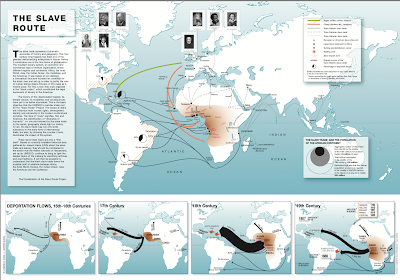
The United Nations Educational, Scientific and Cultural Organization (UNESCO)'s Slave Route project features a good map of the trade. Click below to load at higher resolution.
http://www.unesco.org/new/fileadmin/MULTIMEDIA/HQ/CLT/pdf/MapSlaveRoute.pdf
Map via UNESCO
The black arrows show human trafficking while colored arrows show the "triangle trade" routes where sugars, tobacco, coffee and cotton were brought from the colonies to Europe (green arrows) and weapons and jewelry (orange) were brought to Africa. Dashed lines show extensive overland and sea routes throughout Africa and Asia.
The smaller maps below show trade volumes of deportation through the centuries. The 17th Century map shows the first, relatively small numbers of slaves sent to the Jamestown Colony.
Map via UNESCO
By the 18th Century that number had grown tremendously.
Map via UNESCO
The numbers shrank for the 19th Century as importation of slaves was outlawed in the United States 1807.


Thursday, August 15, 2019

Woodstock in Maps

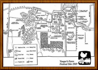
While watching a documentary on PBS about the Woodstock Festival on its 50th Anniversary, I noticed an intricate site map. The site was spread out and I imagine one could get lost easily-especially if under the influence of drugs or alcohol.
This appears to be an official map - via the Woodstock Preservation Archives.
http://woodstockpreservation.org/Gallery/SiteMap.jpg
I dig the legend - it's groovy! Also, good to know where the barbed wire is.
Here is another map that was used at the festival.It came from an underground magazine called "Rat" and is available at WorthPoint.
https://thumbs.worthpoint.com/zoom/images1/1/0618/15/original-woodstock-music-festival-map_1_b725d8fc0d79ed3f6fe1b01305d92ca6.jpg
The map has a "Survival Guide" printed on the side and many nice details,
in addition to another carefully done legend. It even shows the outhouses though that may be a generous description of the porto potties on the site.
Finally, here is the cover of the East Village Other showing a nice, fanciful map of the area and some nice psychedelic details like birds with instrument heads and women being squeezed out of Gleem toothpaste tubes - via Barron Maps.
http://www.barronmaps.com/wp-content/uploads/2019/07/10601-The-East-Village-Other-Aug-13-1969-Woodstock.jpg


Monday, August 5, 2019

Terms of Sale

Laphams Quarterly created a nice map showing how words have evolved through centuries of trade.
Items documented include whiskey, cotton, ivory and tomatoes. As an example the word for tomato has its origins in the Nahuatl language. It spread to much of western Europe and Africa with a similar name. However, the Italians started calling it "golden apple" (pomodoro) and variations on this word spread to eastern Europe and central Asia as seen in the red arrows.
The map also documents the dual words for tea referenced in a previous blog post- variations on cha from land trade and te variations from overseas trade.