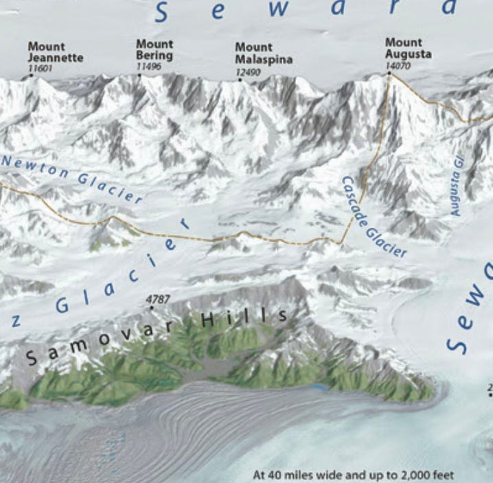
In last week’s post I reviewed Volume 7 of the Atlas of Design. As an occasional cartographer I have been interested in how topography is represented in maps for a long time. This atlas volume provides many contrasting examples. From the “cartographic realism” of Tom Patterson’s Malaspina Glacier map,
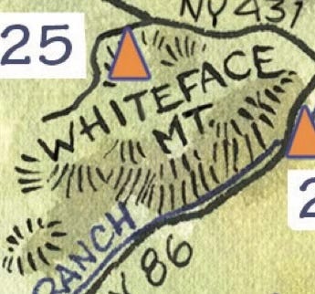
to the sketchy, hatchy peaks of the Adirondack Paint Map (with added shading),
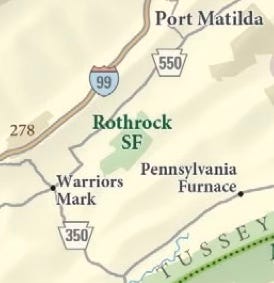
to the very subtle shading of the Purple Lizard Maps recreation map of Pennsylvania.
There are quite a few very different approaches and this post will be more about appreciation than technique. I wish I could speak more about the processes used but I know little beyond using the standard hill shading algorithms in mapping software and one or two not very successful tries at using Rayshader. I suspect these techniques were at least partially used in many of these maps but there are many artistic flourishes these cartographers have used.
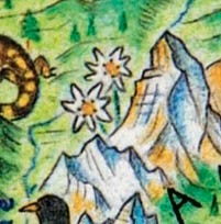
Wild World by Anton Thomas is pure art with computers only used to position features. Here is his drawing of the Matterhorn in Switzerland.
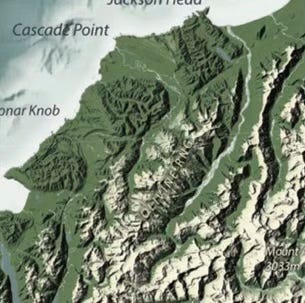
Ian Reese’s Aotearoa/New Zealand Map used many layers and blending modes between them to get his semi realistic look.
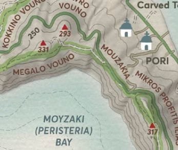
For the Santorini Islands map Spyridon Strides uses contour lines combined with shading.
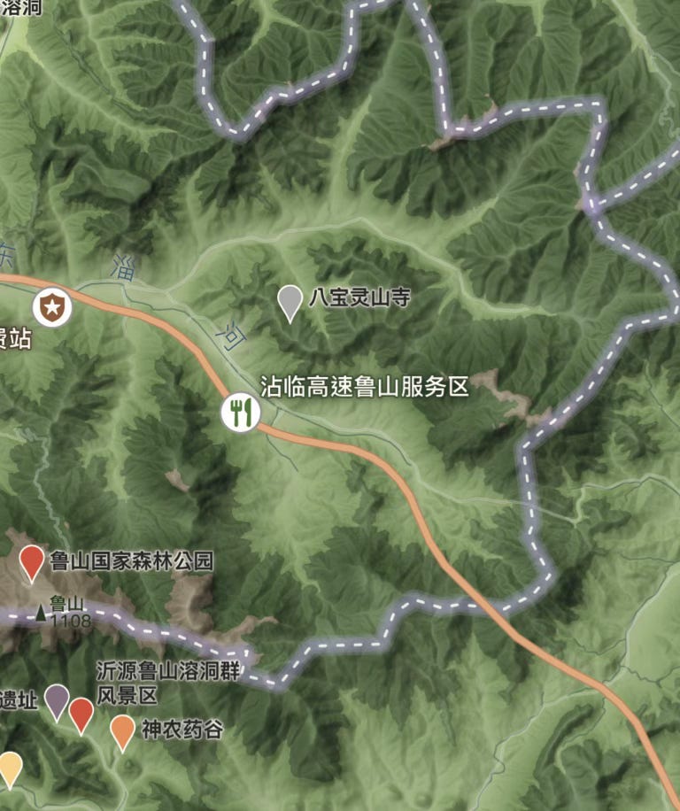
The Zibo Map of Culture and Tourism uses a mixture of colors and shades to create a green fuzzy effect.
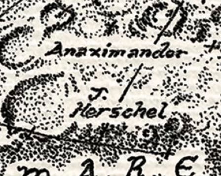
How do you represent terrain on the moon? In this case with well placed dots.
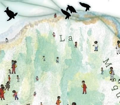
The “Centroamerica se mueve” map uses subtle watercolor effects.
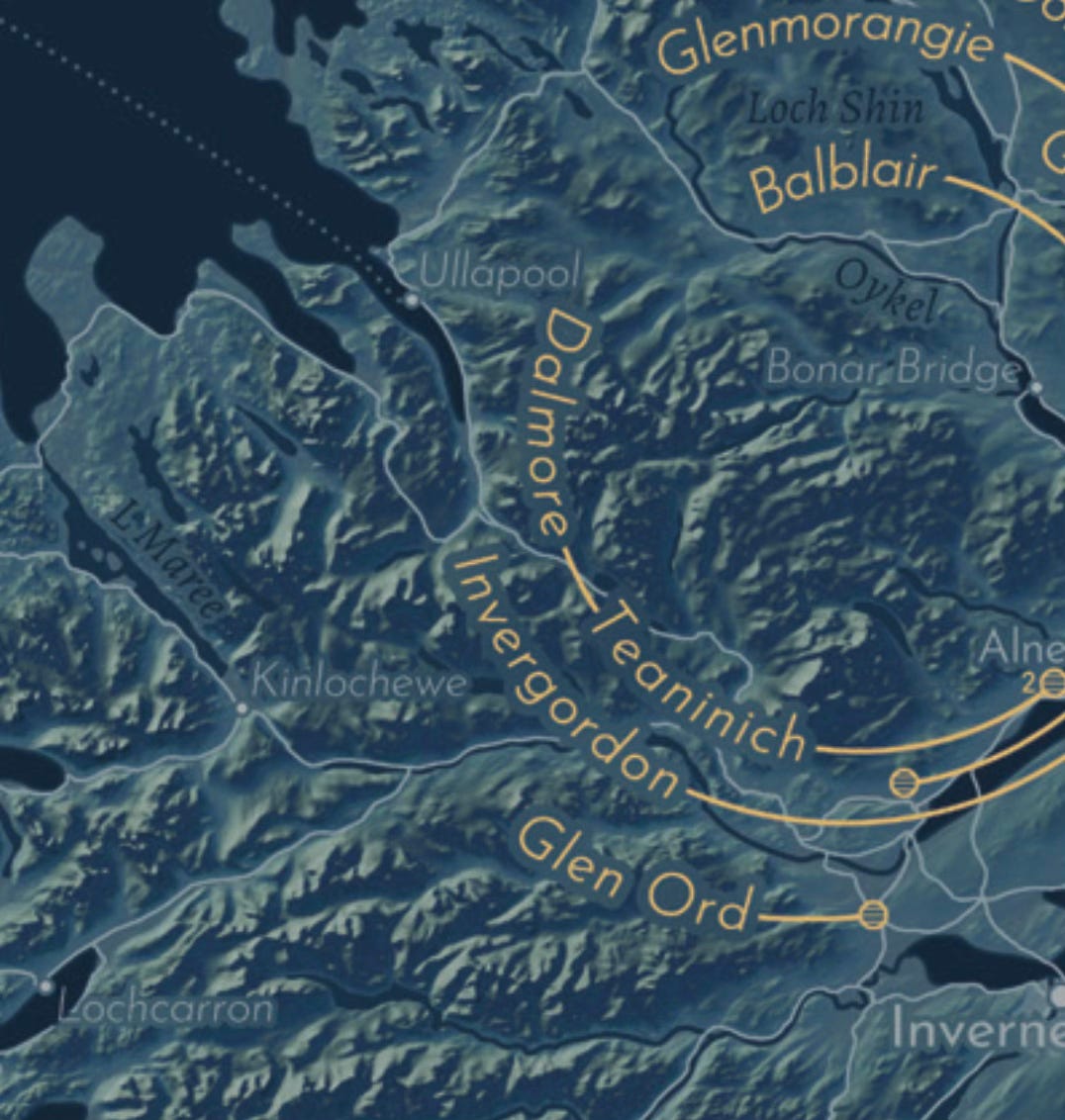
The map of Scotch distilleries uses a “layered pie” overlay of hill shading colored in a blue to gold gradient with some mist to add depth to the lowlands.
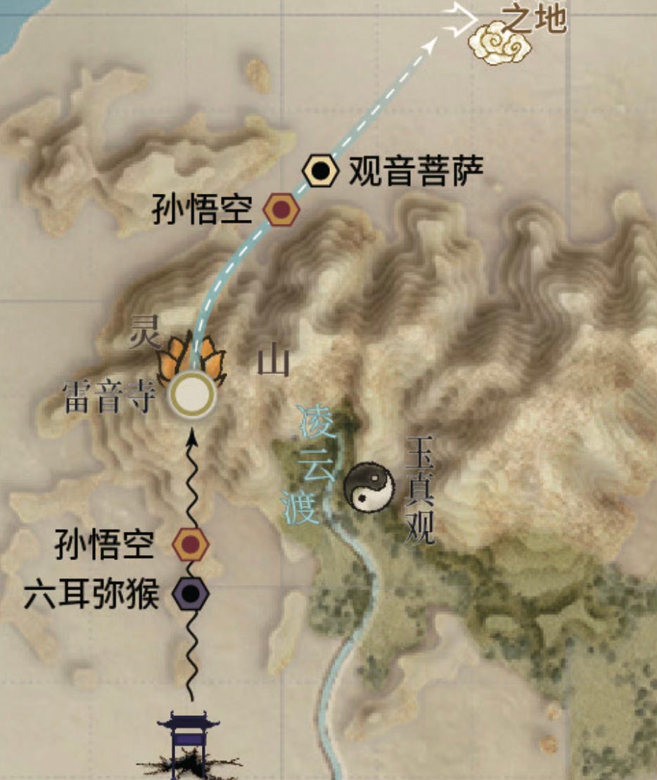
The Journey to the West map uses an interesting layer cake look with a contour and shading combination. Though it does not look as realistic as some of the above examples, I like the effect.
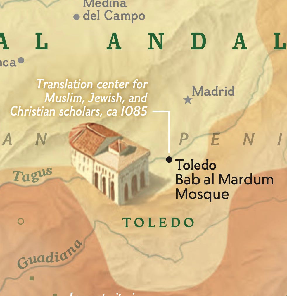
Finally, “Spain’s Muslim Era”, made for National Geographic uses a very subtle hill shading in order to not compete with all the other dense information typical of NatGeo maps.


