Monday, June 16, 2014

Quest for Nevada Begins!

Train just pulling out of Denver. According to the Amtrak status map it's going to be a windy route.


Wednesday, June 11, 2014

Continental Divide Interrupted

In the Teton Wilderness of northwestern Wyoming the Two Ocean Pass creates a small hole in the Continental Divide. North Two Ocean Creek flows across a ridge and then splits into two distributaries, Atlantic Creek and Pacific Creek. Atlantic Creek flows into the Yellowstone River, then to the Missouri and Mississippi Rivers, Gulf of Mexico and Atlantic Ocean. Pacific Creek goes to the Pacific Ocean via the Snake and Columbia Rivers.
This joining of waters allows fish such as the cutthroat trout to migrate across the divide, from the Snake River to Yellowstone Lake (source National Park Service.)

There are several other gaps in the Continental Divide as shown on this map. 

The areas with double red lines are endorheic basins. They do not drain externally-water flows into swamps, the ground, or it evaporates. The Great Basin (in brown above) is a large example of this. I plan to travel through there next week and may have more details about that region.

There are a couple of other places where waters cross the Continental Divide in North America. These include Divide Creek near Kicking Horse Pass in the Canadian Rockies and Isa Lake in Yellowstone National Park. Isa Lake (autocorrects to "is a lake") has streams that flow westwards to the Atlantic and eastwards to the Pacific which is totally backwards!

Wednesday, June 4, 2014

40 Maps That Won't Explain Anything-Part 3

The "40 Maps" articles are breeding like rabbits! There's 40 maps to "explain" the Middle East, the Internet, maps that show you How The World Works, and Maps They Didn't Teach You in School (diss the education system all you want, at least they didn't teach you this crap!) If you wade through all of this, you will find a few useful maps but mostly you'll find bad cartography, bad data, and bad assumptions made from the bad data. You'll also find a healthy serving of lazy stereotypes.

I'm not sure why 40 is the magic number but to properly make fun of this series of viral garbage, I have 40 maps that will not explain anything to you, they're just maps. Enjoy them. Since 40 is (in my opinion) way too many maps to absorb in one blog post, I am doing them 10 at a time. This is Part 3. Part 1 and Part 2 are here and here.

21. Tourist Map of Liechtenstein - click to pan and zoom the whole country.
http://www.mappery.com/map-of/Liechtenstein-Tourist-Map
22. Movie Star Homes-Hollywood-Brentwood
 
23. Proposed LA Metro Westside expansion-via Jewish Journal
24. EPA's Top 10 cities with the most Energy Star Certified Buildings - locations of cities are a bit off but I've seen much worse.

25. From Visualizing Mental Maps of San Francisco - "Yo-Shang Cheng is Sill Not Entirely Sure What's in the Southern Half of the City"
http://groups.ischool.berkeley.edu/mentalmaps/index.html
26. Mario BART
 27. The Apollo 11 landing site using a baseball diamond for scale - from NASA
 28. Apollo 17 using Paris for scale - also from NASA
29. The Ohio State Parks Geocache Challenge
30. Map of the Week, according to the Geek Art Gallery.
http://geekartgallery.blogspot.com/2011/11/posters-map-of-week.html


Wednesday, May 28, 2014

Fifty Years! Fifty States!

Some of you know that I just turned 50 on Tuesday. I have been to 49 states so this is a good year to get to 50. Here is the map hanging in my kitchen showing all the counties I've been to.
My last state is Nevada. In a couple of weeks my wife and I plan to go to Lake Tahoe. The #AmtrakResidency got us excited to get on a train. Rather than waiting for the unlikely event of being chosen out of tens of thousands, we will do our own #DIYAmtrakResdidency. We are taking a 25 hour ride from Denver to Reno followed by a drive to Tahoe. 

If or when I can I will blog and/or tweet the event. There is probably no Welcome to Nevada sign on the tracks and it will be the middle of night so it may not be as fun as posing with my wife at the North Dakota border for her 50th. However, it's still exciting to me. Stay tuned. 

Wednesday, May 21, 2014

Europe 1914

This summer will mark the 100th anniversary of the "Great War." Here are several maps of Europe as it appeared in 1914.

The simple map - BBC
http://news.bbc.co.uk/1/shared/spl/hi/europe/02/euro_borders/html/3.stm
More complicated maps showing ethnic groups and some random* provinces.
http://www.teachers.ausd.net/socialsci/ethnicmapeur1914.htm

 An even more complicated map showing more random* provinces - from AltHistory.
BibliOdyssey has a nice collection of satirical maps. This one called "Dogs of War" has a very long winded explanation of how the war started. Some of it is below - the complete text is here. 
http://www.flickr.com/photos/85009674@N00/2722416468/
The Dogs of War are loose in Europe, and a nice noise they are making! It was started by a Dachshund that is thought to have gone made -- though there was so much method in his madness that this is doubtful. [NOTE FOR THE IGNORANT: The German for Dog is Hund. The English for German is Hun. Dachshund means badger-dog -- and he is sometime more badgered than he likes.] Mated with the Dachshund, for better or for worse, was an Austrian Mongrel. By the fine unwritten law of Dogdom big dogs never attack little dogs. There are, however, scallywags in every community, and, egged on by the Dachshund for private ends, the Mongrel started bullying a little Servian. And the fat was in the fire, for the little Servian had a great big friend in the form of a Russian Bear, and he stood up for his pal. And that was what the Dachshund wanted. He hoped that a big row would ensue, and in the confusion he intended to steal a bone or two that he had his eye on for some time. He got what he wanted -- and a little more. For the Russian Bear had friends too. There was a very game little Belgian Griffon, and there was a great big French Poodle, a smart dandified fellow, and there was a Bulldog. Rather a sleepy chap this last one, and the Dachshund despised him because he was not always yapping and snaring. But the Bulldog has a habit of sleeping with one eye open, and, when he is roused, he grips and won't let go.
If none of this makes you understand the point of this "great" war don't worry - few of us do understand it.

* Why some provinces are outlined or labeled and others not is not always clear.

Wednesday, May 14, 2014

Your State's Third (or Second) Language

The American Community Survey shows that English is the most commonly spoken language in all 50 of the United States. This makes for a pretty boring map. Slate has a set of maps that dig deeper into the data to see what other languages are spoken. Spanish is the second most commonly spoken language in 43 states so that map is still not very interesting. However when you remove English and Spanish and look at the third (or second for 7 states) most common language things get more interesting.
http://www.slate.com/articles/arts/culturebox/2014/05/language_map_what_s_the_most_popular_language_in_your_state.html
This type of map should be taken with some caution as the numerical differences between languages may not be very large. Also one large urban area such as Detroit, with its large Arabic population can bias an entire state. If I had more time I could look this up but I would guess that not many Michiganders speak Arabic in the Upper Peninsula, or even north and west of Pontiac. Still, it's interesting to see how some of the original settlement patterns of the US have persisted (Navajo in the southwest, German in the midwest, and pockets of French, Italian and Portuguese in the east,) while other states show more recent settlement patterns such as Filipinos in California and Nevada, Vietnamese in Texas, Oklahoma and two other states, and Korean.

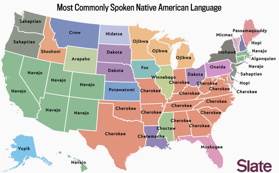
The article has several other maps showing the most common Scandinavian, South Asian and African languages. These are based on much smaller numbers so they're not as meaningful, yet there are still some regional patterns that emerge. More interesting is the map of the most common Native American language. The map mostly reflects original or sometimes forced settlement patterns, but also shows some long distance migration, particularly of the Navajos.
http://www.slate.com/articles/arts/culturebox/2014/05/language_map_what_s_the_most_popular_language_in_your_state.html
For more details and maps go to Slate.

Wednesday, May 7, 2014

Dug Tries Open Source Mapping

I was asked to make some maps showing a family's escape from Nazi-occupied eastern Europe during World War II. I've gotten used to relying on ESRI's expensive mapping software but nowadays there are many good open source tools available and many of them are platform neutral, meaning I can use them at home on my MacBook, or at work on my Windows PC or laptop. I hope to use more of these tools for personal and work projects.

I looked at some good tools for creating interactive (clickable or animated) maps, but this project only required a simple printed map. After some research I settled on the MapQuest API. This creates a map by entering a line of text in a web browser. For example this URL (the full text is below) creates a map showing the two towns in Belarus (variously under Polish, Russian and Lithuanian control at the time) where the grandparents came from.
http://open.mapquestapi.com/staticmap/v4/getmap?key=Kmjtd%7Cluu7n162n1%2C22%3Do5-h61wh&size=1200,1000&zoom=7&center=53.35,26.1&pois=yellow_1,53.219784,26.68405,0,0|red_2,53.489738,26.738491,0,0

The code above includes the image size, zoom level, center (in latitude, longitude) and two points ("pois" in the code) whose coordinates can be found by entering the name of a place or address in various online mapping services - Bing Maps is particularly easy to use to get these coordinates. The map above is oddly missing country names and needs the two points labeled. This is easy to do by saving the image and bringing it into Paintbrush, a free Mac program, or Paint if you're using Windows.
https://blogger.googleusercontent.com/img/b/R29vZ2xl/AVvXsEgXH_M_QoT9nY75Hrt8YzYJv8cKT9Ad8XOQIXQqkYvqC29SHYMMP2IfSukSLsT_9tmFTRE74GpmqyyRNyBl0UMCx3e0mVdqyzZtCyhovcZuBgUBUFYMQPR8F2ZwFy4zNDrR8vGCADudtco/s1600/Belarus5.jpg

The same process resulted in this map of five addresses in Warsaw.
The map looks fine but doesn't really tell a story. To illustrate the forced relocations and disappearing family members, I used Inkscape, an excellent free program but with a steep learning curve, to create arrows and some text effects. The bubble text was done using my Mac's native Preview app, though this can also be done in Powerpoint, Inkscape (with difficulty) and other software packages.
Click on the map above to see the entire picture or look at this detail to get the idea.
I look forward to making the rest of the maps showing the family's difficult journeys through France, Britain, Spain, Portugal, Mexico and finally to the United States. It's been a good learning experience both about the mapping tools and the horrible past that we're lucky to have escaped.