Wednesday, November 18, 2015

Canada's 1955 future

Macleans magazine bought this map from the Canadian government. It is from 1955 and details "100 Important New Resources That Will Help Make Canada's Future Bright And Prosperous" - 1950's booster-ism at its finest.
http://www.macleans.ca/news/canada/1955-map/
Here is a close-up view showing details such as petro-chemical and nickel leaching plants near Edmonton, a nationwide microwave net for TV, far-reaching rural electrification, gas turbine locomotives and a money tug of war with the United States.  
Sample text from the title block
"Yesterday many of the places shown here were barren rock, desolate tundra or virgin forest. Tomorrow they will pour out a swelling flood of nearly all the materials needed by modern man...."
I'm not sure if the colors (green, yellow and red-ish) mean anything (elevation?) or if that's just an artistic effect. Also, the leaf-like channels within the Great Lakes are a strange touch.

The Macleans article has a nice selection of items from the map showing which predictions were good (tar sands oil) and which were overly optimistic (potash.) Some other interesting items not covered in the article:
  • "Flying laboratory” carries ½ ton of electronic equipment in simultaneous search for many minerals.
  • Latest rust-resistant wheat developed at government lab in Fort Garry, Man.
  • Continent’s first turbo-prop airline service.
  • 2,250-mile gas pipeline from Alberta to Toronto-Montreal at cost of $300 million.
  • 19 new river valley conservation programs in Ontario.
  • $60 million for world’s largest transatlantic telephone cable built by Canada, U.S.A., U.K.
  • Atomic reactor at Chalk River for research into peaceful uses of atomic energy.
 I included that last item because I spent time in Chalk River as a graduate student and got to know some of the nuclear plant workers.

A complete list of all 100 resources can be found here, while a larger version of the map is here.




Thursday, November 12, 2015

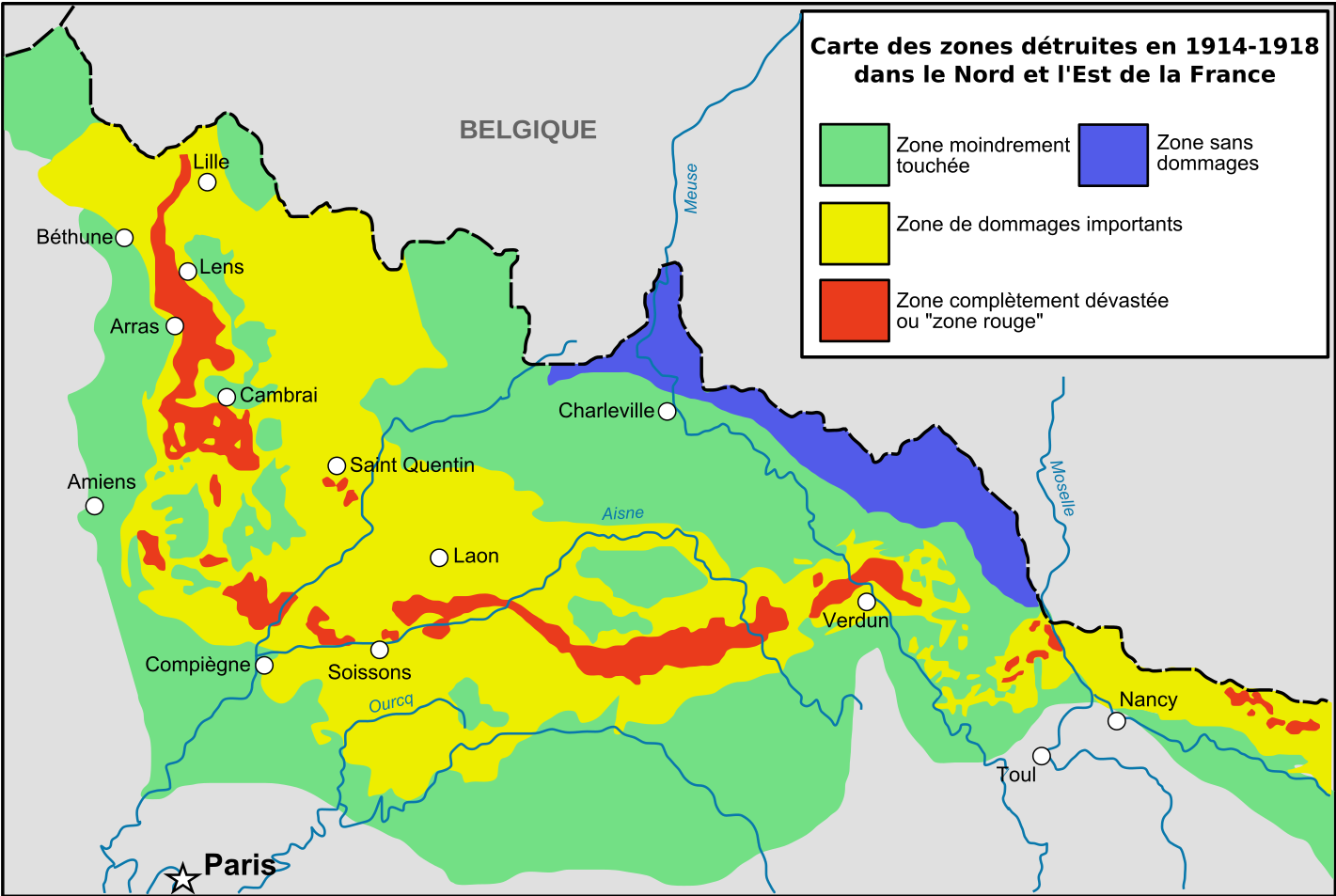
The "Red Zone" in France

The Red Zone is a series of areas in northeastern France that were isolated by the government after World War I. These areas were too damaged by the war for agriculture or human habitation. Some small areas remain off limits.
https://upload.wikimedia.org/wikipedia/commons/8/81/Red_Zone_Map-fr.svg
The red zone on the maps refers to completely devastated areas and the yellow areas have major damage. The green areas only had minor damage and the blue area was undamaged. The red zone is still full of unexploded shells and the soil is polluted by various chemicals and human and animal remains. From Wikipedia:
Each year dozens of tons of unexploded shells are recovered and, according to the Sécurité Civil agency in charge, at the current rate no fewer than 700 more years will be needed to completely clean the area. Some experiments conducted in 2005-06 discovered up to 300 shells / 10.000m² in the top 15cm of soil in the worst areas.
Some areas remain off limits (for example two small pieces of land close to Ypres and Woevre) where 99% of all plants still die as arsenic can amount up to 17% of some soil samples. Most destroyed villages lie in this area.
 Some of these areas have been set aside as artificially planted state forests but the trees are in poor shape. Other areas have been cleared for agriculture but concerns about pollution remain. Much more detailed information can be found on the French language wikipedia page.


Wednesday, November 4, 2015

The Island of Bad Art

Artist Grayson Perry created this etching to look like a Renaissance-era map of Venice in conjunction with the 2013 Venice Biennale. The place names reflect Perry's categories of bad art-here are some examples.


Based on some of the internet commentary he seems to have offended many people which is what art should do. It may be a bit snooty, but the mappy details are well done and enjoyable. Click below for an enlarged, readable version.
https://s-media-cache-ak0.pinimg.com/originals/f2/d8/68/f2d8685121a0e0484f39a1c5f4a54088.jpg


Monday, November 2, 2015

Mappa Monday: The Schuylkill River Aerial Tram

The 1976 Bicentennial celebrations prompted some grand visions for Philadelphia. Planning director Edmund Bacon envisioned a world's fair modeled on the highly successful 1876 Centennial, the first major world's fair in the United States. The fair was to be held on the same exhibition grounds as the 1876 fair with a system of boats and aerial trams along and across the river linking it to the central parts of the city.

http://philadelphiaencyclopedia.org/archive/bicentennial-1976/#6808
Utlimately this and other grand plans were sunk by the politics of the time. The bicentennial events did bring millions of tourists to the city but the numbers were well short of expectations, as were the long term benefits to the city.

Wednesday, October 28, 2015

Madrid Subway Complaints

This map shows complaints at subway stations-presumably from some 311-type of database. Complaints are color coded by type and given concentric, proportional symbols. The map is not easy to interpret but it makes for great art.

https://congosto.cartodb.com/viz/e5da12e2-9fe7-11e4-bc43-0e853d047bba/public_map
 The legend is in English, the popups are in Spanish.
As you hover over a station you can see the complaint type and frequency. Multiple complaints show up as concentric circles. The popup depends on what part of the circle you're pointing at. There are no obvious patterns, it seems like each station has its own discreet issues. Some of the data seems a little strange though.
For example,the 866 complaints about a breakdown at Nuevos Ministerios yet no other types of complaints. While most other stations have speed and access complaints (I'm guessing this means problems with tickets, turnstiles and/or maybe wheelchairs) there are none of these complaints here. That must have been one horrible breakdown.

Also, the dark base map is great for artistic effect but makes it hard to see where you are.
This whole thing would be easier to read with fewer categories and bigger circles but it would also be less fun. I enjoy watching how the artistic effect changes as you zomm further out.


Explore the map here.

Wednesday, October 21, 2015

Canadian Election Maps - The Good, Bad and Ugly

I hesitate to criticize another country's election maps but come on! This is Canada - you people invented GIS! I'll start with the ugly and work my way over to the good so I end on a positive note.

Here is the National Post's interactive map.
http://news.nationalpost.com/news/canada/canadian-politics/canadian-election-results-2015-a-live-riding-by-riding-breakdown-of-the-vote
Granted, this is interactive so you can zoom in as needed but still the emphasis on Canada's Arctic waters in the default view makes the smaller places (where almost everyone lives) hard to see. Also, it's ugly, and the Mercator projection makes it uglier and harder to read. Finally, being a conservative paper, all that red must be making their eyes water. Their non-interactive maps are much better (see further below)

BAD: Here is a cartogram from The Star.
http://www.thestar.com/news/federal-election/2015/10/19/how-the-parties-performed-in-each-province.html
 This is a cartogram? So the liberals won the north of every province and the conservatives the south? Compare British Columbia with the interactive version.
The cartogram is interactive. Click a dot and you will see that there is no relationship between its position on the diagram and its geographical location resulting in misleading information. If the goal is simply comparing numbers then the Globe and Mail version is the way to go.
http://www.theglobeandmail.com/news/politics/federal-election-2015/ridings/
When you click on the cells above, the map takes you to that individual Riding (I love that term!) Also, they have a nice list of key Ridings underneath their interactive info.
This map also came from the Globe and Mail - nicer looking, better projection and it includes St Albert among the important cities - what???

On the good side of things the National Post has this excellent graphic that lets you compare the vote from the last three elections.
https://nationalpostcom.files.wordpress.com/2015/10/na1020-election_map_1200.jpg

I like the detailed city maps - except they forgot St Albert!

Wednesday, October 14, 2015

Minneapolis Carto Quilt

The North American Cartographic Information Society (NACIS) begins its annual meeting in Minneapolis today. One NACIS tradition is the Carto Quilt, a cartographic collaboration. Quilt squares are different views of the host city. Here is this year's Minneapolis Quilt.
http://nacis.org/wp-content/uploads/2015/10/NACIS2015_CartoQuilt.pdf
Here are a few close-up details. Unfortunately the resolution won't allow for good legibility.


Hopefully someone at the meeting will take higher resolution images. Better yet, maybe NACIS can put readable (and find-able) versions of these on their web pages.