Wednesday, February 15, 2023

Turkey and Syria Earthquake Response

Parts of Turkey and Syria have been devastated by the strongest, most destructive earthquake in the recorded history of those countries. The earthquake has been followed by over a hundred powerful aftershocks, including one almost as powerful as the original magnitude 7.8 quake.

Map via Ajazeera

One of the many problems hampering response is the lack of adequate mapping in many of the areas. While many high profile large buildings have collapsed there are also buildings that are not mapped and those can get missed by response teams. The Humanitarian OpenStreetMap team is recruiting volunteers to help locate buildings and streets via aerial and/or satellite images. No experience or travel is needed, people can do this work at home. This map via Twitter shows (in the text box) the percentage of and number of buildings and streets mapped in each area. It also identifies where mapping needs are most urgent. The buildings in light blue unfortunately cover up the other information on the map.

If you want to help map these areas you can go to this task.

Wednesday, February 8, 2023

Icelandic Glacier Web Portal

This web portal is a collaborative effort by Icelandic institutes, agencies, companies, societies and private persons to display an overview of glaciological research and variations of Icelandic glaciers. The portal provides access to measurements, observations and photographs over an interactive map.

Zoom in for more details. Photographs can be seen by clicking the camera icons.

A click on the snowflake icons will bring up a description of each glacier including dimensions, measurements and a description of what rivers or other water bodies emerge from the glacier. There is also a measurement tab where you can see how much the area of each glacier has (in most cases) decreased over time.

You can also turn on the historical outlines of each glacier to see how they have shrunk over time from circa 1890 (yellow lines) to 2019 (red lines).

There is much more to explore including graphs, links and photos here.

Wednesday, February 1, 2023

Suginami Walking Tours

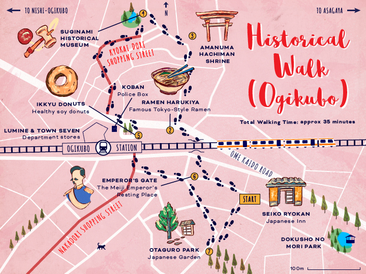
Suginami is a ward on the west side of Tokyo. The Experience Suginami web page features a series of walks and tours with some nice maps. 

The Historical Walk shows not only the shrines and gardens of the neighborhood, but also shows where you can get ramen and "healthy" soy donuts. 

The Subculture Rock Walk shows the clubs, studios record and comic stores and other sites, as well as the nearby train stations.

The Smile-Pearl Walk takes you through the Asagaya neighborhood from the Smile Hotel to the Pearl Center.

This is extremely helpful because everyone needs a cup of smiling panda coffee.


Wednesday, January 25, 2023

Taiyoh Pokemon Nation

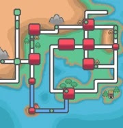
Taiyoh is a fan-made Pokemon nation. It is based on Japan. In fact, the resemblance is so strong that I came across these pages when looking for maps of Japan.

I will refrain from commenting on Pokemon given my lack of knowledge. However, I like the look and feel of this map. It's nice to see fantasy maps that aren't obvious attempts at stealing the Tolkien motif. Here is a close-up of the Kanto region, the capital located and shaped quite a bit like Tokyo Bay.


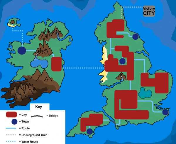
Looking at the author's Lunos nation, there's a definite style to his cartography.

Finally, here's the Karai Region.

 I can't quite place it but these shapes seem a bit familiar too.


Wednesday, January 18, 2023

The Inequalities of Climate Change

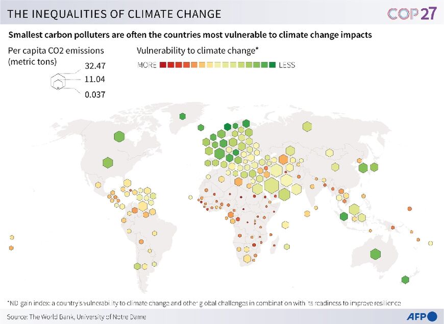
There was much talk, if not much action, at the recent COP27 conference about wealthier countries compensating poorer ones for the impacts of climate change. The poorer countries see the largest impacts, while contributing the least to the problem. This map illustrates the problem well. Unfortunately, I could not find a clearer version of it-this one is from Al-Monitor

The larger hexagons show higher per capita carbon emissions while the redder colors represent vulnerability to climate change. 

There is another version of the map via Arab News-this one has a truly bad and confusing color scheme (the "more" colors should be reversed) but the text is identical. In other words, read this map for the details but use the other one to see the pattern-this one just muddies the message.


Wednesday, January 11, 2023

Artwork of Mary Edna Fraser

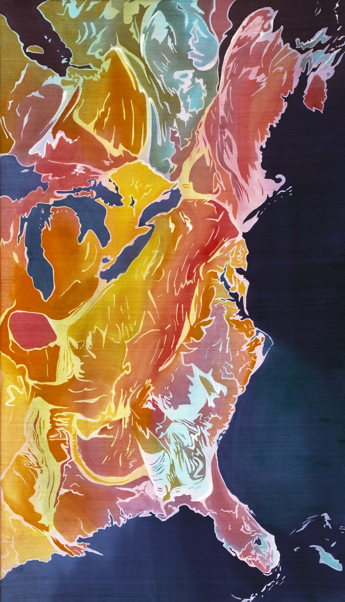
Those who have read this blog over the years know that I love the intersection of art and cartography. One of my recent discoveries is artist Mary Edna Fraser. Her textile work (from silks to rugs) and paintings range from the continental scale,

East Coast, US-batik on silk

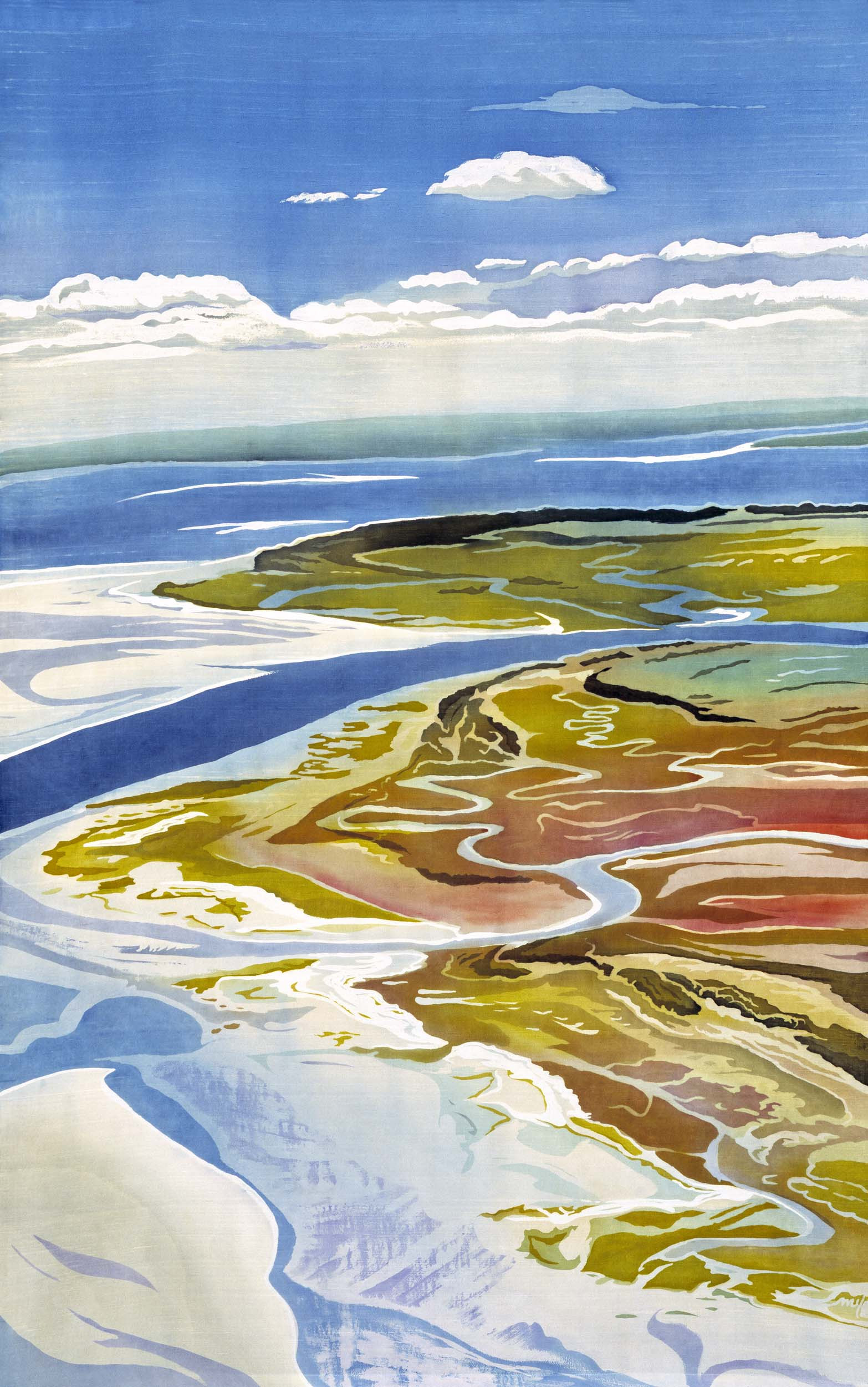
to the local scale.  

Edisto (South Carolina) -Batik on Silk

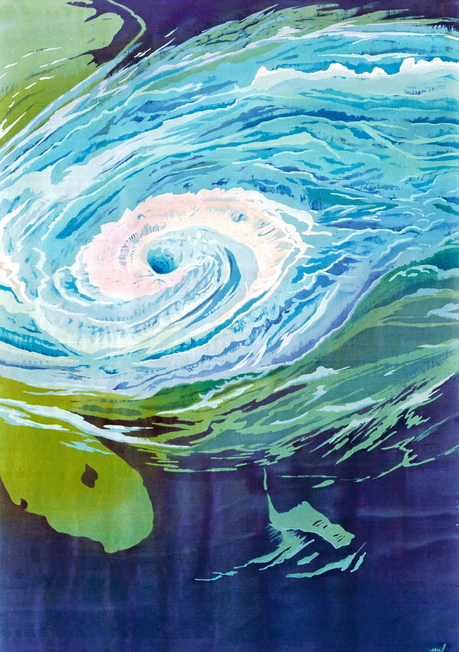
She has done some stunning works depicting hurricanes such as this one

Hurricane Season-batik on silk
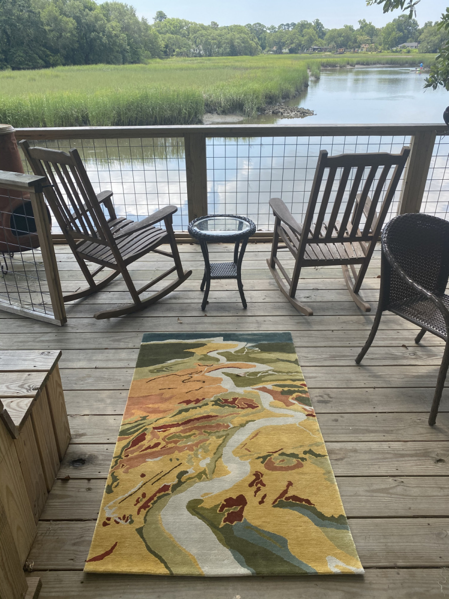
Her rugs are also very nice.
Ashley River

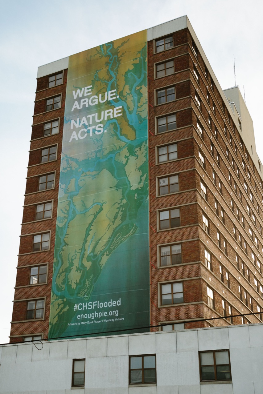
She helped organize a civic art and event-based discussion on rising sea levels that included this banner hung on the Joseph Floyd Manor in Charleston, South Carolina showing NOAA predicted flooding in the area.

Her work has been commissioned by government agencies, non-profit organizations, universities, hospitals and other companies around the world. Her main artist page is here where you can get lost in the wealth of examples.

Wednesday, January 4, 2023

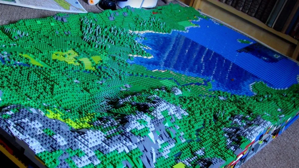
Huge Lego Model of the Lake District

Artist Jon Tordoff has made a 100 square foot, 200,000 piece (so far) Lego model of England's Lake District.

via Getty Images
 The model began as a pandemic recreation map of Buttermere, his favorite spot. 

"Now I've come over the Honister Pass, up Borrowdale and I've got Derwent Water heading towards Keswick now in the next valley," he said.


The model will be displayed at the Belper Library in Derbyshire (just north of his home in Milford) on January 6th and 7th.

All quotes and images taken from this BBC article where you can read more.