Wednesday, February 26, 2020

Hidden Goodies in Swiss Topo Maps

The Swiss Office of Topography (Swisstopo) has long been creating the most beautiful and meticulously created maps anywhere. A wonderful new article in the American Institute for Graphic Art's Eye on Design is titled  For Decades, Cartographers Have Been Hiding Covert Illustrations Inside of Switzerland's Official Maps.
https://eyeondesign.aiga.org/for-decades-cartographers-have-been-hiding-covert-illustrations-inside-of-switzerlands-official-maps/
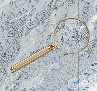
Cartographers at the office have been putting images like this marmot on their maps as an inside joke or possibly as a way to escape the strictures of such cartographic rigor and the level of concentration demanded of it. Most of them are removed when discovered by proofreaders but some elude discovery for years. Here is a nice fish hiding in a nature preserve.
https://eyeondesign.aiga.org/for-decades-cartographers-have-been-hiding-covert-illustrations-inside-of-switzerlands-official-maps/
A hiker making his way among the mountain peaks just across the Italian border. The cartographer may have drawn it in part to fill in details they were missing from the Italian geographical services.
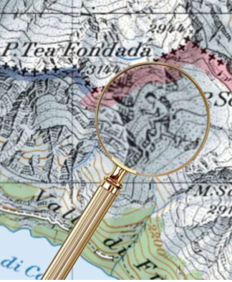
https://eyeondesign.aiga.org/for-decades-cartographers-have-been-hiding-covert-illustrations-inside-of-switzerlands-official-maps/

Here is a spider.
https://eyeondesign.aiga.org/for-decades-cartographers-have-been-hiding-covert-illustrations-inside-of-switzerlands-official-maps/
Many more nice examples and details can be seen here.


Wednesday, February 19, 2020

Rand McNally, The Early Years

Rand McNally is a giant in the world of cartography, dominating the US market during the pre-internet era and still producing maps and road atlases as well as being a player in the fleet management, connected vehicle and educational markets. The company began as a printing shop in Chicago in 1856. According to company lore (via Wikipedia) the business survived the Great Chicago Fire by burying two printing machines in a beach on Lake Michigan.

In the 1860's they began printing railroad timetables and in 1872 produced their first map as part of their Railroad Guide.
https://www.raremaps.com/gallery/detail/19350/rand-mcnally-and-cos-new-railway-guide-map-of-the-united-st-rand-mcnally-company
The Library of Congress has some nice examples of their early maps. Before they developed a standardized look their maps had all kinds of creative details. This giant finger, for example, is kind of awesome.
https://www.loc.gov/item/98688734/
This map, Colonists' and emigrants' route to Texas has some wonderful townscapes, though I'm not sure how accurate they are or were at the time.
https://www.loc.gov/item/79691569/
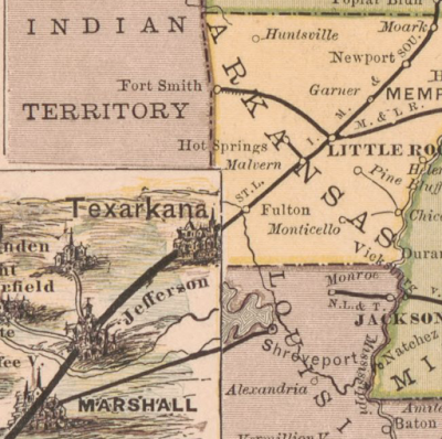
What I really like though is this transition from a traditional continental-scale railroad map to the larger scale pictorial map of Texas right at the border.
https://www.loc.gov/item/79691569/
Texas is a REALLY BIG state! Here is what the whole map looks like.
https://www.loc.gov/item/79691569/
Galveston, with its steam ship lines.
https://www.loc.gov/item/79691569/
 One final detail of this map that I like is the water lines.
https://www.loc.gov/item/79691569/
Here is some really nice topographic and road detail from their 1877 northern Black Hills map.
https://www.loc.gov/item/2011589611/
The map features illustrations along the sides including this classic stereotype.
https://www.loc.gov/item/2011589611/
The company began producing atlases in 1876. "Printed in colors from plates secured by letters patent, producing the clearest typographical effect of any known engraved plates." Here is a sample from the 1878 Business Atlas, later known as the Commercial Atlas & Marketing Guide. The maps are beginning to show a standardized style.
https://www.loc.gov/item/2011588339/
In the pre-auto age these atlases emphasized the railroads (the dark lines). The current Road Atlas, shows motor vehicle routes while not showing railroads at all.
https://store.randmcnally.com/rand-mcnally-2020-road-atlas.html


Thursday, February 13, 2020

Tokyo Trains in 3D

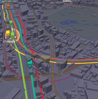
I love these live train animation things and yes I've shown them before but this one is 3D!
https://nagix.github.io/mini-tokyo-3d-preview/#16.15/35.682536/139.704328/0/60
Yes the trains are overly boxy but still pretty cool. Also, like any good visualization you can click a train for info.
The more you zoom in, the more detail you get, and the faster te trains go.
https://nagix.github.io/mini-tokyo-3d-preview/#16.15/35.682536/139.704328/0/60
 Here is the busy Shinjuku station in motion at night.
This site is was created by Akihiko Kusanagi.
Watch the trains here-just keep in mind that if you are in North America, there is a good chance you will be watching these trains in the middle of the night Tokyo time and may not see much action.

Wednesday, February 5, 2020

Map Haiku

Satellite Studio, a data visualization firm, has created a map haiku generator. Go anywhere and get a poem.
My first instinct was to go to my childhood home in Levittown, Pennsylvania. Clearly it is cold and rainy there because many of the poems referenced that fact. In addition to grabbing local data from OpenStreetMap, they are also grabbing current weather conditions from OpenWeather. The slightest move of the move will generate a new poem.
Trying out a more urban feel I went to nearby Philadelphia.
There is a "Locate Me" button though it was several miles off when I tried it. Also if you know your approximate latitude and longitude you can get nearby by manipulating the URL. There is also a crosshairs icon but I also found this to be off by a block or two. You can also change the language to French, Spanish or Czech, just be warned it will also change your location.
If you are in an area without much detail your poem will be "There's not much around..." The OpenStreetMap data through its amenity tags will give the poem local context about restaurants, bars, bus stops, etc.  Supposedly if you're near a supermarket it will reference that and generate a poem about aisles or cashiers or food but I tried a couple of known stores and only got references to Starbucks. I tried my local airport and got this unrelated poem.

For a random exploration I went to Arjona, Colombia (found by changing my URL coordinates) - it was quite apparent that my location was near both a cemetery and a school based on the poems I got. I was able to confirm this on OpenStreetMap.
https://satellitestud.io/osm-haiku/app/?lg=en#15/10.2483/-75.3452

Try it out.


Wednesday, January 29, 2020

Taste Atlas

Taste Atlas is a fascinating wormhole to be sucked into if you're into "foodways" as wonky geographers call it. You can pan and zoom all over the world to see what the local dishes are.
On one hand I like that certain cliches are avoided. In an example near to my heart, for Philadelphia they ignore the Cheesesteak* which you can get anywhere (though usually poorly made) in favor of the Roast Pork Sandwich, truly hard to find outside of southeastern Pennsylvania. On the other hand some of the choices seem like missed opportunities like they can't come up with something better than hot dogs to represent New York** or Cheeseburgers for Los Angeles. Then again after writing this and doing more panning and zooming, I found different items showing up in these places.
Here is part of South America.
Another option is to click a country, city or region to see what they eat there.
Click on the dishes to get descriptions, mouth watering pictures, suggestions of where to eat them with restaurant details and often recipes.
In the mood for Indonesian?
* Upon further clicking the Cheesesteak did appear, it's just not the first item to appear.
** Upon further clicking the Rueben did appear for NYC, it's just not the first item to appear.

Wednesday, January 22, 2020

The Top 100 Private Land Owners in the USA

The United States Government owns 640 Million acres of land (about 28% of the country's land mass). Of the privately held lands, 40 million acres (about the size of Florida) are owned by 100 individuals. This map from Bloomberg shows who these people are and where (most of) their land is.
https://www.bloomberg.com/graphics/2019-largest-landowners-in-us/
A zoom in shows you who these people are - a combination of investors, energy company owners, ranchers, media moguls, heirs and various other wealthy people. Here is the Texas Panhandle and northeastern New Mexico,
and southwestern Texas-the blue piece furthest west is owned by Jeff Bezos where one of his companies tests a reusable rocket.
Here are the top 10 landowners with the acreage (in the millions) they own.
Most of this land is in the western half of the country. Here are some holdings surrounding Yellowstone National Park.
There is not much action in the east, except for in Georgia, Florida and Maine where seven families collectively control a quarter of the state's land, including Subway (the restaurant, not the transportation option) co-founder Peter Buck.

Wednesday, January 15, 2020

Sea Turtle Threats

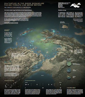
One of the best visualizations that I missed in 2019 was this one showing the threats to sea turtles in the Aegean Sea by Jonni Walker.
https://public.tableau.com/views/TheTurtle/Tester?:embed=y&:display_count=yes&publish=yes&:origin=viz_share_link&:showVizHome=no#1
The map has a strong National Geographic feel to it-packed with dense information, some of it interactive. One of the things that is amazing is that it was created using Tableau, a data visualization software instead of using traditional cartographic software, although Mapbox was used for some of the cartographic display.
Turtle hotspots are indicated "firefly" style in the bright blue. Below the National Marine Park of Zakynthos is highlighted. It is the first national park established for the protection of sea turtles in the Mediterranean. The airport on this island banned overnight flights because that is when the turtles lay their eggs and they are susceptible to the noise and light. 
One of the biggest threats to these turtles is plastic debris. They will ingest floating bags because they look like jellyfish to them. The graphics below the map area are interactive. You can hover over them for further information.
I also like the way he did the legend though some people think this kind of legend is hard to read. I've been criticized for using this kind of legend in a map but I think it's better to see the colors and symbols against the map background than stuffed into a white box.
It looks like there are supposed to be some controls for interactively changing the angle and orientation of the map but i have not been able to get them to load on my computer. This is a problem overall that the visualization s very large and difficult to load. You can explore it here but be patient with the slow loading.