Wednesday, April 27, 2022

The Quarantine Atlas

Two years ago, at the beginning of the current pandemic, Bloomberg CityLab asked readers to map their life under quarantine. They displayed many maps, some of which were featured here on a previous blog post. Last week they published over 65 of these maps as The Quarantine Atlas.

While the publisher's page does not show any examples, there are quite a few on this Bloomberg page as well as many other maps not in the atlas. Here are a few that I like.

Tiara Lui - Hong Kong
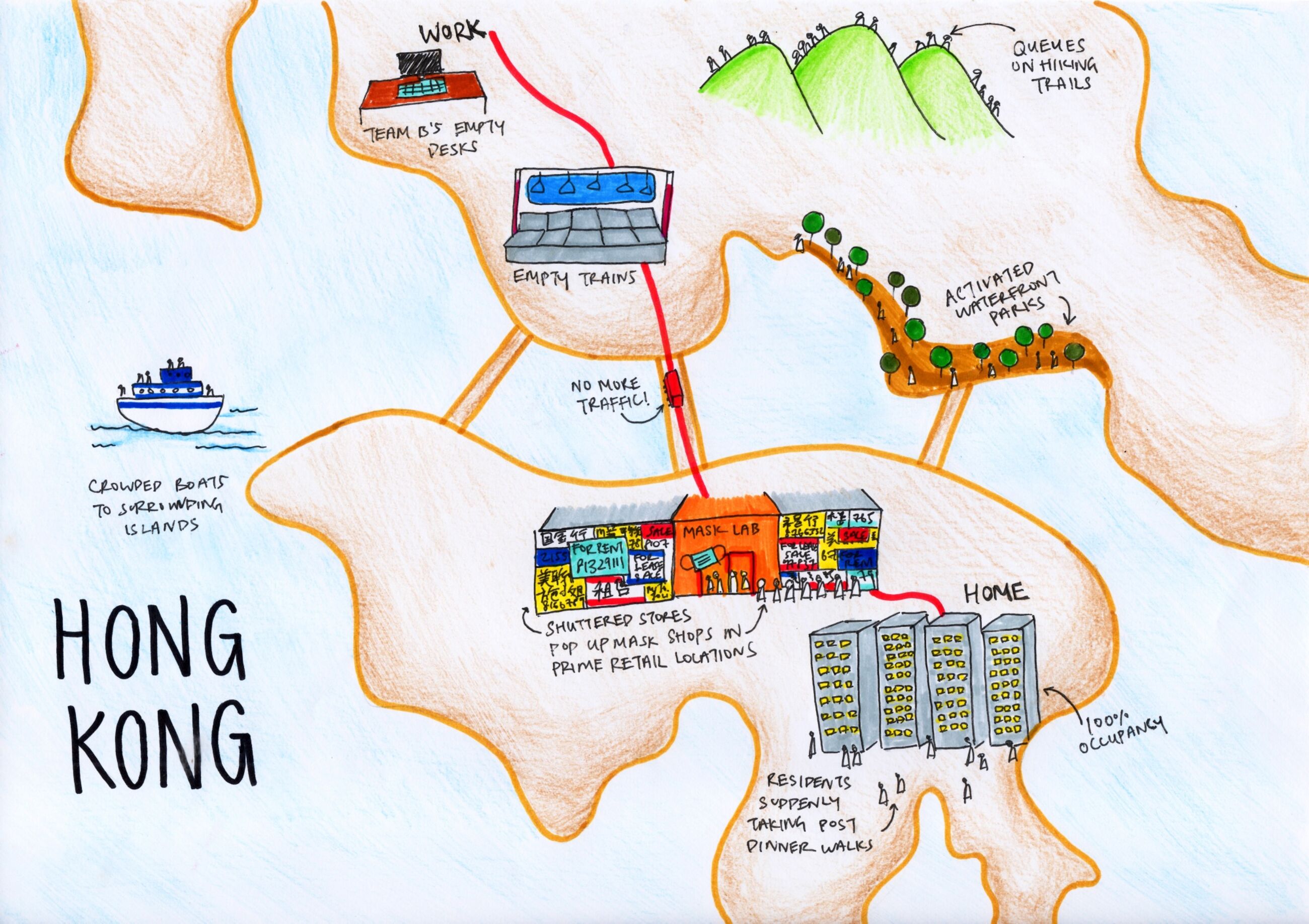
Nice job showing the commute and pandemic disruptions to the city.

Nabilla Nur Anisah - Depok, West Java, Indonesia 
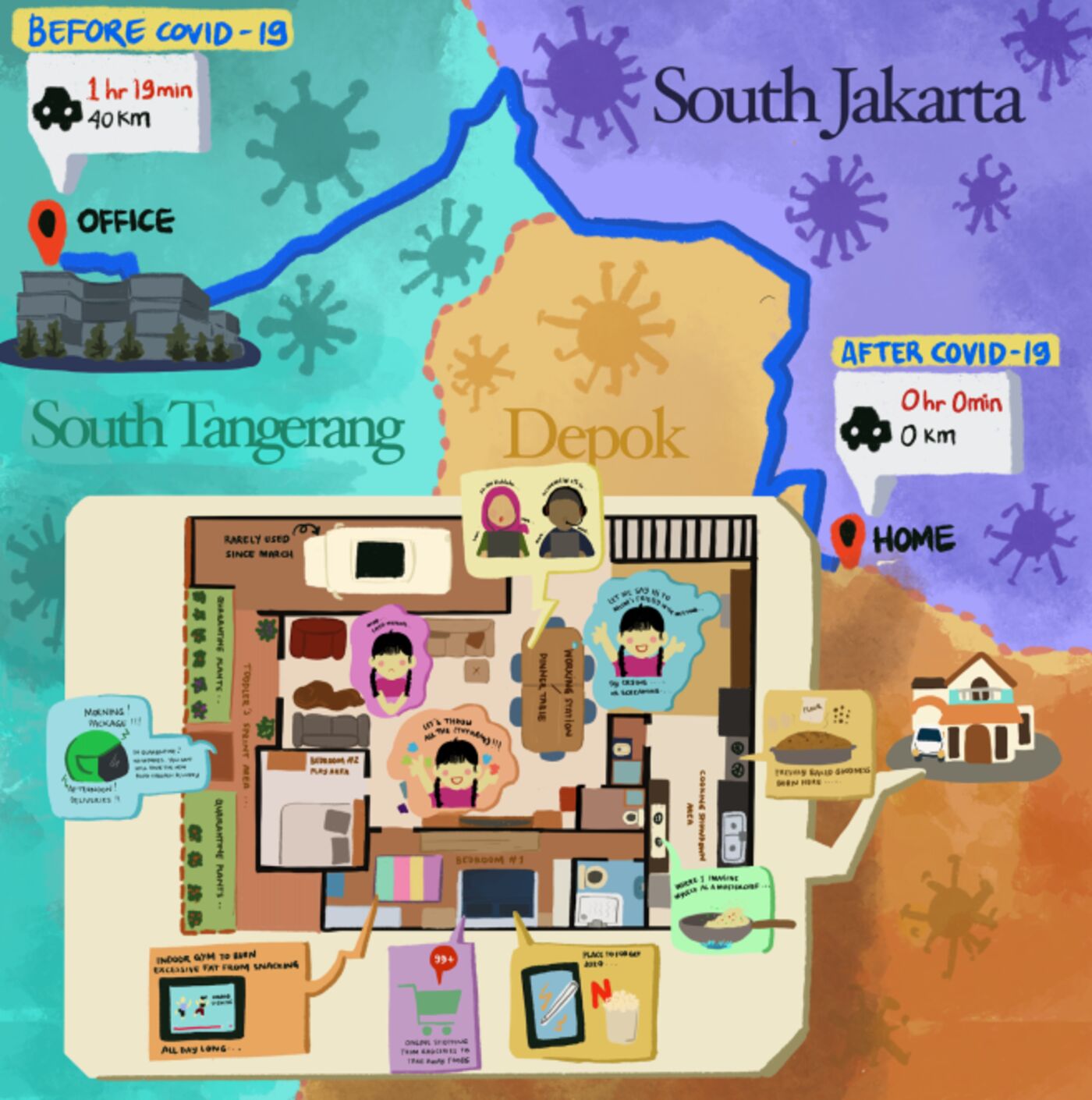
Many of the maps show floor plans of the residence as that is where people are stuck. I like this one because it contrasts the home life with the three hours of commuting to an office in South Tangerang.

Alfonso Pezzi - London transformed. Everything is delivered home including entertainment and work.

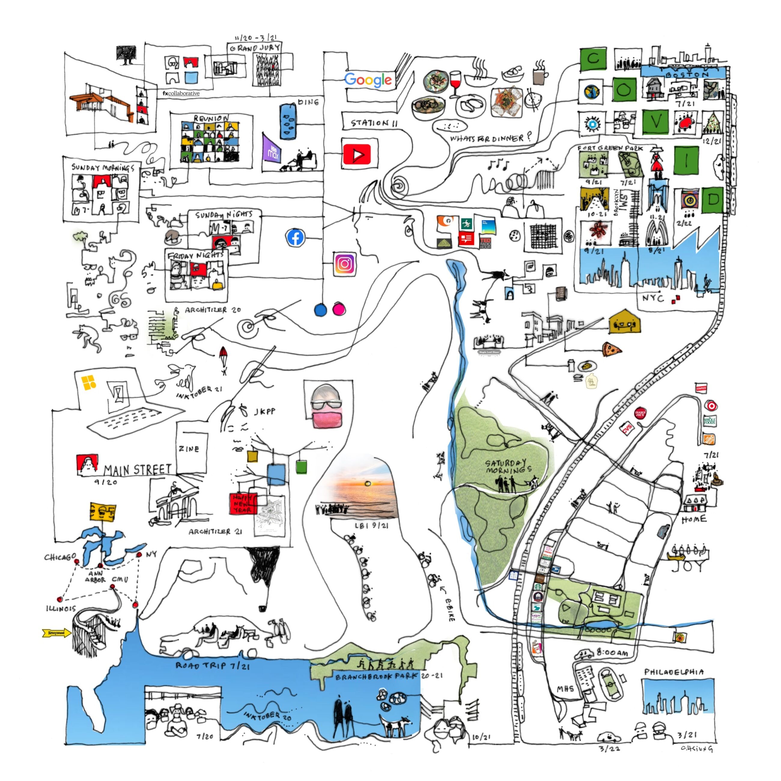
Finally here is one that did not make the atlas but I like all the intersecting geographies; floor plans, the local park, the drive to school, various road trips to nearby cities and then out to Illinois.

Carol Hsuing - Millburn, New Jersey

Wednesday, April 20, 2022

Mapping the Indigenous Diaspora

The Comunidades Indigenas en Liderazgo (CIELO), a non-profit advocacy organization, in conjunction with UCLA created a story map called We Are Here, showing the indigenous diaspora of Los Angeles. This is to counter the "statistical genocide" the US Census creates by lumping these groups under the broad Hispanic/Latino classification. This erases their cultural differences, including 30 different unique groups speaking over 17 indigenous languages. The map shows the locations of these language speakers by color.

Clicking on a zip code brings up a pie chart of the language speakers.

Unfortunately the colors of the pie chart are not the same as those of the map leading to confusion. On this graph the K'iche speakers are yellow but on the map they are green. On this chart they are blue.

The tabulation by zip code also creates confusing dot effects on the map where the shapes of more dense zip codes are emphasized. This graph within the story map shows the universe of languages on the maps.

The organization aims to get the public agencies of the City and County to recognize and provide translation services for these languages. Here is a translation card for the Guatemalan regional dialects - there is a separate card for Mexican regions.

As you scroll through the story map you get videos and map content showing the locations of festivals, conferences and organizations that aim to teach the cultural traditions.

The story map is on view at the Mixpantli: Contemporary Echoes exhibit of Los Angeles County Art Museum (LACMA)

Wednesday, April 13, 2022

Maury's Wind & Current Charts

U.S. Naval Officer Matthew Fontaine Maury developed wind and current charts starting in the 1840's. They helped save shipping companies millions of dollars and avoid losses of life and cargo by giving sailors critical information about wind and current patterns. 

Wind & Current Chart of the North Atlantic-via American Geographical Society Library

Detail off the coast of Tampico, Mexico
As director of charts for the Navy, Maury had access to decades of ships' logs. These logs included routes and weather conditions. During the California gold rush these charts helped shorten the trip from New York to San Francisco by 40 days or more. 

The length of the arrows denotes the strength of the current. Colors indicate the season of each track. The dots represent wind speed as indicated in the legend below.

Here is a detail of the mouth of the Rio De La Plata from one of his South Atlantic charts.
via Yale University Library

Maury went on to map the Pacific and Indian Oceans, monsoon patterns, ranges of the sperm whale and discovered an undersea plateau that could be used for laying the first transatlantic cable. More on his life can be seen in this PBS American Experience article.

Wednesday, April 6, 2022

Alabama Coal & Iron Sketch

I found this charming map looking through the University of Alabama's impressive online map collection.

William Atkinson, 1872

I love the way the coal looks like spilled ink. Let's appreciate it up close.

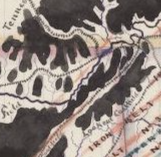
There are lots of charming hand drawn details such as the railroad tracks and city symbols. One of the most charming things about this map is its inaccuracy. The coast of Florida dips south way too soon, as does Mississippi. Nashville is too far south. Even parts of Alabama are off. The coastal part is too wide and a bit off too. The border with Florida is too straight and the whole state seems a bit short. In an age of digital maps using common databases, this stuff is refreshing.


Wednesday, March 30, 2022

Women's Suffrage in 1917

As a follow up to Women's Suffrage in 1908, here is an ad from 1917 showing how suffrage (the white areas*) had expanded through most of Canada and parts of the United States. 

The ad is from the National Women's Suffrage Publishing Company and asks how long the U.S. will lag behind Canada. For contrast here is the 1908 map again. Keep in mind that the color scheme is reversed.


*yes the white areas are actually sepia areas, OK.

Wednesday, March 23, 2022

The Atlas of Imagined Places

 The Atlas of Imagined Places by Matt Brown is now available.

The book shows the "likely geography" of places in literature, media, myths and video games.

"The authors have taken years to research the likely geography of thousands of popular culture locations that have become almost real to us. Sometimes these are easy to work out but other times a bit of detective work is needed and the authors have been those detectives. By looking at the maps, you’ll find that the revolution at Animal Farm happened next to Winnie the Pooh’s home."

Here is another image from the Amazon page.

Wednesday, March 16, 2022

Emma Hart Willard's Atlas

Emma Hart Willard was a pioneer of education and geography. She saw geography as a foundation for teaching. Her approach was to have students start with maps of their local environment, instead of at a harder to grasp global scale. She published Willard's History of the United States, which included an atlas. Unlike many other atlases, this one began with the indigenous settlement of North America.

This "Introductory Map" shows the approximate locations of tribes. Arrows convey their movement. The map title is "Locations and Wanderings of the Aboriginal Tribes". Perhaps in a nod to the aboriginal people, the Atlantic Ocean is called "Salt Water Lake or Great Water".

The next map, the First Map of 1578 shows intersecting tracks of the European explorers and in pink Sir Humphrey Gilbert's patent, the first land patent granted by Queen Elizabeth I.

The "Second Map of 1620" has a similar look but the ships are for commerce, not exploration, including a Dutch ship "with negroes from Africa". The entire east coast up through New Brunswick is labeled as the North and South Colonies of Virginia and there is an inset map of the places at the mouth of the Hudson River visited by the Dutch. The rolling up of the left corner of the map is a nice touch that she employs frequently.

The next group of maps show various wars with the indigenous tribes and between the British and French and then the gradual formation of colonies, followed by some Revolutionary War maps. It concludes with a map of the "Principal Seats of War 1812-13-14" showing the areas around Detroit, Buffalo, New Orleans, the Chesapeake Bay and St. Lawrence River.

You can read more about Willard's life and work on the Worlds Revealed blog from the Library of Congress. The atlas can be seen here.